_LIVABLE ART
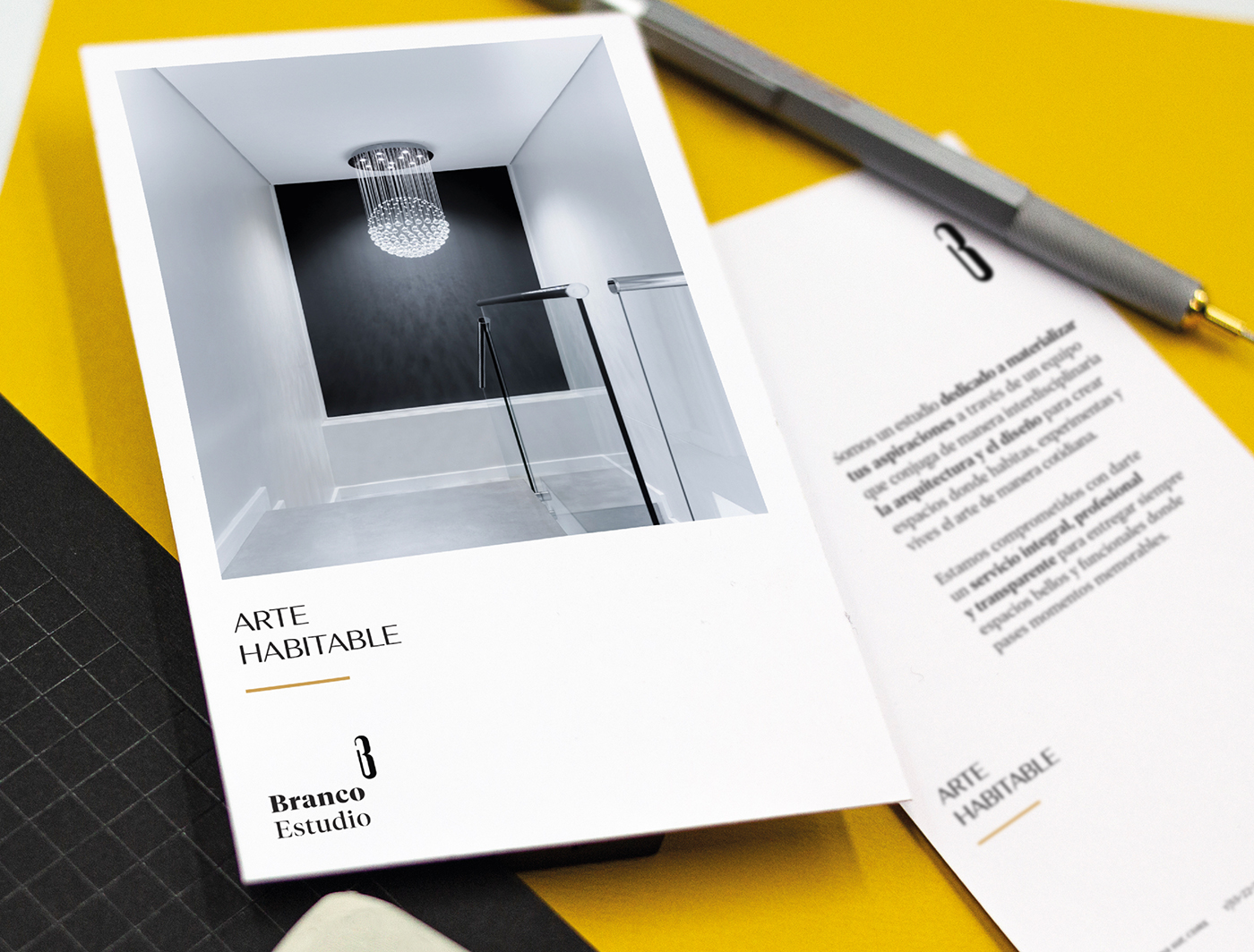
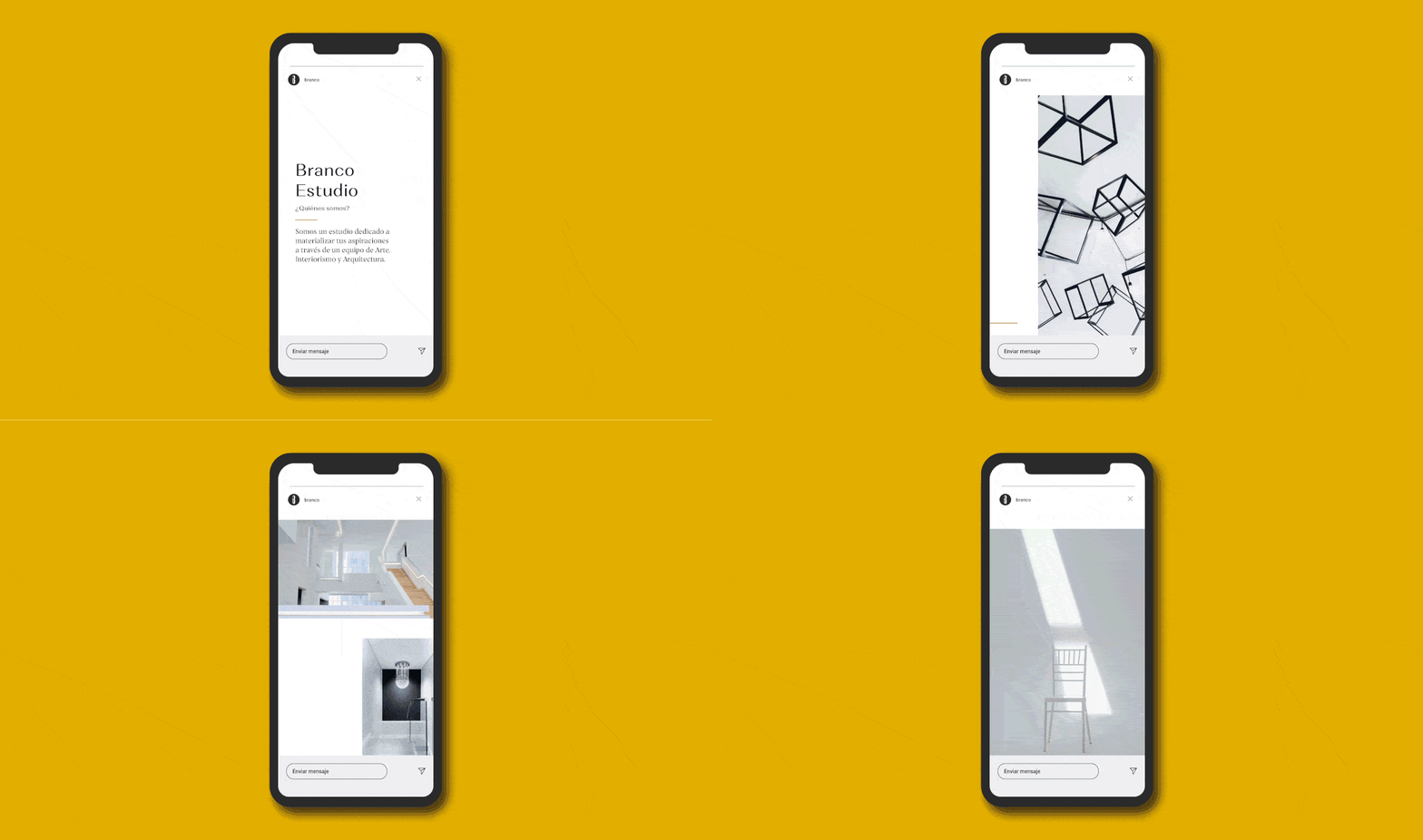
_Branco Estudio is dedicated to making its clients' dreams come true by using their interdisciplinary team who combine architecture, design, and art. The mission of Branco Estudio is "to create spaces that become more than a place". Its founders are committed to ensuring that their clients can experience art in their everyday lives, and they fulfill this by creating spaces that are simultaneously aesthetically pleasing and functional.
INFO
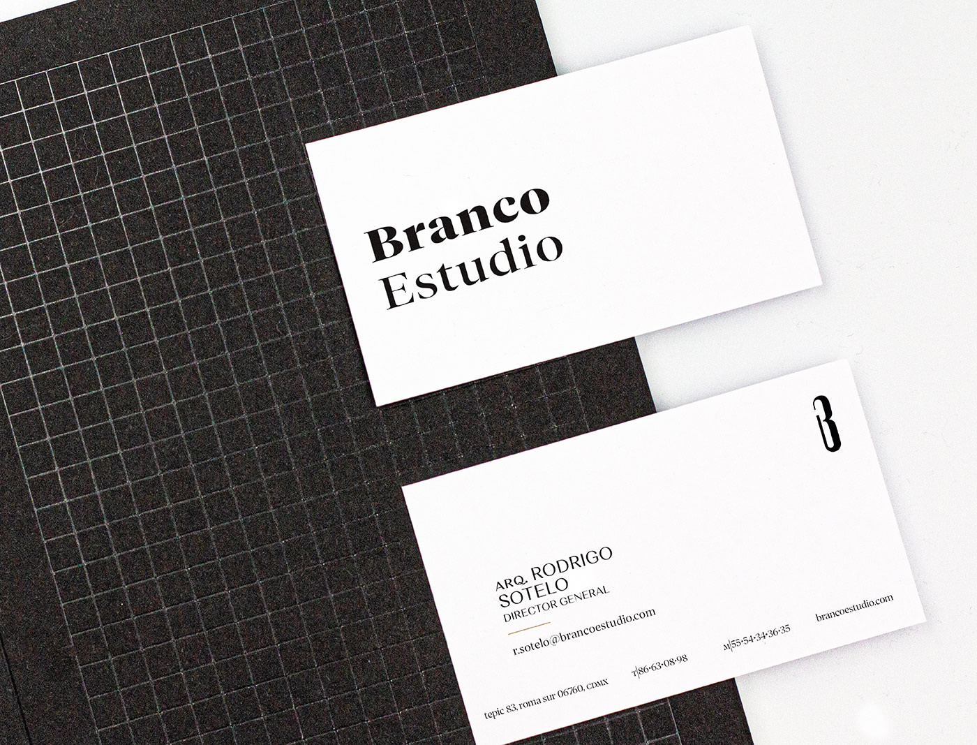
The name means white, a color associated with purity and new beginnings. It is inspired by the painter's unaltered canvas; the achromatic wall in interior design; the architect's undeveloped plan; and the client's living space. Their essence, "livable art", is also used as a slogan and appeals to their team's desire to break down the barriers that art often implies and bring it into the everyday experience.
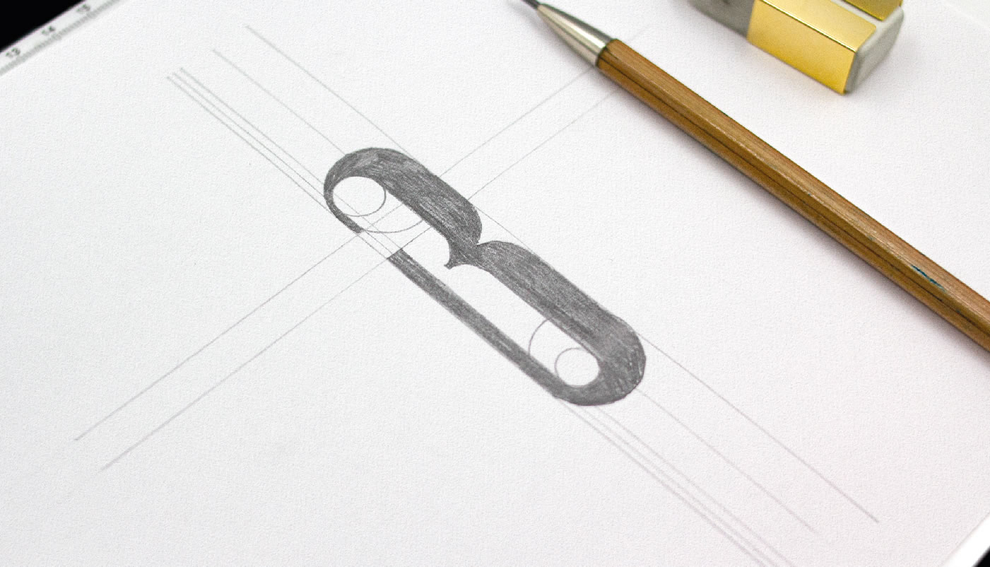
The main element of the logo is the number three, which refers to the number of founding partners and the three disciplines that make up the spirit of the company - an abstraction of exponential talent. Meanwhile, the typography supports the transmission of the most functional values: formality, punctuality, transparency, and constant communication.
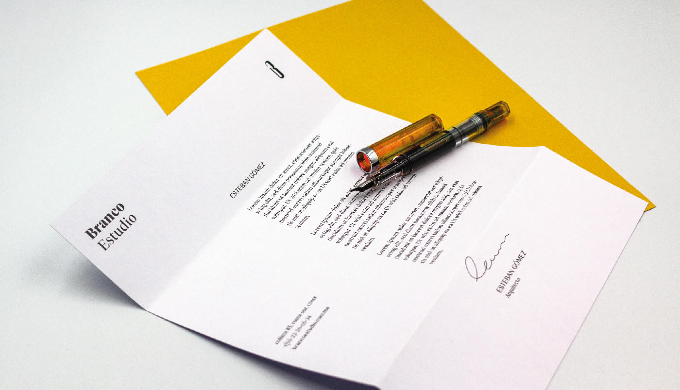
Branco Estudio makes it possible to inhabit art, and now can do so through a graphic identity built especially for them.

