_CELEBRATE PLEASURE
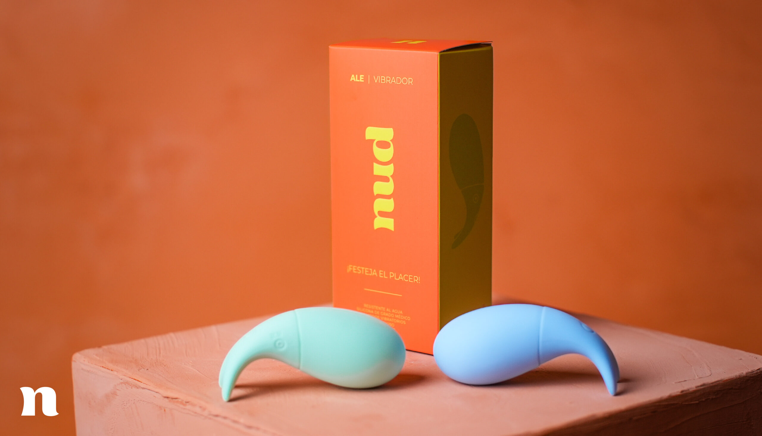
Tania and Karen decided to pool together their expertise in sex education and in the business world to create a happy, disruptive and friendly brand. They came to us to develop a brand, identity and packaging strategy that reflect their personality and essence.
INFO
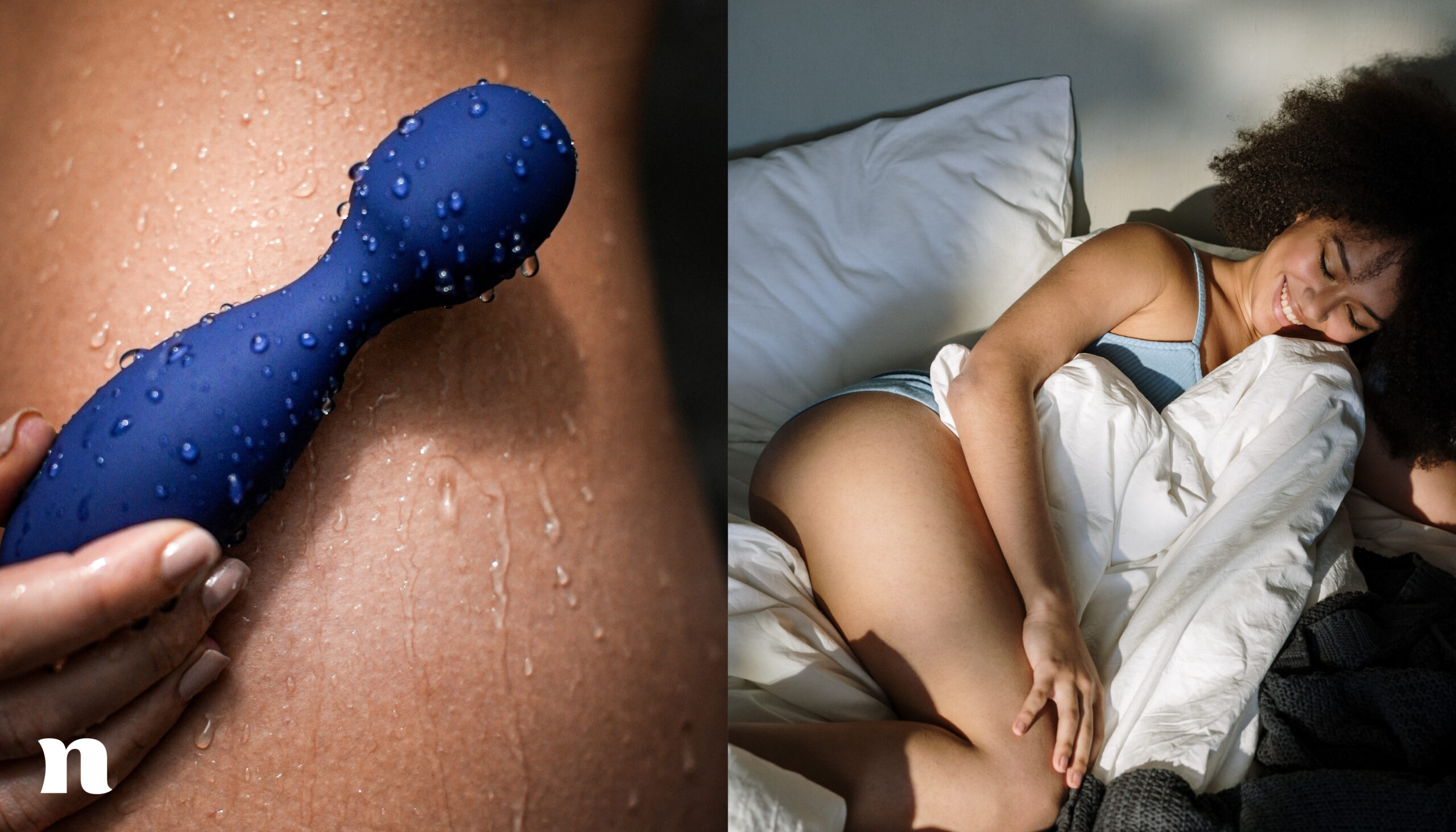
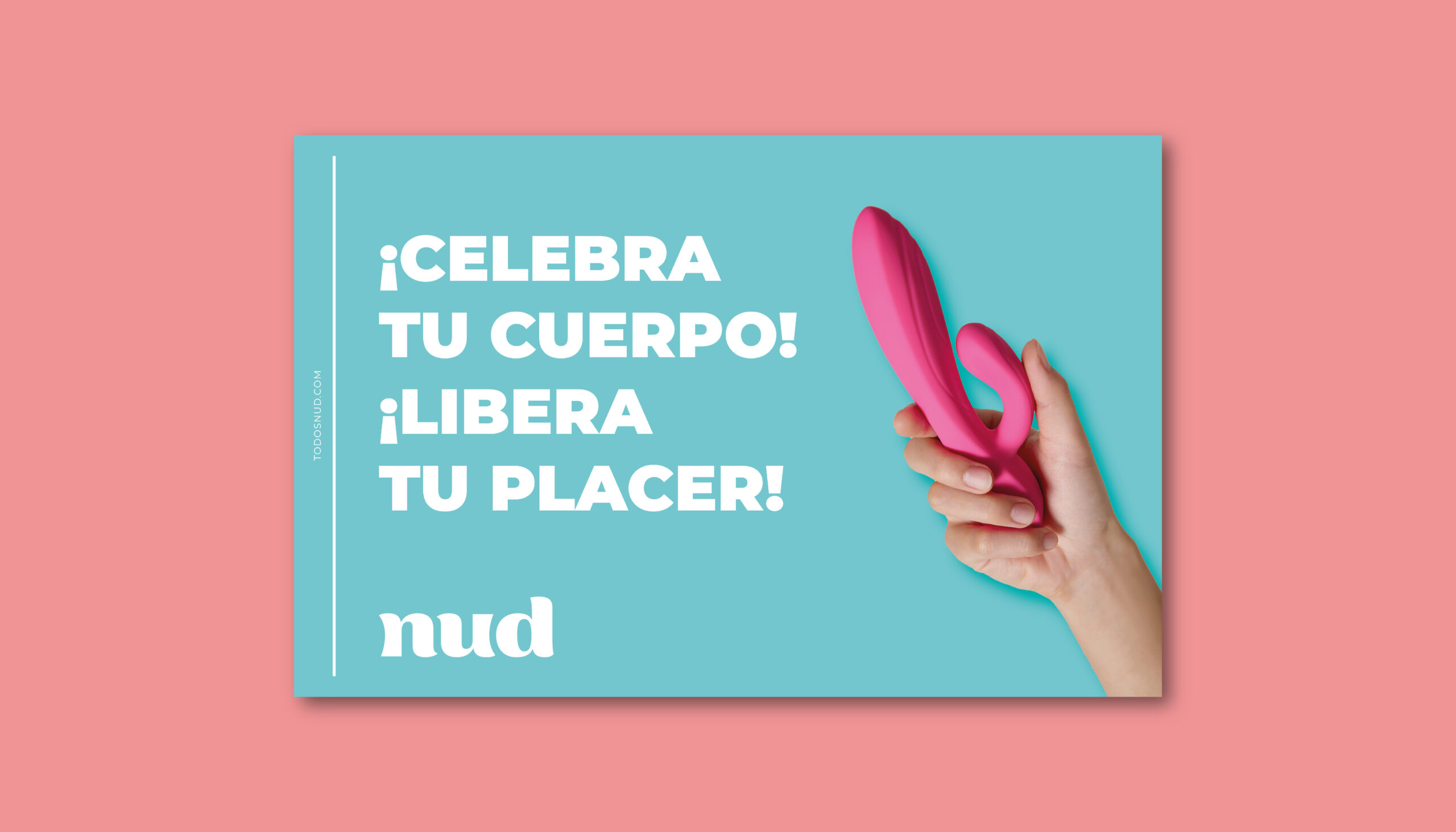
At Nud, they faithfully believe that the most important thing about our body is to discover and enjoy it, which is why the main values that the brand communicates are freedom and pleasure. Thus, they are breaking with existing taboos and becoming more than just accessories: it is a place to share, learn and enjoy.
The logo is made up of a thick typeface with soft strokes that refer us to a friendly and fun brand, while its lowercase letters speak of the closeness and intimacy with which Nud communicates. It is a simple, clean and timeless logo, whose curves reflect the movement of bodies and the celebration of pleasure.
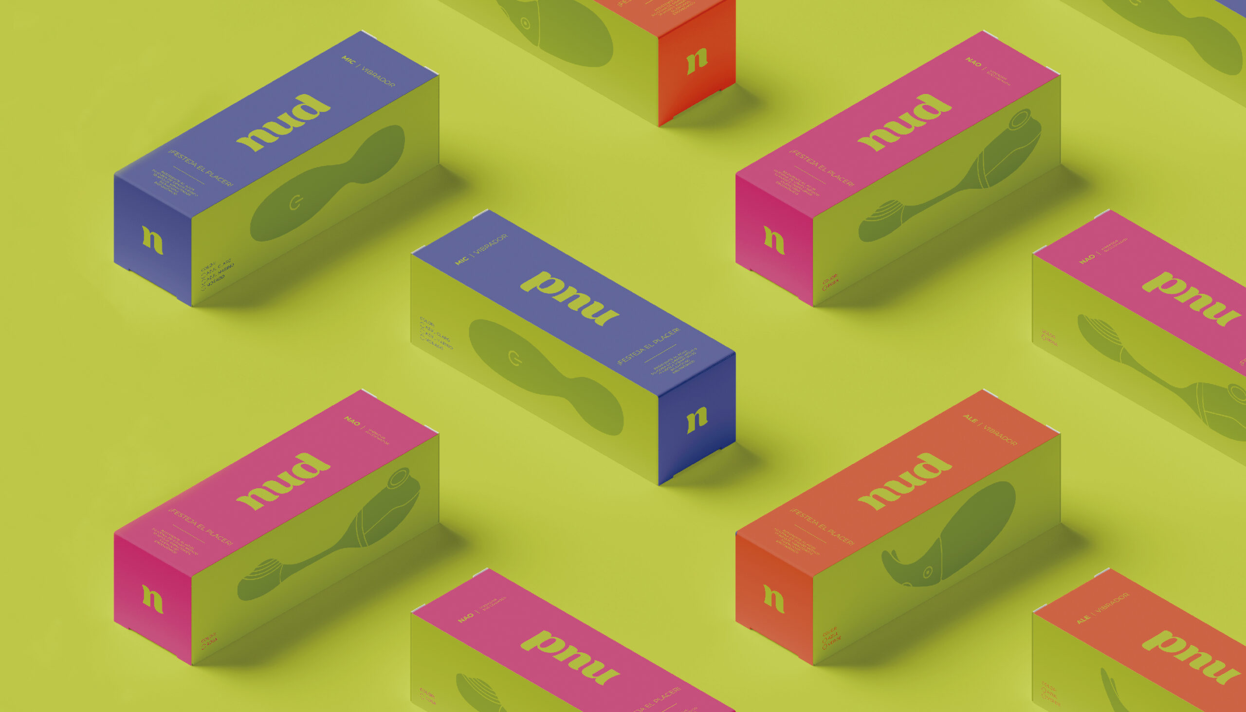
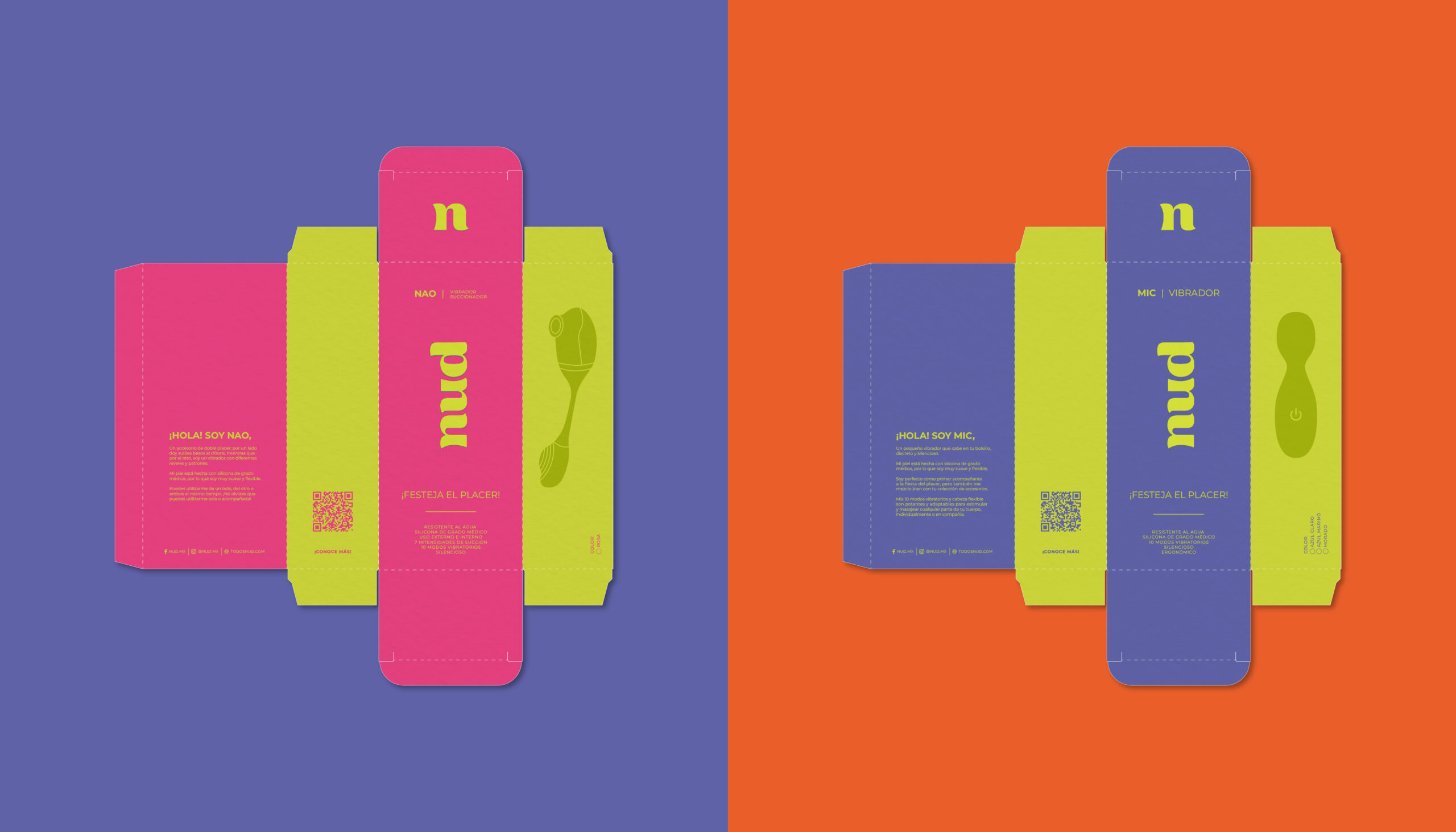
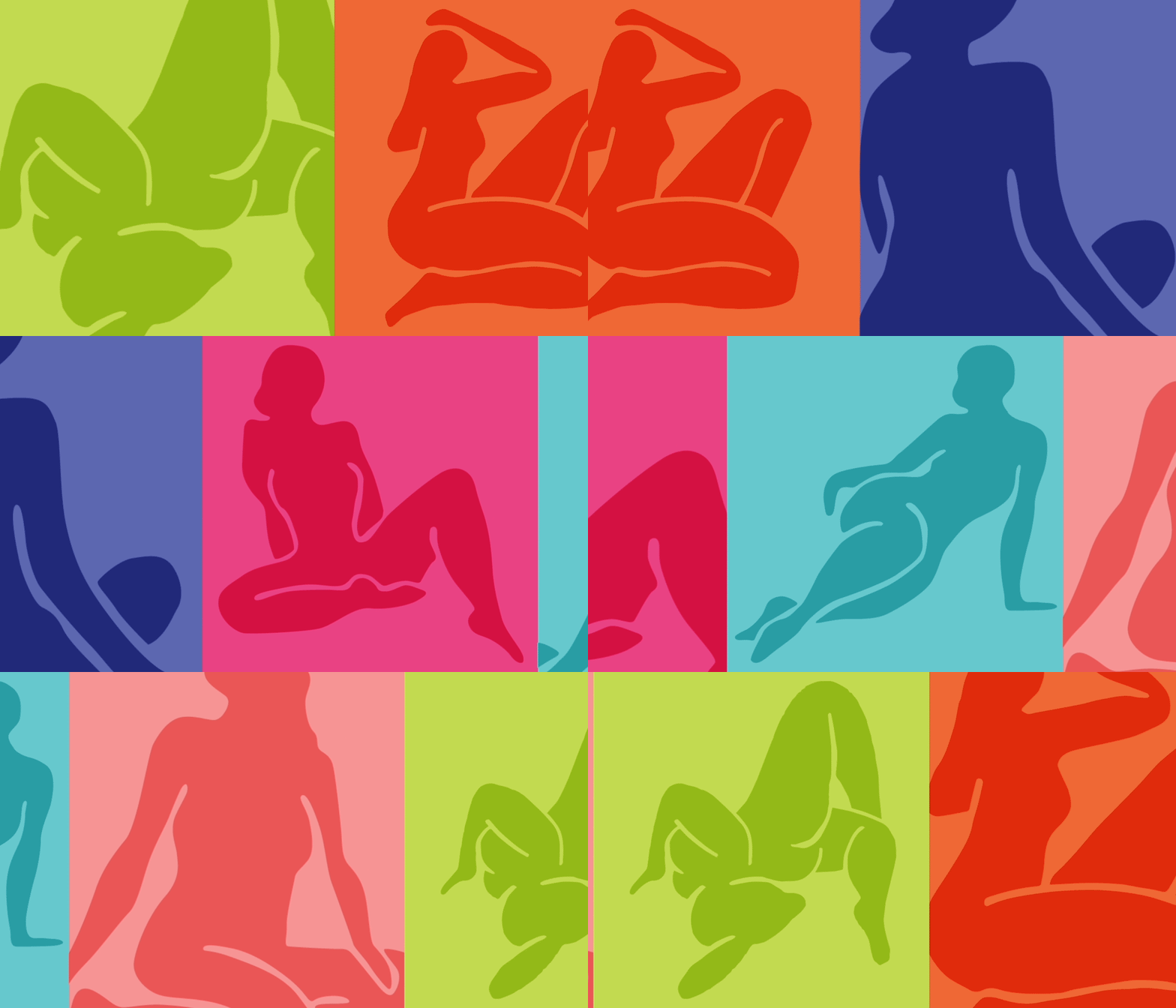
Taking into account the spirit of celebration that was raised in the strategy phase, we developed a bright but reliable packaging where a simple box becomes the invitation to your party of pleasure. We use a color palette and certain illustrative resources such as female silhouettes and an informative iconographic system that refers us to a bright and energetic joy, highlighting the brand's pillars: turn on, enlighten and let go.
We can see that the final result feels close and fun, striking a balance between the intimate and the bold..

