_VE MÁS ALLÁ
Ópticas Lux was somewhat lost in an increasingly competitive industry, guided by omnichannel models and consistent identities. For this reason, we collaborated to develop a brand redesign that showed their essence and maintained relevance in the future with their different targets.
INFO
The brand faced a lack of clarity in its messages and visual communications, so it was key to develop a strategy that aligned the aesthetics with the concepts of trust, innovation, originality and approachability to improve brand recognition and strongly express its tone and personality.
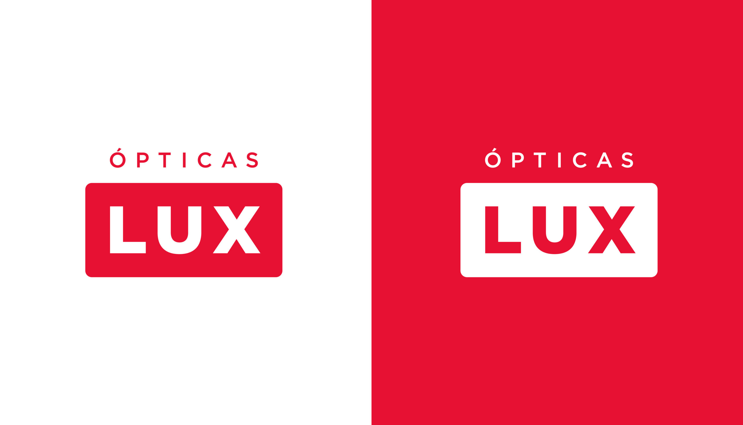
Taking into account the need to remain current and contemporary, we redesigned the logo giving it a friendly, clean and timeless style that evokes the strategic values and connects directly with a diversity of audiences, prioritizing freshness and simplicity.
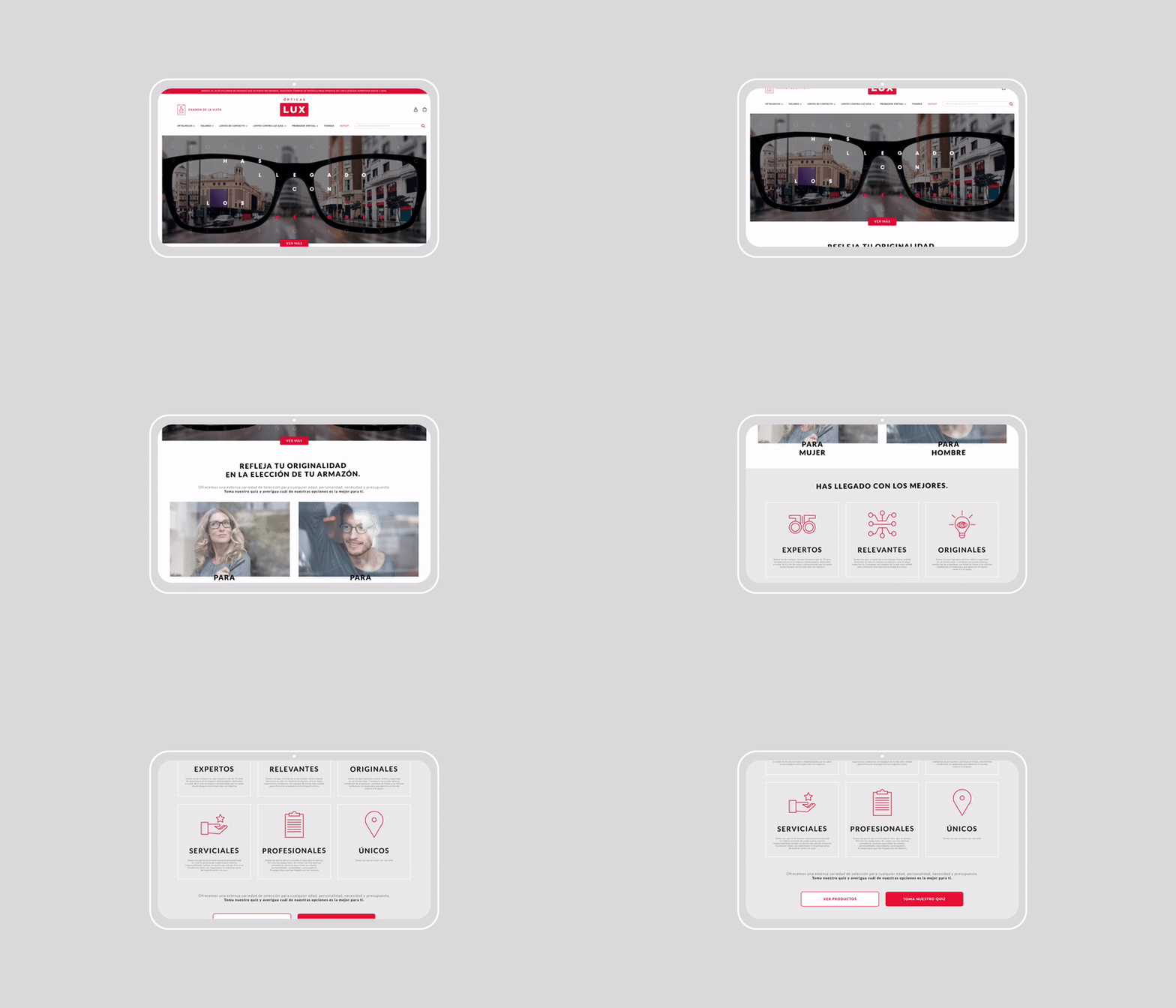
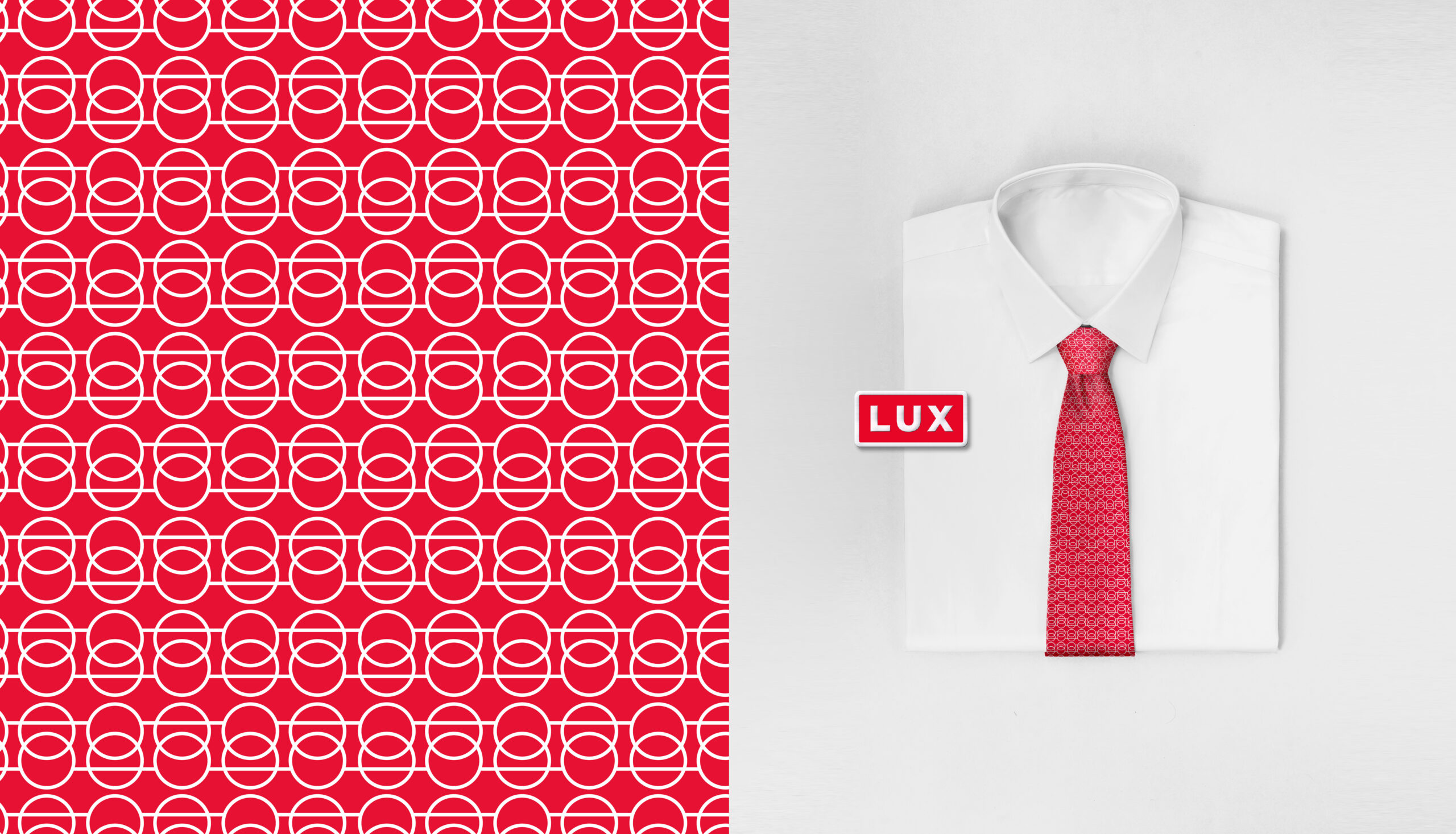
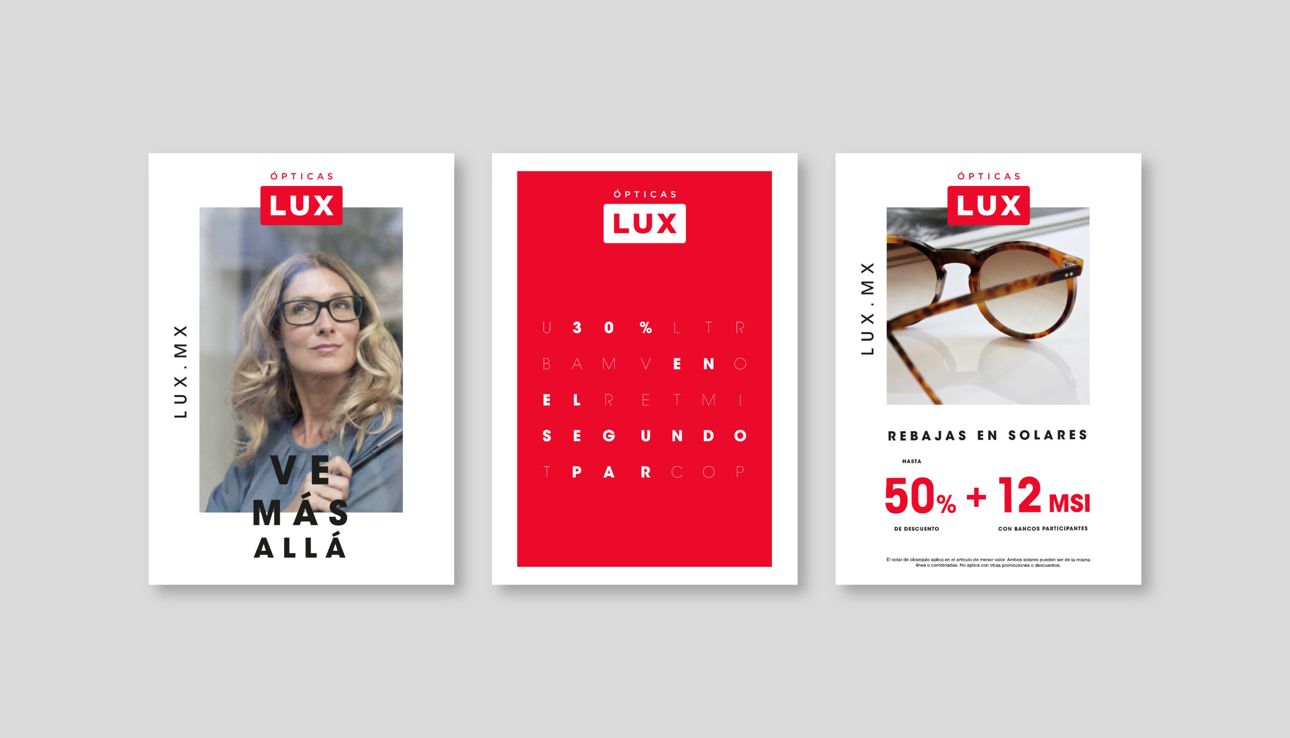
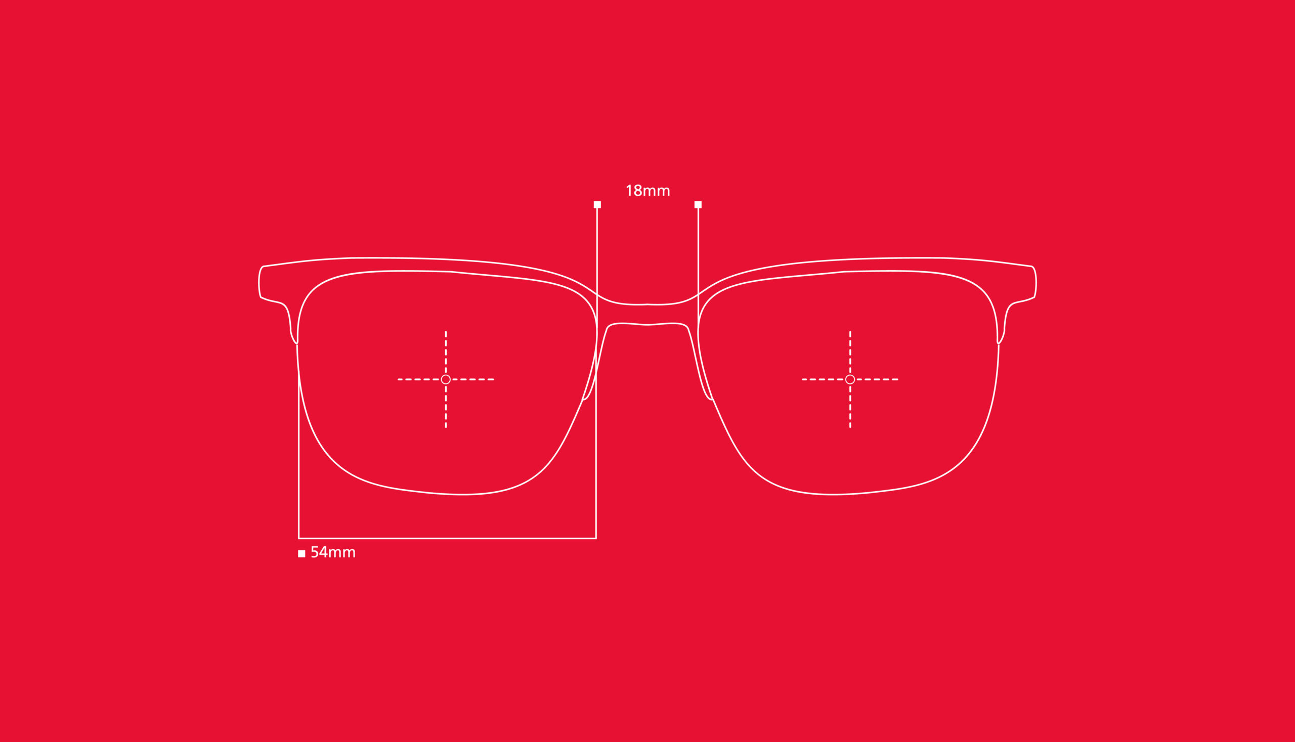
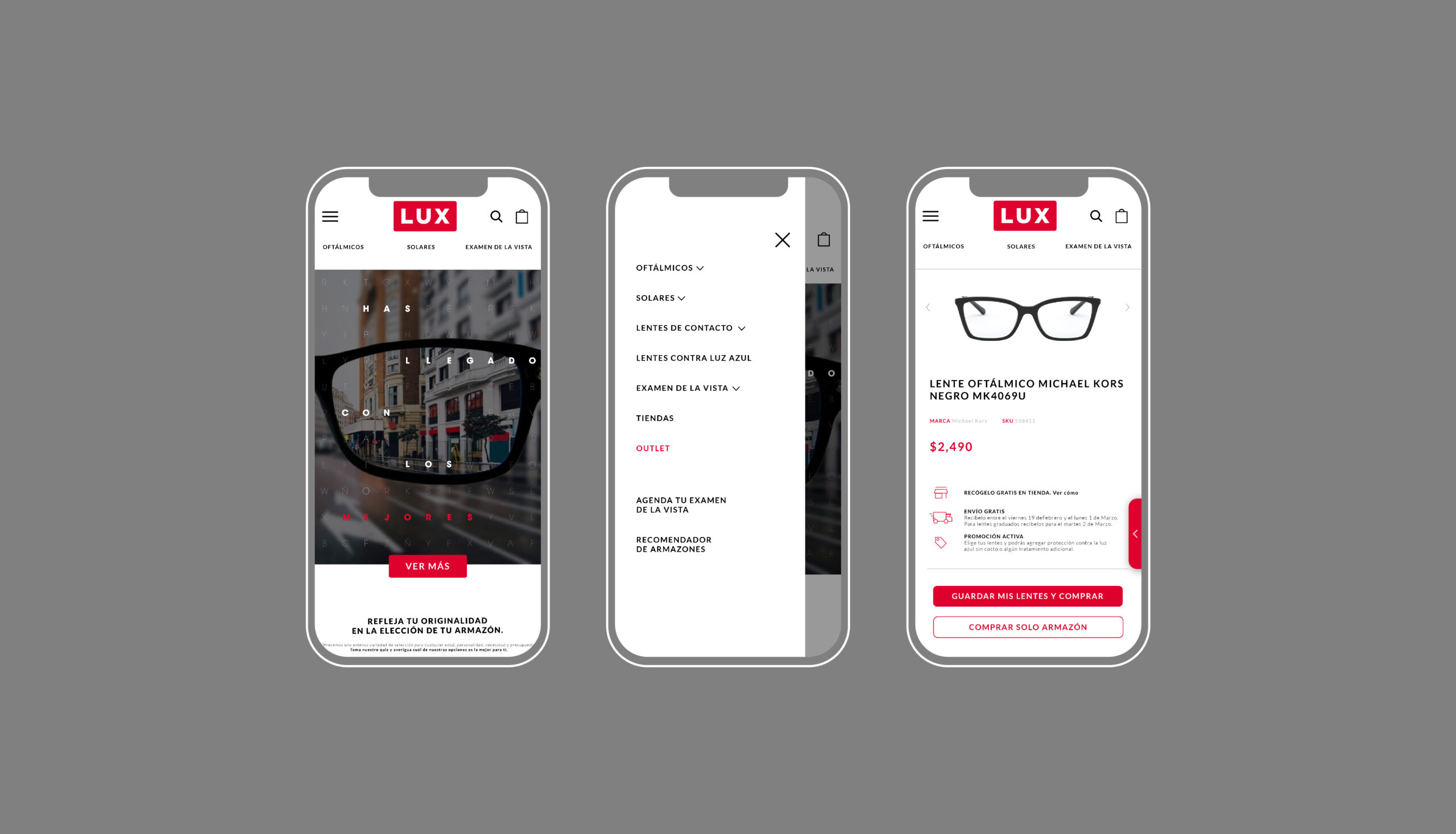
For the visual territory, we featured a reduced palette where red becomes the most representative color of the brand. We borrowed resources such as those used in visual examinations carried out by reading arbitrary letters, hiding messages within them, and developed an illustrative iconographic system that makes the brand friendlier and more attractive to younger segments. We unified the photographic style as well as the use of typographies to ensure a consistent and memorable system.
