ULTIMATE VACATION CLUB
_ This exclusive club offers an experience of the highest level. Day by day it pursues a single goal: to pamper and ensure the happiness of all its guests.
INFO
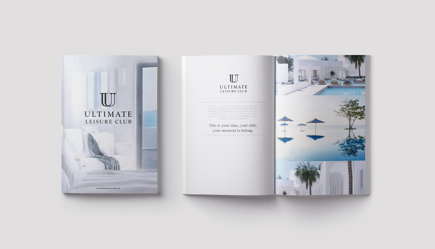
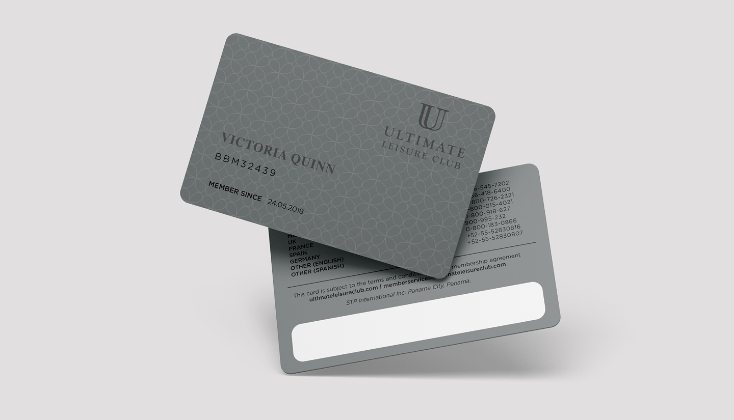
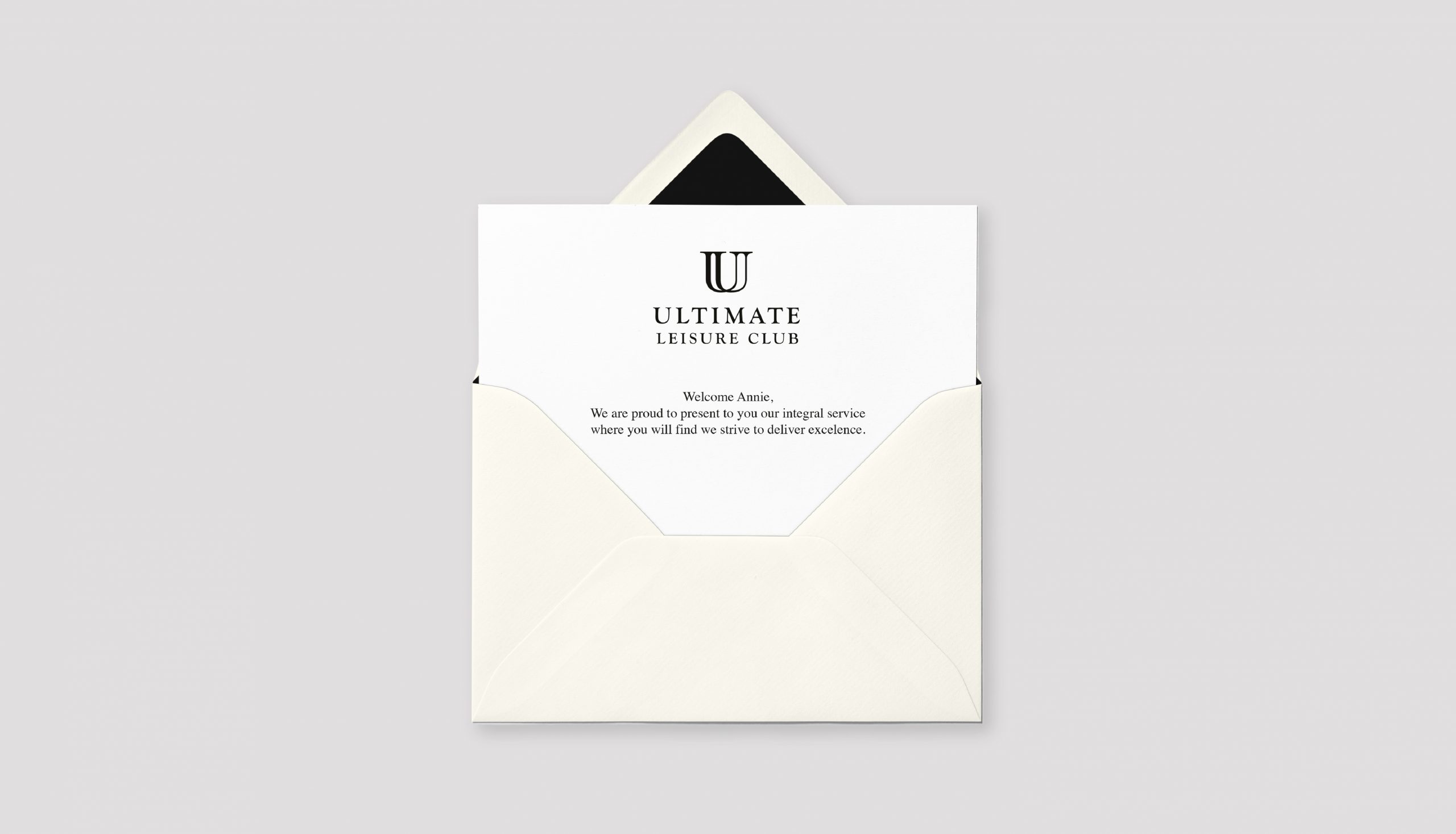
The Ultimate Vacation Club logo represents the luxury, elegance and exclusivity that this brand offers its guests throughout their vacation experience. The monogram (which comes from the Greek word meaning “a letter”) is delicate and fine, contrasting with a classic and neutral typography. While its predominant color reminds the viewer of shades of gold, a precious metal.
Brandia was also responsible for the development of the name. The objective was to portray a place of the highest level, with the latest, most sophisticated and inspiring trends. At Ultimate Vacation Club, guests are the most important thing, and so everything revolves around their comfort and enjoyment.
“Boosting healthy, curious and creative minds” was the brand’s promise that was defined in order to communicate the importance of developing children's creativity. Its essence, "Great minds, great worlds", highlights the space where your great ideas are inspired to create and build a great world.
The logo is very colorful and refers to its most important market: children. The rounded typography speaks of closeness, love and security to demonstrate the company’s awareness. The union of colors in the O conveys a feeling of movement to illustrate the vital and creative minds of children. The character named Boki, who is the letter O with arms and legs, was developed to go along with the brand. His movements are fun, and creates a bond of trust with their market.
