_YOU LOOK AND FEEL GOOD
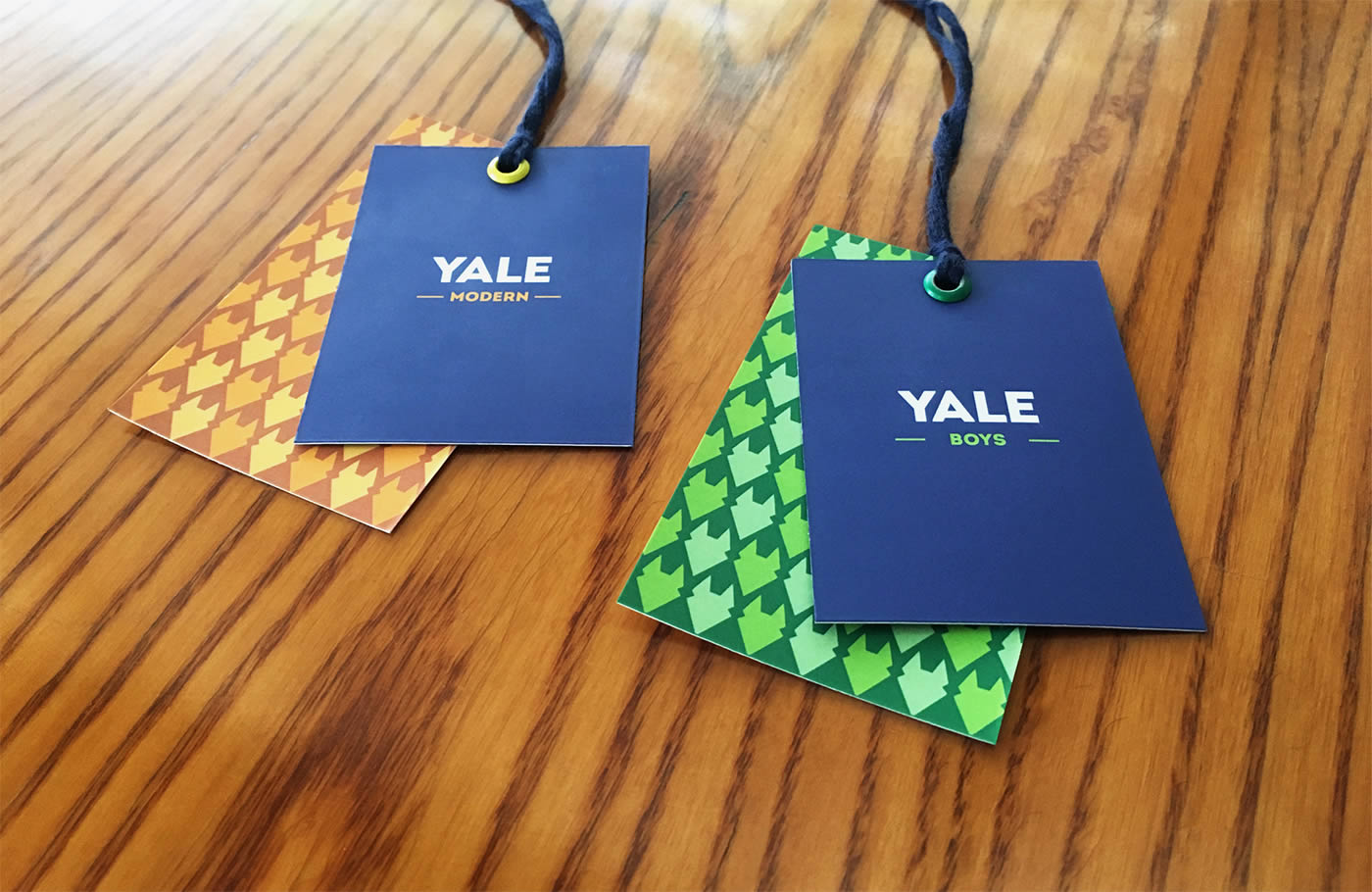
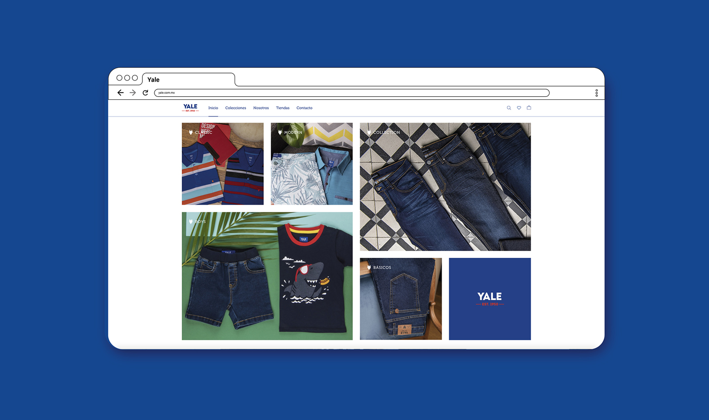
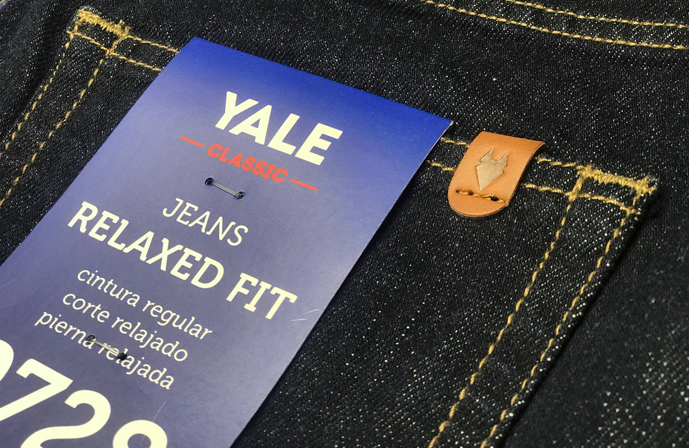
_Yale went through a comprehensive branding project that defined its value proposition, its brand portfolio and its graphic identity. The attitudes and styles of the name Yale were specified, and a solid brand architecture was formed, with a system of labels and symbols that facilitate the structure and organization of the entire company: Classic, Modern, Boys and Kinder.
INFO
"You look and feel good" is the essence that was developed for the brand, because it speaks of the confidence and naturalness with which you free yourself from complexes and are willing to meet people, have fun and make plans.
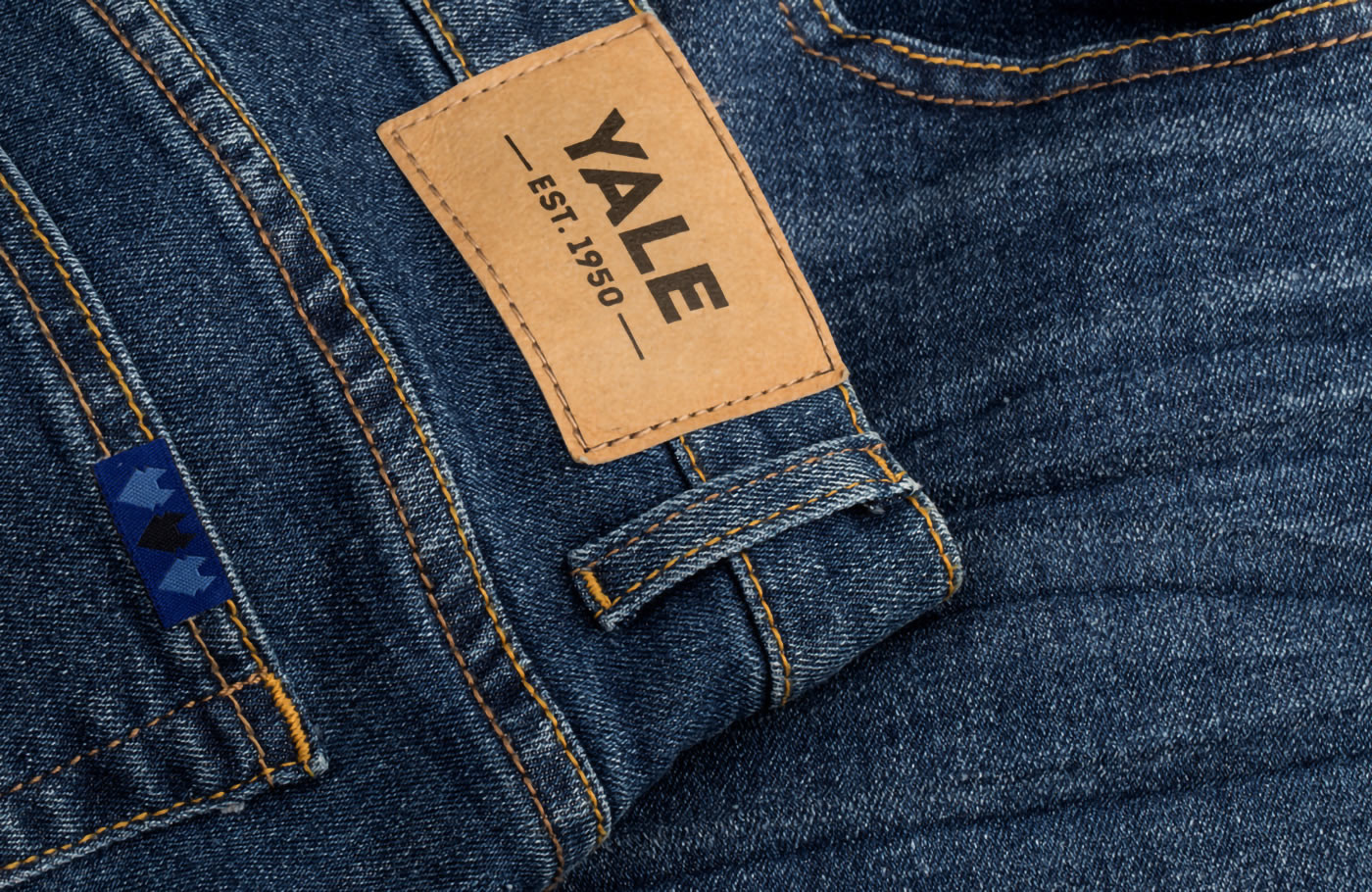
The brand strategy is reflected in a graphic identity that supports the brand's tradition but communicates innovation and modernity through strokes and colors that clearly represent the essence of the brand. The capital letters speak of a mature and friendly brand that also boasts its legacy and trajectory since its foundation in 1950.
