At Brandia, we partnered with Lavuu, an Ecuadorian Korean Skin Care, at a defining moment: its entry into the Mexican market. The goal was not to “change” the brand, but to Make it warm and desirable. within a new context, through a strategy capable of supporting growth without losing coherence.
INFO
The challenge was to compete in a saturated category, where many brands look interchangeable and where the “Korean” attribute often remains superficial if not translated with intention. Lavuu necesitaba una identidad más actual y consistente, una comunicación más clara y una estética que equilibrara cercanía con una percepción premium. Para entrar al mercado mexicano se necesitaba orden, intención y diferenciación real: no un disfraz, sino una evolución.
Our response was a form of strategic tropicalization:preserving its territory of origin as an advantage — Korean skincare as an aspirational signal — while adjusting the visual and narrative codes for the Mexican consumer. Rather than designing isolated assets, we built a system: hierarchies, rules, and resources that allow the brand to express itself with the same strength across digital, retail, and physical experience.
The logotype we developed captures that intention. The “Lavuu” wordmark is built from broad, rounded forms to convey care, closeness, and trust; the Korean symbol operates as a cultural seal — a marker of origin, not an ornament; and the tagline “We Care. You Glow.” anchors the promise in a line that is direct, emotional, and aspirational. An identity designed to be remembered and, above all, applied.
From there, we structured the full visual language: a warm, trustworthy color palette; a typographic system with clear hierarchy; a pattern derived from the geometric repetition of the symbol to create continuity; and a photographic style centered on real skin, soft light, and everyday gestures.
The result: Lavuu, ready for Mexico — clearer, more contemporary, and more competitive, while preserving its international essence and speaking with local relevance. At Brandia, we did not create a “rebrand,” we did what a brand needs in order to cross borders: a cultural translation built as a system, so every touchpoint says the same thing, with the same precision. una traducción cultural con sistema, para que cada punto de contacto diga lo mismo, con la misma precisión.
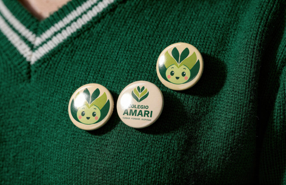
Educating through care to transform lives. Amari is the new identity of the educational project formerly known as Colegio Meyalli. This change reflects a process of brand evolution guided by a clear premise: to grow without losing its essence..
INFO
At Brandia, we partnered with the institution to redefine the meaning of its identity, understanding that the challenge was not simply to change a name, but to translate a strong legacy into a brand capable of projecting itself into the future with clarity, coherence, and emotion. In an educational context that increasingly demands purpose-driven brands, we built an identity that connects with families, teachers, donors, and community, while honestly expressing who this educational project is and where it is headed.
We began with a deep conviction: education is not only about instruction, but also about care, guidance, and belonging. From this came the brand’s core idea: Educating through care to transform lives, a principle that structures the entire construction of Amari and distills its purpose into a brand that feels close, human, and meaningful.
The name Amari emerges from the root of the verb to love: a short, clear word with strong emotional resonance, one that communicates the essence of the educational project — love as the driving force, community as the foundation, and growth as the destination — without the need for complex explanations.
The visual identity was developed under the same approach, with a warm color palette, contemporary typography, and soft graphic elements that humanize the experience and reinforce a brand that accompanies rather than imposes. Every visual decision responds to a clear philosophy: putting people at the center.
Today, Amari is more than just a name. It is a community with its own identity — a way of educating grounded in values, social impact, and a forward-looking vision that honors its history while paving the way for a new stage of growth.
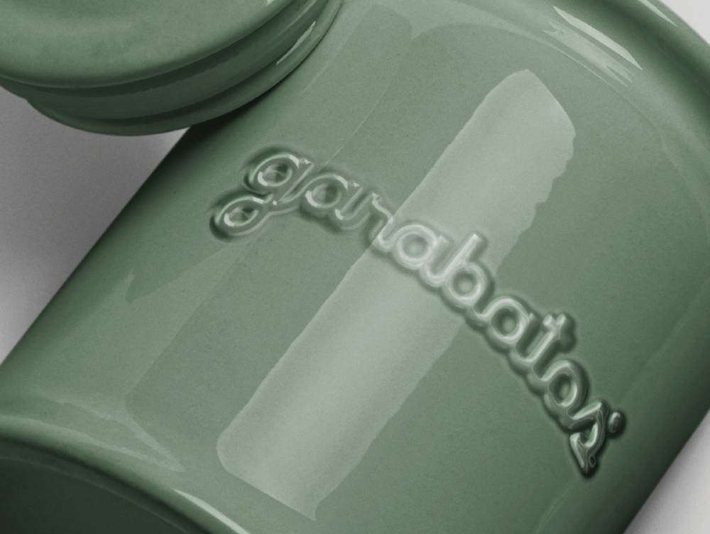
Garabatos is a well-known and loved brand in Mexico, its essence is to be a meeting point to share flavors and smiles anytime, but their positioning had pigeonholed them as a place to visit with older segments and predominantly for breakfast. With our redesign we transformed not only the uniforms but also all printed and digital materials for the Querétaro location to reflect the real personality of the brand and evoke its versatility, which will permeate the rest of the touch-points.
INFO
The objective of this project was to create a new strategy for the messages and visual identity of the brand that communicated the fact that Garabatos is a space for everyone and for any meal (breakfast, lunch and dinner). This was extremely important since they were not satisfied with their current positioning and the reopening of the restaurant in Querétaro was approaching, where they wanted to feature the new brand. The messages and strategic values developed focus on welcoming all audiences and creating an inclusive environment, as well as providing valuable functional information for both diners and the internal team, highlighting quality and artisanal approach with a warm and authentic tone.
The first thing we did was adjust the legibility of the logo to later integrate a color palette that speaks of freshness, cleanliness and the organic nature of the products, with whites, creams, browns and greens. The classic fonts complement each other, evoking the quality and refinement of the brand. The photographic style demonstrates the deliciousness of the dishes, the enjoyment of consumers, and the overall experience of visiting Garabatos. Certain graphic elements such as frames, underlines and textures using the logo's monogram were also added to create a memorable impact and consolidate the new positioning.
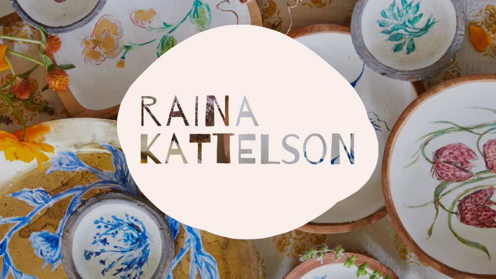
Raina Kattelson is a prop and interior stylist based in New York who has worked with numerous notable individuals and renowned brands, creating rich, human visual worlds. Together, we collaborated to create an identity that evokes her personality and highlights her work, connecting with new audiences.
INFO
Raina's vision was to refresh her image in order to have a more recognizable and consistent brand, showcasing her projects and personality in an organic and contemporary way. To achieve this, we developed a logo that combines a “handwritten” typeface with an imperfect, enveloping shape, evoking her curiosity, creativity, and sense of freedom.
We accompanied the logo with a graphic system that draws from tones recurring in her work, interacting in a harmonious and balanced way. This is paired with a more experimental typographic approach, combining two very different typefaces and consistently replacing the word “and” with the ampersand (“&”). Additional elements like bars, color blocks, and the use of the enveloping shape are incorporated to formalize the graphic outputs.
With that system in place, we developed the look & feel of her website, promotional postcards, presentations for creative briefs, among other materials. The result is an engaging, organic, and modern brand.
At Brandia, we’re always grateful for the opportunity to connect with such brilliant and inspiring individuals like Raina, to create memorable and impactful projects together.
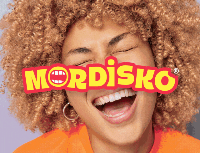
Mordisko, under Holanda's umbrella, is one of the most emblematic brands of Mexico and is recognized as the pioneer of ice cream sandwiches. Its essence is elevating consumers with innovative and refreshing mixes. We collaborated with the advertising agency DDB to, as a team, refresh their identity and maintain relevance and impact with newer generations.
INFO
The main objective for this rebranding was to update Mordisko's image, since it had not been renewed in many years and was beginning to become a predictable brand without surprises. Their personality is fun, disruptive and dynamic, so we developed an identity that evokes these concepts, especially for the Gen Z.
The new logo features the playful image of a mouth inside the first “o”. This was combined with a bold typography where the letters dance and escape the boredom of a uniform baseline, making it a fresh and cheerful logo.
For the packaging, a brighter and more striking color palette was developed so that they could stand out within the fridges, integrating the different tones with waves that impact our consumer and at the same time highlight the mix of textures and flavors that are so representative of the brand.
Within the new visual landscape, we proposed the use of stickers to have a more contemporary and playful language, using different symbols that lead us to positive concepts and enjoyment. The photographic resources include the dazzling palette and show younger consumers delighting in the experience of this lively brand.
We love working in collaboration with great creatives on projects as relevant as this one.
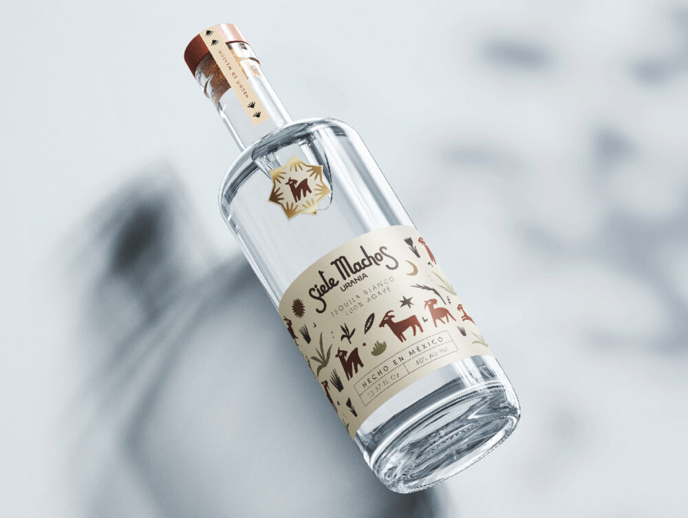
Siete Machos is a national brand with decades of recognition, having perfumed generations. The legendary group approached us with the intention of refreshing their websites—both for cosmetics and spirits—as well as redesigning the tequila label to better connect with younger audiences.
INFO
The project began with the redesign of the tequila packaging, where certain core elements had to be preserved, such as the use of goats, agaves, and the logo. Understanding the concept of celebration behind the drink, we created an illustration featuring seven male goats dancing and celebrating alongside other elements, turning the image into a communal festivity.
After agreeing on the new visual style for the tequila, we translated that look & feel to the spirits website, incorporating illustrative elements into the site's iconography, along with the new warm and elegant color palette and more contemporary typography. These elements elevate the product presentation and enhance the navigation flow.
For the cosmetics website, we focused on preserving the brand’s essence by highlighting the ritualistic and esoteric uses of the products. We maintained certain dark elements while updating the typography, ensuring consistency in the photography style, and carefully crafting the user experience as they explore the world of Siete Machos.
We love collaborating with such iconic brands, helping to preserve their relevance both now and in the future.
Spiraldot is an innovative human-centered tech company that has two branches currently: Spiraldot Health, which focuses on bettering the healthcare experience and Spiraldot Ventures, dedicated to creating and supporting a community of entrepreneurs. Talha F. Basit, the group’s founder, sought us out with the intention of renewing their image and communicating in a more friendly, updated and organic way. For us, the first step was to fully understand the existing brand and to create something impactful.
INFO
During the initial phases of our collaboration, the brand’s values and personality became very clear as we discovered a team that’s driven by their pursuit of innovation, excellence, humanity and authenticity, looking to expand and explore different endeavors. This bold, straightforward and human approach became a guiding factor for the messaging and visual elements developed.
As we defined the key strategic concepts, the original logo was redesigned to communicate them in a more effective fashion. We maintained some core elements, like the dynamism of the spiral itself and the dot, but simplified them to showcase a more timeless aesthetic. The symbol forms an implicit S and references a fingerprint making it human. Its rounded strokes and the use of lowercase in the sans-serif typography make it more approachable and friendly.
Taking these resources into account, we developed a flexible and responsive visual system, opting for a monochromatic use of color that would stand out within the healthcare industry, shining through in orange and providing an energetic warmth to the brand. When thinking of the other branches, Ventures had to portray reliability so we opted for a bright blue, leaving the general brand with a neutral gray, making each of them identifiable and memorable.
The visual elements are used to make the user feel engaged and the content more personable, like the different photography styles that speak to universal concepts with rounded organic textures and images of humans interacting in the healthcare contexts. The communication system is accessible and reliable, making it easier to Connect for Good, for Change, and for the Future.
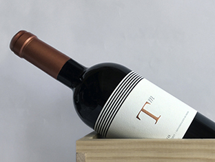
_Tresmano is the representation of an exclusive wine brand, recognized for its tradition and elegance, while transmitting the innovation of its technology and the contemporary design of its winery.
INFO
Based on a rigorous investigation of the context where the wine would be developed, the characteristics of the creation process and the vision of the partners, the DNA “Essence of our origin” and the mission “We honor our origin by dedicating time and heart to creating unique experiences” were created, which are inspired by the history of the privileged area of Ribera del Duero.
Based on this, the name “Tresmano” was devised, which is an ancient Spanish localism to measure distance and which also matches the number of main partners of the project. The identity design reflects the balance between tradition and innovation that makes them unique. The bottle lines are based on the architecture of the winery.
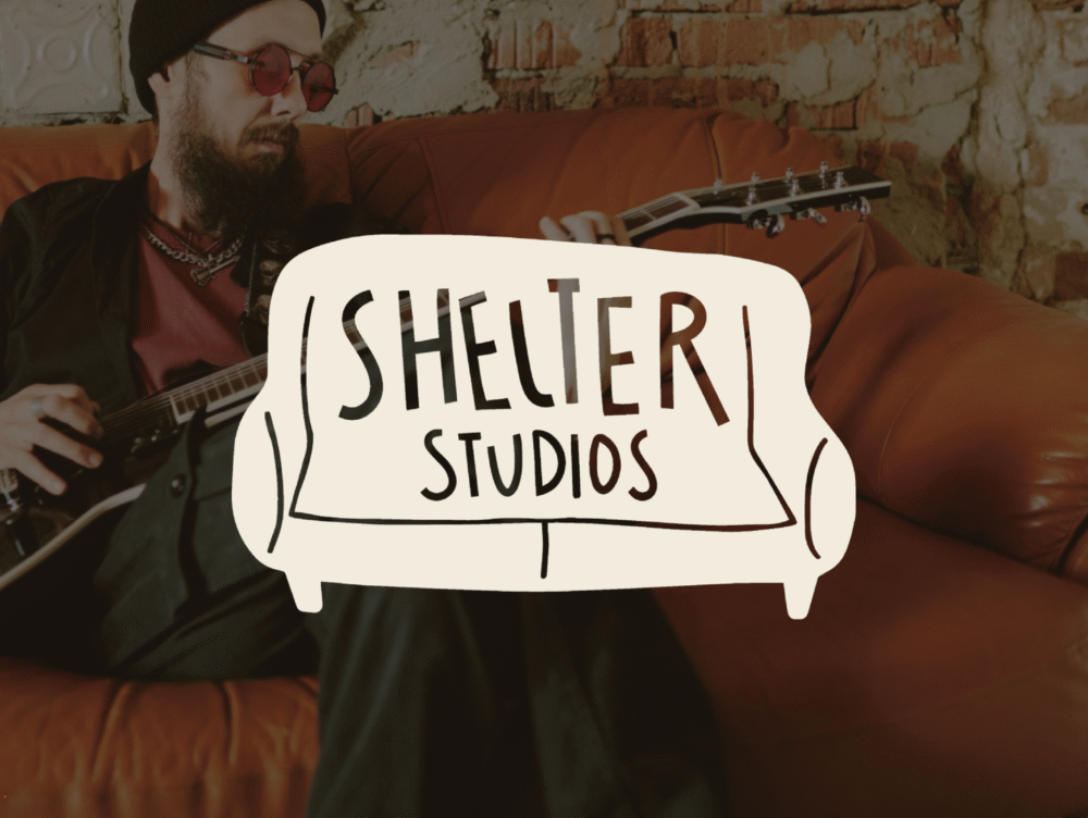
Shelter Studios was born as an initiative to promote emerging and established artists in audiovisual productions, creating a community and a more intimate space to meet them. We collaborated to create a name and identity for the program.
INFO
The project's intention was to create a space for concerts and interviews with musicians in a homey and intimate setting, with the goal of humanizing them and generating a dialogue among music lovers. From the beginning, the team envisioned developing a diverse program in terms of musical genres, origins, and styles, which would become a platform for discovering the latest in music in Mexico.
These concepts inspired the creation for Shelter Studios, a name that captures the essence of the project: a warm haven for music. This idea was visually translated into the logo, where the armchair serves as the main icon and identifying element of the brand. This symbol was also incorporated into the stage design, always engraved on an armchair or sofa that changes with each artist, thus reinforcing the visual connection with the concept.
The brand's visual territory is built through the use of silhouettes. The armchair, along with other typical living room elements and musical instruments, become an enveloping frame for some images. All of this is complemented by an expressive and striking typographic combination, resulting in an adaptable, attractive, and contemporary visual system.
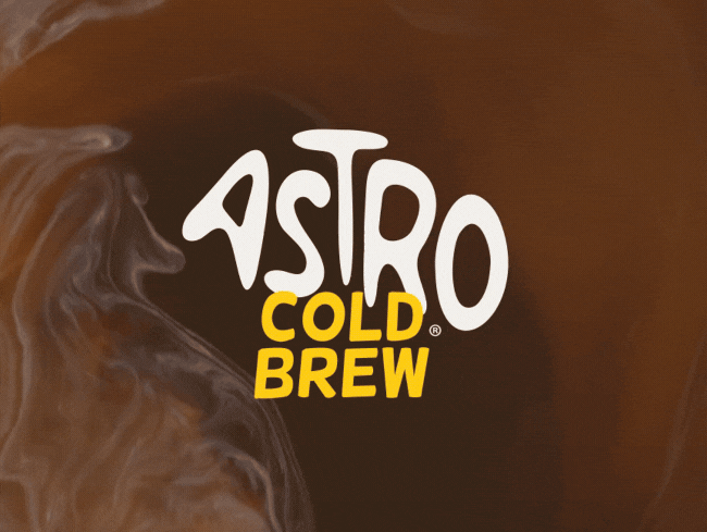
Astro Cold Brew comes from the Shake Shack in Mexico. This innovative and energizing beverage arrives in canned form to inspire and motivate its consumers. We collaborated to create the brand from the strategic aspects to the visual identity.
INFO
At the beginning of the collaboration, we discussed the key concepts that guided the project: the quality of the beverage, supporting new consumers, the enjoyment that comes from a moment of indulgence, and the energy that drives us to continue achieving our daily goals.
From these concepts, we created the name Astro Cold Brew, a beverage that elevates the good, recharges you, and allows you to take off toward your goals. The communication was aligned with an "out-of-this-world" narrative, with messages like "we are a comet of quality, flavor, and energy," highlighting a friendly and dynamic tone.
We brought this universe to life visually through a friendly and bold logo that speaks of energy and a human quality. This is complemented by equally strong fonts, vibrant and disruptive colors, and a system of illustrations that help show the brand as a fun ally in the adventure of the cold brew world.
At Brandia, we always appreciate being able to collaborate on projects as exciting and fun as this one, where we take an idea, a concept, a product, and build an entire world that makes the brand transcend and impact actual people.
We use cookies to enhance your experience while using our website. If you are using our Services via a browser you can restrict, block or remove cookies through your web browser settings. We also use content and scripts from third parties that may use tracking technologies. You can selectively provide your consent below to allow such third party embeds. For complete information about the cookies we use, data we collect and how we process them, please check our Privacy Policy