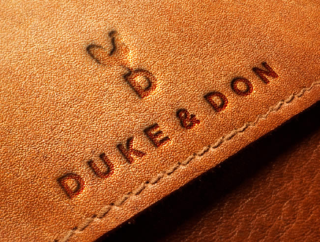
_With the aim of revolutionizing the footwear industry, Duke & Don creates unparalleled designs that reflect excellence and good taste. Through its technological platform, they guarantee variety, practicality and quality from the purchase of your footwear, until its use.
INFO
"Echoing the originality of your style" was the rationale established for this unique brand of shoes. The essence "Lead the way" speaks about the individuality of people and of the importance of being yourself. The brand talks about its innovative value proposition through sophisticated design, agility and style.
To reflect the sophisticated style and innovation, a unique logo was developed that uses a rooster-shaped wind vane, making a great connection to the strategy by generating a sense of direction, change and leading your way.
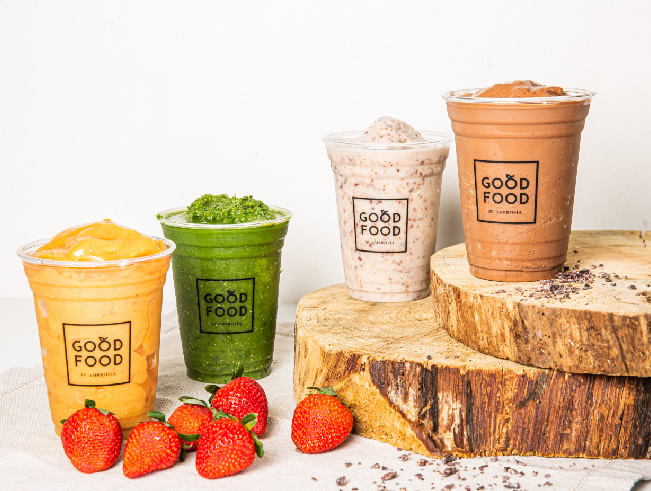
_Good Food is a cafeteria of healthy foods made with natural products of the highest quality. The brand seeks to be a reference among food options for people who care about their health and physical well-being; those who need an innovative and healthy menu proposal for their day to day.
INFO
A naming process was carried out to reflect the healthy lifestyle that the brand seeks to communicate. Through a creative process, the name “Good Food” was reached, which reflects both the simplicity and the naturalness of the brand in two easy-to-understand words; Both words together create a concept of well-being, quality and health.
To convey this meaning, an equally simple logo was created as the last three letters of both words are the same and manage to create a visual balance. To make it more interesting, the logo plays with the letter “O”, making it one of the healthiest foods in the world: the apple. An envelope was added to the words to incorporate the company behind this brand, Ambrosía.
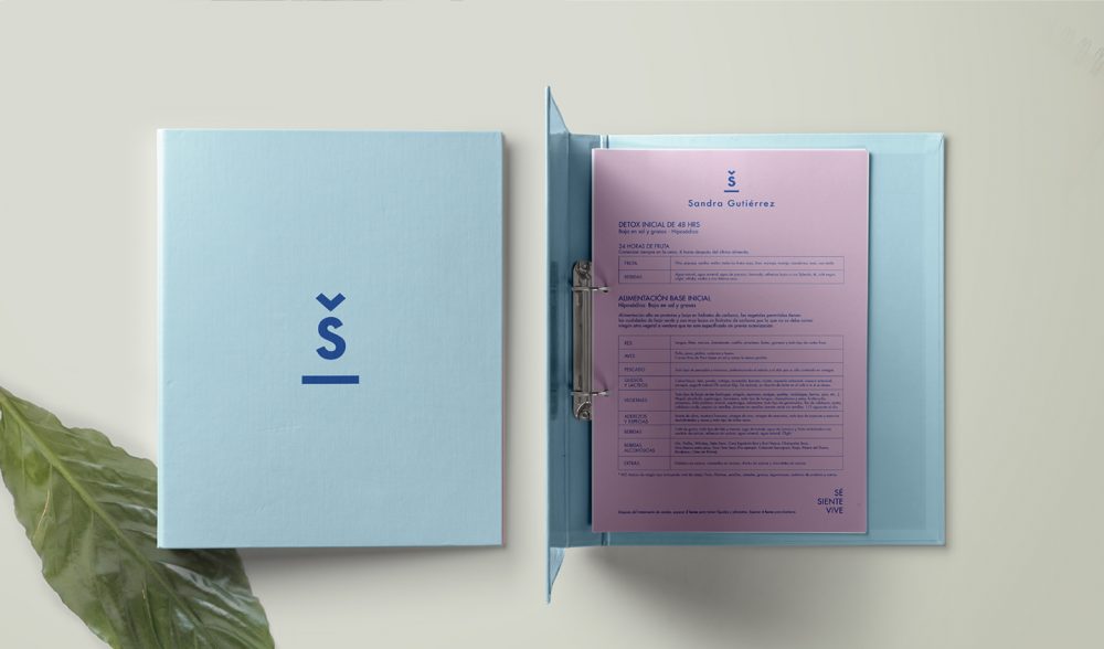
_Sandra Gutiérrez is the creator of a comprehensive wellness system that helps you enrich and take care of your health. Through constant support, the goal is to strengthen your emotions to generate physical, mental and emotional harmony within your body. Its system creates and personalizes the ideal path so that each person can achieve every one of their goals.
INFO
In this case, the brand strategy was developed, having the rationale as “supporting you to generate a conscious transformation of your lifestyle in order to achieve a revitalized version of yourself”. With the aim of communicating a conscious and real lifestyle, the authentic and clear slogan “be, feel, live” was created.
The logo was created, made up of two main elements: the symbol and the name. The typography used gives a sense of kindness and closeness to the client. The blue color represents serenity and growth. The symbol is composed of the letter S that is part of the brand name, a platform that represents settlement and security and an accent that inspires the idea that there is constant supervision and care throughout the process.
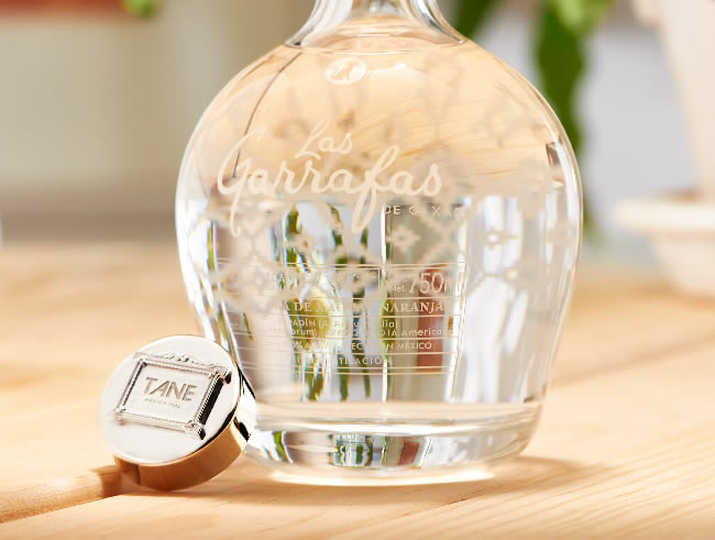
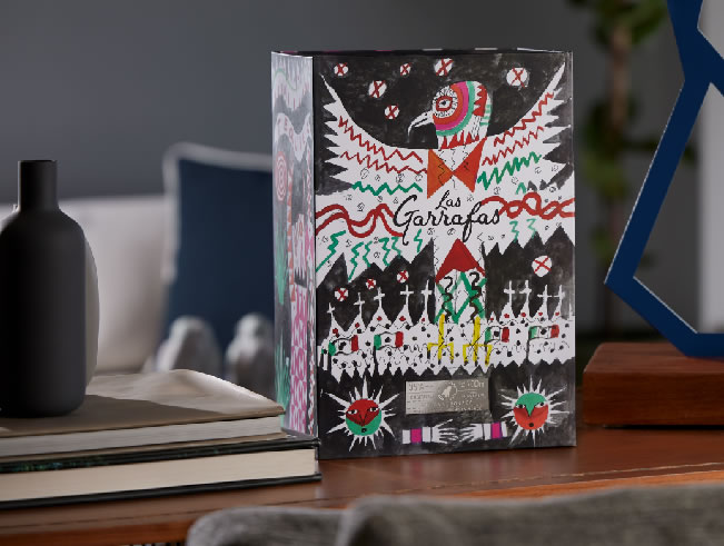
_There are combinations that result in successful and surprising decisions, such as a shot of mezcal followed by a worm-salted orange. In this case, we are talking about two brands that distinguish themselves for their elegance and attention to detail.
INFO
Las Garrafas and Tane joined forces to create a special edition that stands out for its elegance, timelessness and unique style. This extraordinary orange trunk features Las Garrafas' Xaguar Mask mezcal, which is accompanied by beautiful tasting vessels made of the highest quality silver and obsidian designed by Tane.
Both brands have in common their constant celebration of Mexican traditions through their undying attention to detail. With only 15 limited and numbered editions, they joined forces to create a collectible that celebrates Mexico in a unique way.
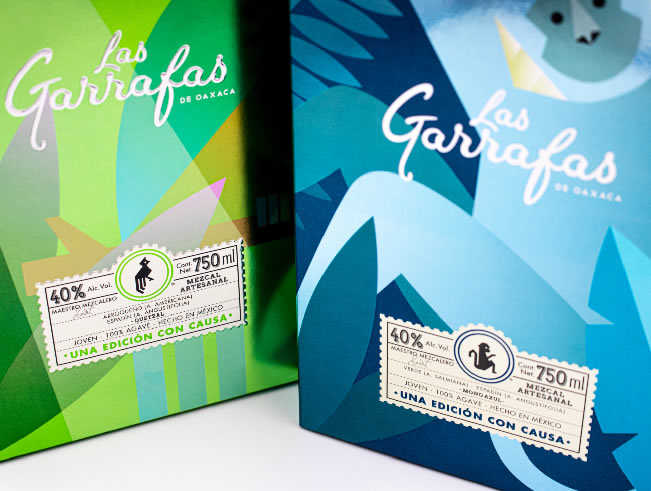
_With beautiful beaches and an idyllic skyline, Cancun is one of the most emblematic cities in the Yucatan Peninsula. That's why Las Garrafas wanted to pay tribute to it through two special editions of Mezcal.
INFO
Art has been embedded in Las Garrafas' DNA since its inception, as well as teamwork and the celebration of life. It was easy to visualize a collaboration capable of successfully combining these ingredients. To celebrate the 50th anniversary of the city of Cancun, we decided to generate two special editions with the help of artist Leobardo Huerta.
One of the challenges was to unite the artist's unique style with the personality of the brand's delicious elixirs, in addition to adding details of Cancun. This was achieved with the use of festive colors and motifs of Mexican roots. The Mexican-born painter succeeded in making Águila Coronada mezcal a sublime homage to our country.
_A living brand is one that changes with the time and remains current as it adapts: this is how we define the spirit of Las Garrafas. This can be clearly seen through collaborations like their one with Regina Marín.
INFO
From the moment we started working with Las Garrafas, we discovered that it was a brand with a strong and solid narrative, which is why we decided to use characters that served as a communication resource within the brand. The narrative allowed us to tell the story of Las Garrafas through different styles and languages, as in the case of Regina Marín.
The youthful talent of the designer gave a different breath to the Mono azul mezcal, custodian of joy. With a fresh and avant-garde touch, her illustrations allow us to imagine the world in which the characters of Las Garrafas inhabit.
_Lamex is a company that produces high quality kitchen items to facilitate and enrich the daily experience of its consumers. Its objective is to respond to the highest demands of the market. Inspired by the avant-garde and innovation, they deliver unique, durable and accessible designs.
INFO
To strengthen and reinvigorate the brand, its history was considered, and work was done to refresh it to be a solid and renewed brand. For this reason, the rationale “We offer unparalleled products that enrich the art of cooking” was developed and its essence “Tradition for innovation” marks its new direction of innovation.
Based on its new strategy, the logo was refined by taking the element of the flame and turning it into the symbol that accompanies the text. The simplicity of the typography gives presence to the brand and conveys the vanguard that represents them. The colors red and orange, which speak of closeness and of the foundation date, were reused conveying the legacy of the company’s knowledge.
Likewise, the nomenclature of products was defined behind the four business lines: origin, idea, professional and energy.
Until a few years ago, Ambrosía had positioned itself in the minds of Mexicans as a company dedicated to events organization. With a tireless curiosity to innovate, they decided to redefine their business model to cover a much wider range of needs. Along this path, they looked again to Brandia to support them in one of the key pillar’s of their company: branding.
INFO
Esta compañía pionera en la creación y organización de experiencias culinarias, va mucho más allá de la industria de alimentos y bebidas. Su portafolio de marcas ofrece una gama de servicios integrales que se dividen en cuatro verticales:
– Ambrosía: servicio de catering, asesoría, planeación y curaduría de eventos. – Ambrosía Centro Culinario: es el semillero de talento gastronómico, ofrece cursos, diplomados, catas, experiencias y especialidades gastronómicas. – Millesime: ofrece experiencias sensoriales únicas con el objetivo de sorprender a sus invitados con un servicio de catering de lujo. – Bok: es una ludoteca y salón de fiestas infantil que fomenta la diversión y el aprendizaje de los niños mediante la expresión de sus habilidades y creatividad.
Al revisitar los cambios de la compañía y entender sus nuevos alcances, decidimos que la marca debía ampliarse. Es por eso que decidimos que el nuevo ADN debía ser: Tu aliado gastronómico. La decisión responde al liderazgo de Ambrosía y a su trayectoria que se caracteriza por servir siempre con pasión, dedicación y entrega.
La estrategia se refleja con el logotipo de la marca con claridad. El símbolo refleja la originalidad y la innovación de esta nueva etapa, mientras que la tipografía remite al legado de la marca, su tradición e historia. A través de la unión de estas dos partes, Ambrosía comunica ser una marca integral y redonda.
_ Bo & Co. is a Mexican fine jewelry boutique dedicated to jewelry, watches and related accessories. The raison d'être we defined for them is: "To shape moments into lifelong memories".
INFO
Their logo is conformed by a typography that inspires elegance and good taste but at the same time remains close to the customers. For the brand it was important to convey a personalized service with experts ready to help at any time, without neglecting the warmth and friendliness of the team.
Through the universe of products offered by Bo & Co. the brand creates lasting memories, occasions that will never be forgotten and pieces that serve as emblems for generations. Graduations, anniversaries, birthdays, engagements, weddings; life is made up of incredible events that are memorialized by the hand of Bo & Co. This is why their brand had to convey elements such as legacy, celebration, knowledge, exclusivity and tradition.
_Yale went through a comprehensive branding project that defined its value proposition, its brand portfolio and its graphic identity. The attitudes and styles of the name Yale were specified, and a solid brand architecture was formed, with a system of labels and symbols that facilitate the structure and organization of the entire company: Classic, Modern, Boys and Kinder.
INFO
"You look and feel good" is the essence that was developed for the brand, because it speaks of the confidence and naturalness with which you free yourself from complexes and are willing to meet people, have fun and make plans.
The brand strategy is reflected in a graphic identity that supports the brand's tradition but communicates innovation and modernity through strokes and colors that clearly represent the essence of the brand. The capital letters speak of a mature and friendly brand that also boasts its legacy and trajectory since its foundation in 1950.
We use cookies to enhance your experience while using our website. If you are using our Services via a browser you can restrict, block or remove cookies through your web browser settings. We also use content and scripts from third parties that may use tracking technologies. You can selectively provide your consent below to allow such third party embeds. For complete information about the cookies we use, data we collect and how we process them, please check our Privacy Policy