_TO THE POWER OF THE N
_AN is a company specialized in consulting oriented to information technologies with a clear international vocation.
INFO
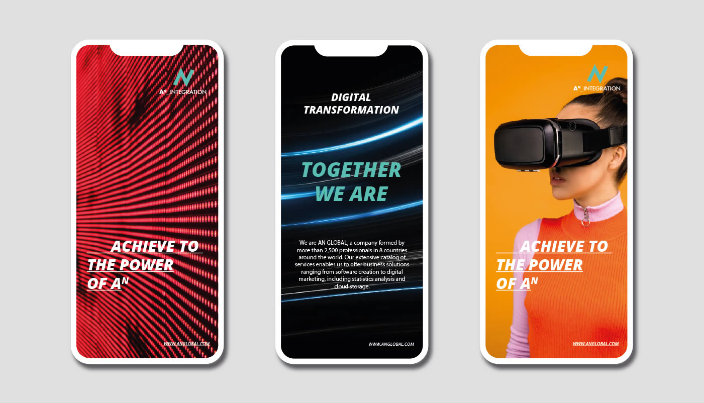
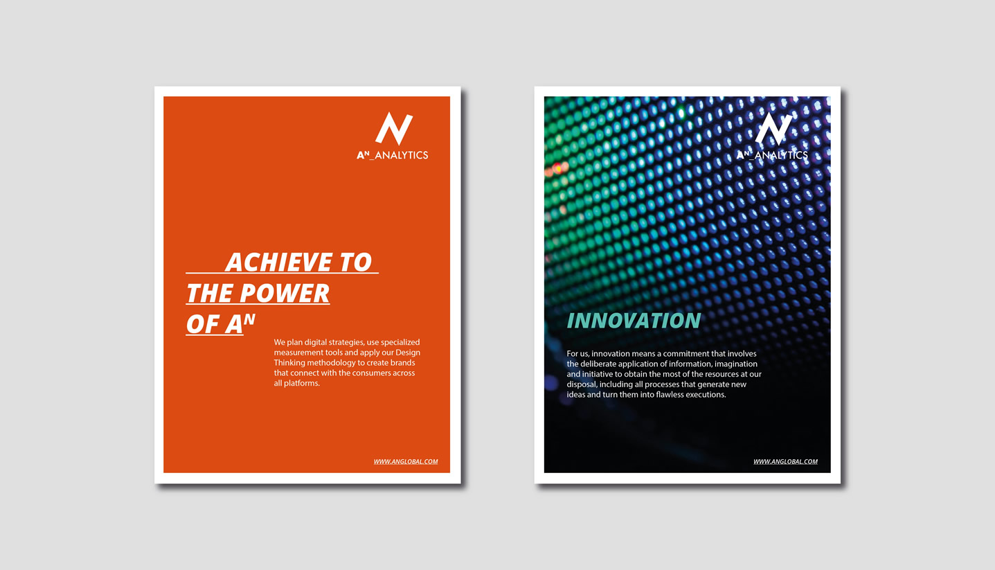
The objective of the project was to create a corporate brand that leads a diversified portfolio of consulting, marketing and IT services. The company's raison d'être was conceptualized as: “We are in business to exponentially transform the power of yours.” The essence was then developed as “To the power of the N”, referring to the name AN and the exponent N as a way of transforming the way of doing business.
The essence can change depending on the company's service: "Transform to the power of the N", "Talent to the power of the N". Thus, a specific architecture was developed for each business area, ordering the company's portfolio of services.
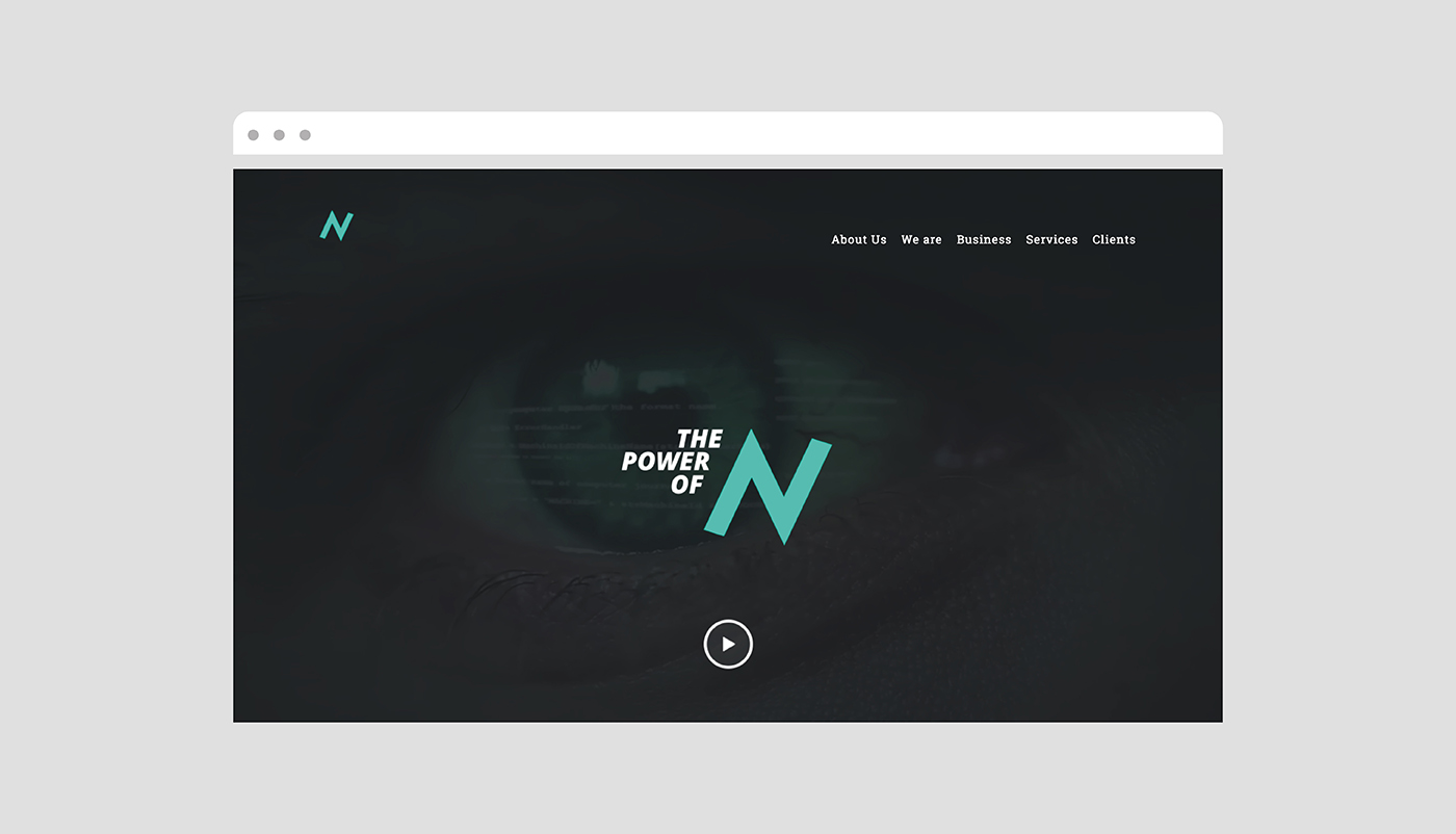
The logo emphasizes innovation and movement through a dynamic form that simulates a graph with growth capacity. The concept of promoting N is emphasized in the typographical arrangement, where the icon is the protagonist. The aqua color speaks of the avant-garde and innovation, in combination with black, which is a color that represents the strength and seriousness of a global company.


