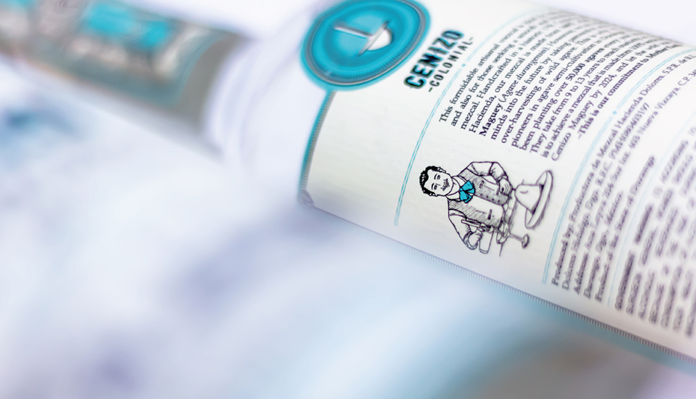
_MIXING MAGIC AND TRADITION
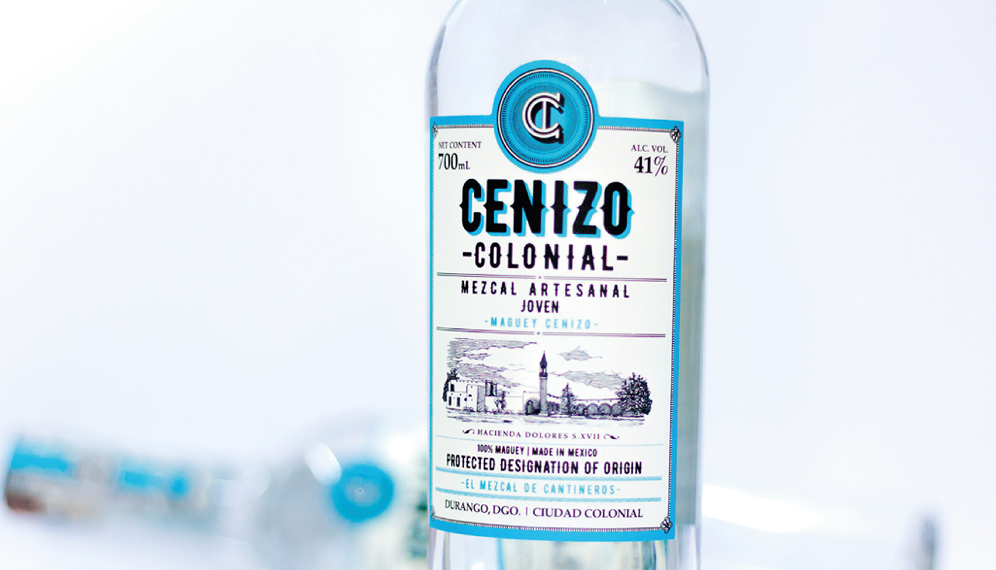
_The challenge was focused on developing a mezcal brand and positioning it among the most important bartenders at an international level, always representing its tradition and Duranguense quality. Based on this, the raison d'être of the brand was established as: “We invoke the colonial essence of Durango to create a dynamic, modern and quality mezcal”. Its essence, “Mixing magic and tradition”, refers to the tradition of the city of Durango and the touch of magic that bartenders add to each drink they prepare.
INFO
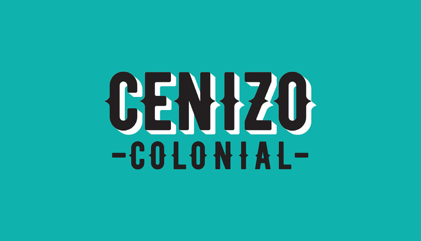
The brand's strategy is reflected in a logo that uses a modern and geometric Sans Serif typography, which incorporates decorative strokes that are inspired by advertisements and documents from the Mexican Revolution era. The Pantone color arises from the agave itself and speaks of the beauty of our origin. In combination with the black color, it creates a striking color palette that conveys joy and emotion.
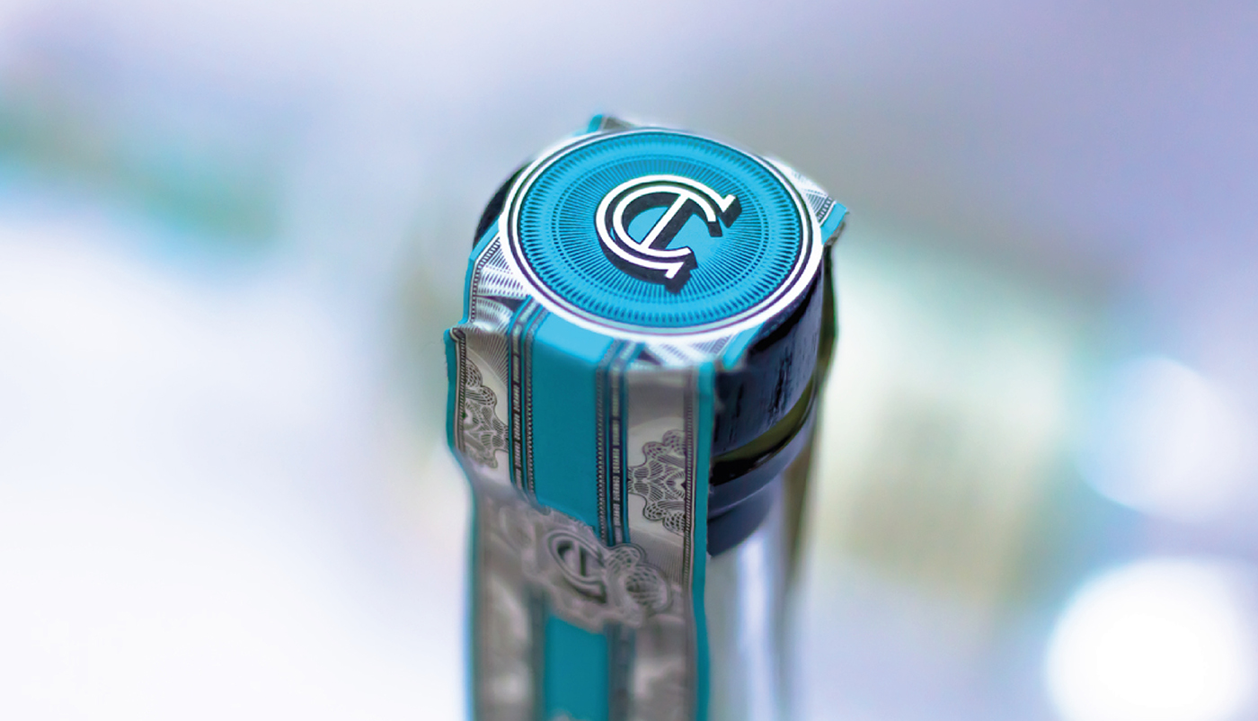
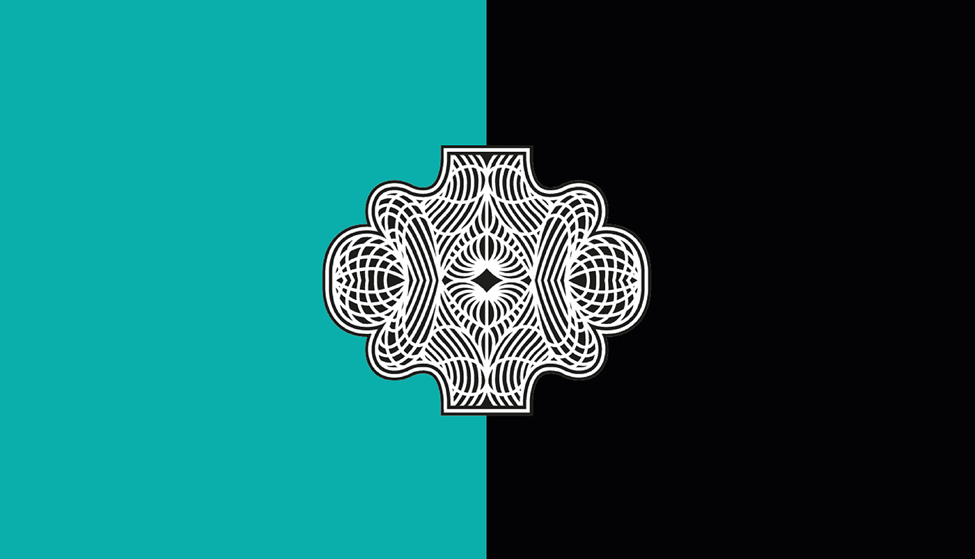
The brand’s shield is based on old cattle brands and reinforces the tradition and the past. The simple monogram that uses the initials of Colonial Ash serves as a small detail that can be used as a decorative element to represent the brand.
