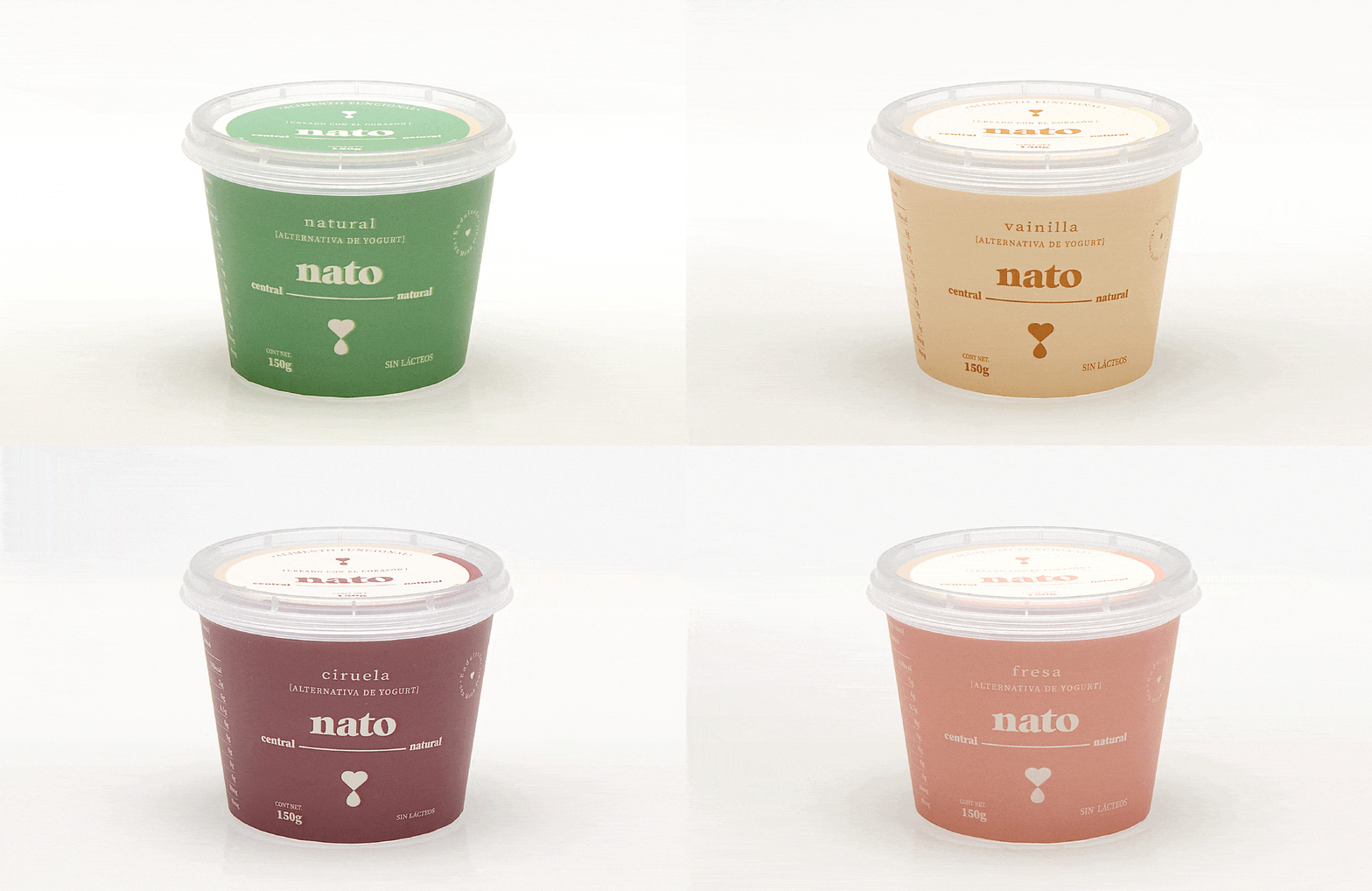
_WITH THE BEST OF THE EARTH
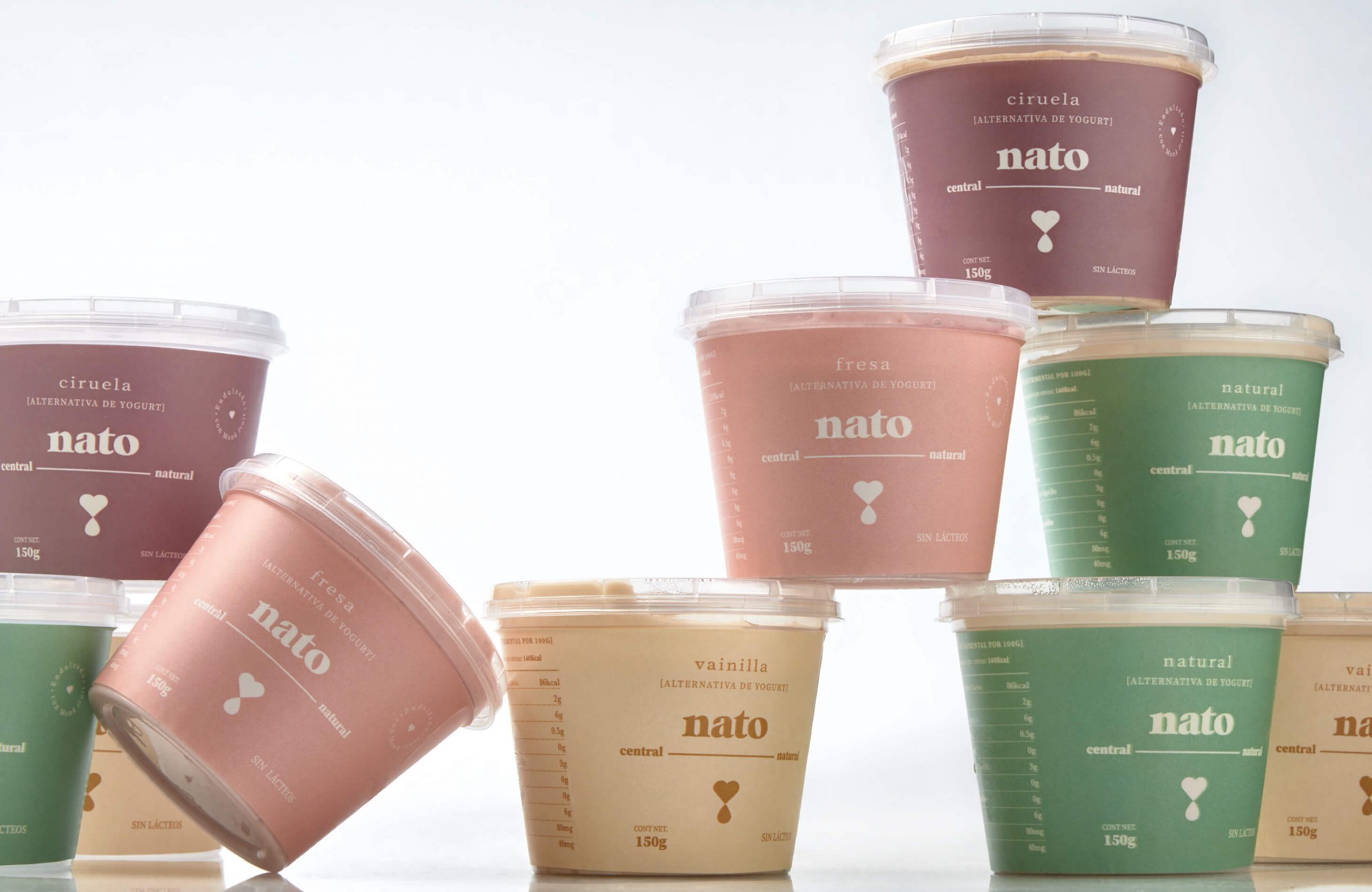
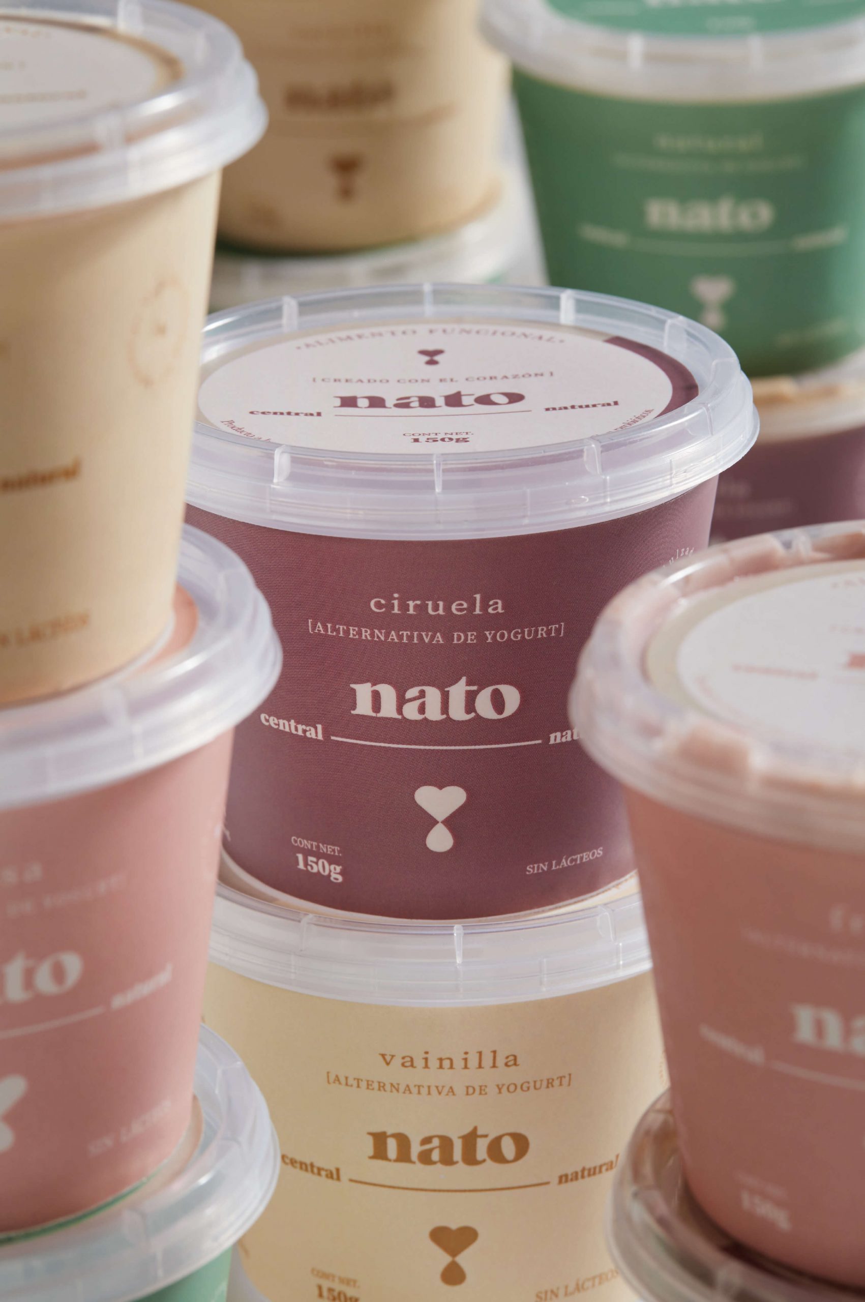
Nato came from the minds and hearts of two sisters who were on the search for healthy products for themselves and their families. On this journey, they set about creating a brand with the best ingredients of the earth, starting with almond milk yogurts.
INFO
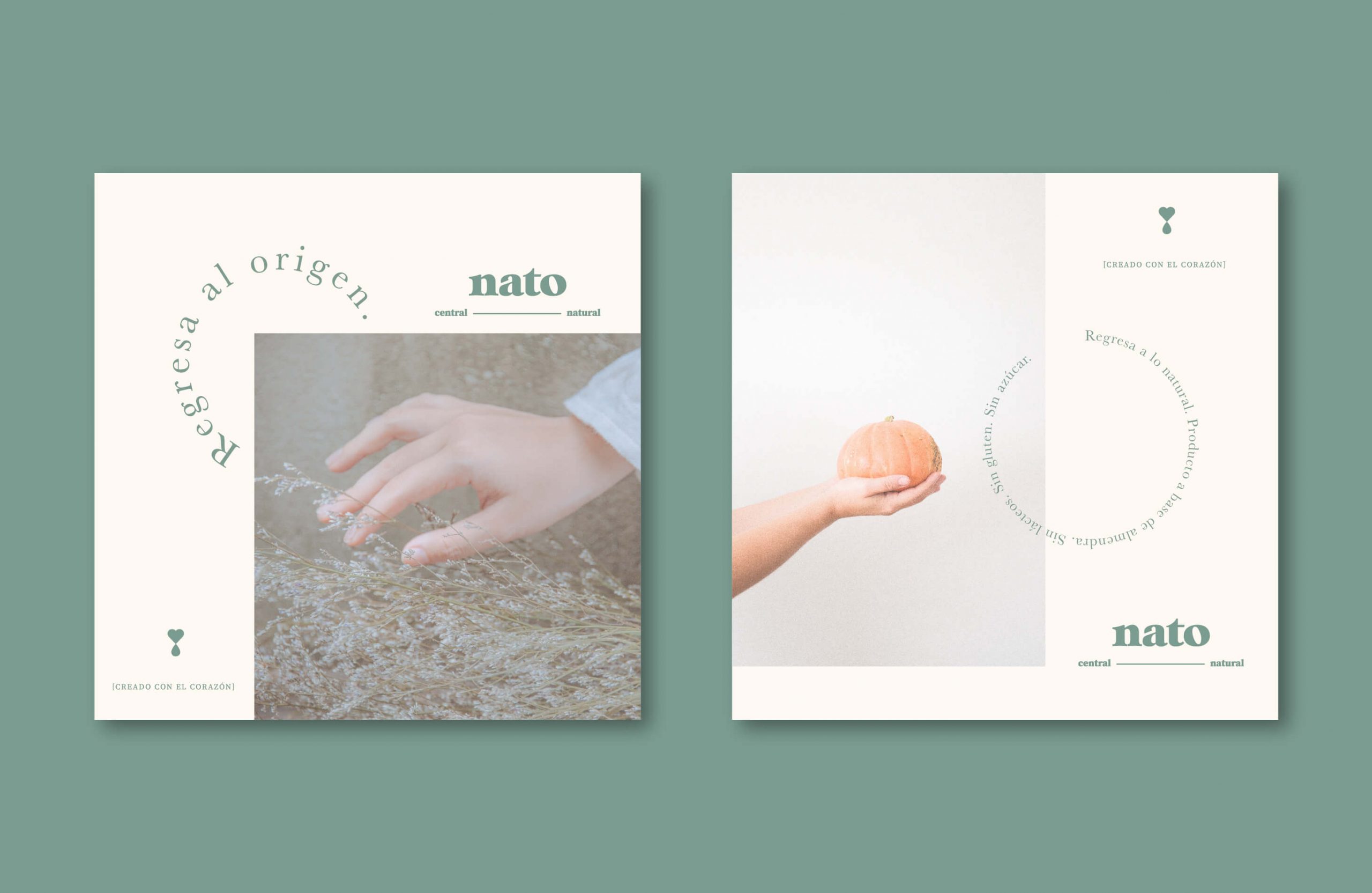
The source of inspiration for Nato’s creation was nature. “We like sincere smiles, walking barefoot on the grass and feeling the coolness of the rain on our bodies”, reads the brand’s manifesto; and that is exactly what the creative concept is encapsulating. This is how we arrived at the brand’s promise: Reminding you that true pleasure comes from what is most natural.
Nato’s logo is direct and transparent and the use of a lowercase font makes it friendly and approachable. In addition, a symbol with a heart and a drop/almond was created to allude to the love of nature. The color palette is based on the basic elements of nature and the human body, delivering a circular and consistent concept at all times.
