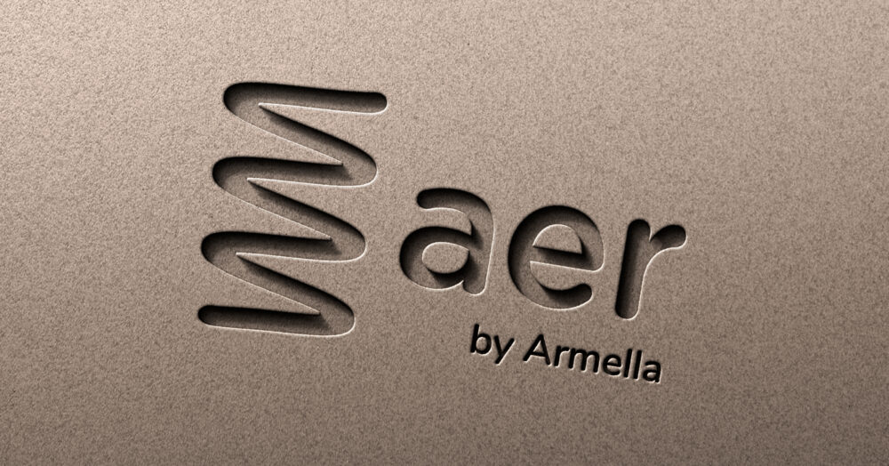
Aer by Armella is a brand that seeks to take the air conditioning industry into the future, with an innovative subscription model focused on its users, simplifying processes and costs so that more people can enjoy the comfort that air conditioning and heating provides. We collaborated to create a name, logo, visual territory and website for the brand.
INFO
For the Armella brothers, it was essential that the brand projected what makes them unique in comparison to the competition: a business model never before seen in the industry. It had to evoke trust and the experience they previously had within the medium and their trajectory, in addition to the fact that the service is easy, agile and effective. With these conceptual pillars in mind, we developed a short and memorable name, which is also descriptive when referring to air in Latin. This was expressed alongside the brand's visually accessible tone with a friendly lowercase logo, accompanied by a variable icon representing air waves, flowing and the high-tech quality of the equipment.
To give it a unique touch, we developed a color palette that refers us to comfort with greens but at the same time to innovation and the positive with orange, which is rarely seen in the industry. The selected fonts prioritize readability by being clean and simple, so that the texts are easy to digest. We define a photographic style where spaces are exalted, people enjoying the comfort and the team installing the machinery. To make the information and content more dynamic, we developed an iconographic system that integrates the logo symbol, not only creating visual coherence but also consolidating the general identity of the brand.
Ópticas Lux was somewhat lost in an increasingly competitive industry, guided by omnichannel models and consistent identities. For this reason, we collaborated to develop a brand redesign that showed their essence and maintained relevance in the future with their different targets.
INFO
The brand faced a lack of clarity in its messages and visual communications, so it was key to develop a strategy that aligned the aesthetics with the concepts of trust, innovation, originality and approachability to improve brand recognition and strongly express its tone and personality. Taking into account the need to remain current and contemporary, we redesigned the logo giving it a friendly, clean and timeless style that evokes the strategic values and connects directly with a diversity of audiences, prioritizing freshness and simplicity.
For the visual territory, we featured a reduced palette where red becomes the most representative color of the brand. We borrowed resources such as those used in visual examinations carried out by reading arbitrary letters, hiding messages within them, and developed an illustrative iconographic system that makes the brand friendlier and more attractive to younger segments. We unified the photographic style as well as the use of typographies to ensure a consistent and memorable system.
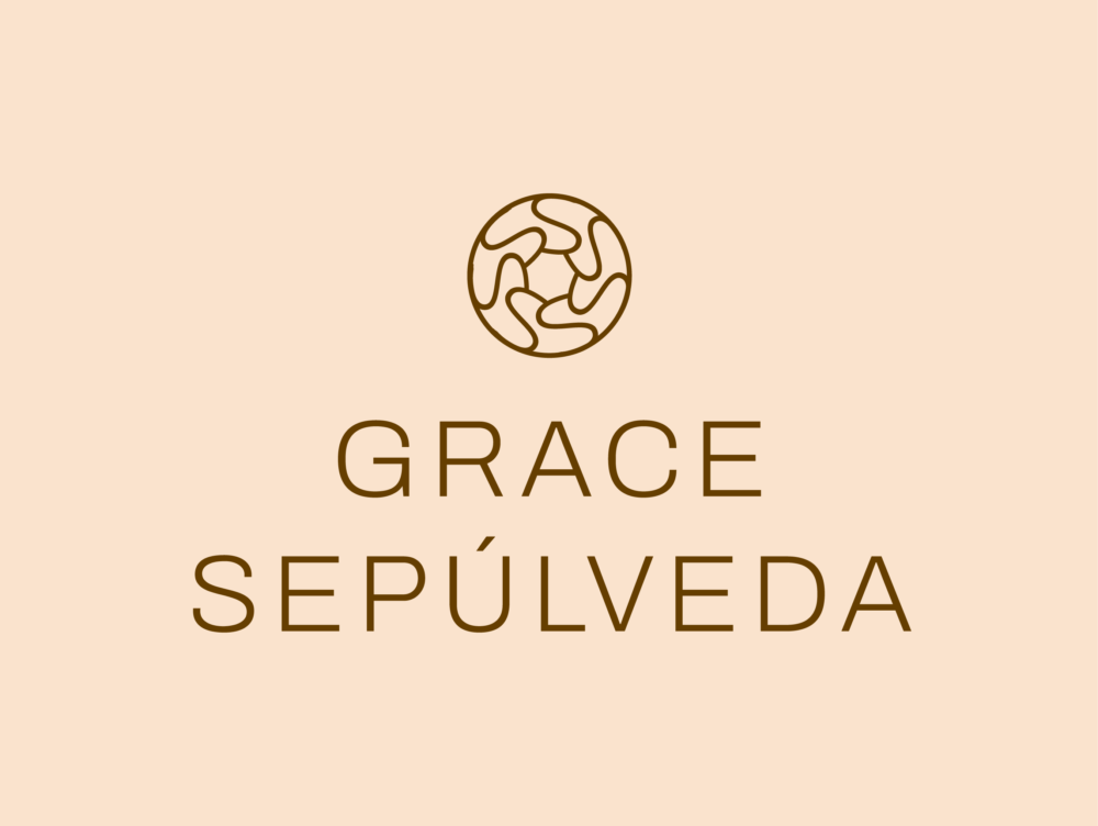
Grace Sepúlveda, expert with decades of experience in the hospitality industry, decides to share her expertise through a consulting agency specialized in timeshares. We collaborated to develop a brand strategy, identity and website that reflect her professional personality and the quality of her services.
INFO
For Grace, one of the most important goals for this project was to generate trust with her clients, that they knew that they were hiring experts focused on generating results. We worked on projecting her innovative and creative attitude, the collaborative nature of the team and the more human and passionate side that exists behind her dedication and journey.
From these strategic concepts we developed a logo that communicates the elegance and modernity that is associated with the founder, using a contemporary sans serif typography and an isotype made up of the repetition of the letter S (for Sepúlveda) that aludes to the serenity of a sunrise, a fluid light and a clean aesthetic.
Taking this innovative and reliable spirit into account, we created a visual system that includes typographic contrasts where a sans serif typography is combined with a serif that has a lot of personality, evoking Grace's strength and subtlety. This was complemented with a palette and photographic system of light colors, with images that give the sensation of lightness through spaces, landscapes and the team, demonstrating the collaborative and human approach of our strategy.
The result of this collaboration is manifested very clearly on the website, where all the elements are combined, unifying the tone and form of the brand.
Tom Kubik is a Los Angeles-based photographer whose focus is on creating real images that showcase the lifestyles of different people. He sought us out to refresh his identity and expand his reach with different audiences.
INFO
Part of what makes Tom's practice so unique and special is the connection between his lens and his subjects, but also the recognition with others that goes beyond the image. One of his priorities is to start a conversation, a space where people feel comfortable and free to share their stories and their lives.
Understanding how important authenticity is to Tom, we opted for a logo with a handwritten typography that serves as a signature, giving it a more personal and close aesthetic. The color palette was kept neutral (with white/black) to let the photographs be the protagonists of the communications. The curved lines coexist harmoniously with Tom's visual world and help it interact with the images without overshadowing them.
The business cards maintain Tom's unique tone with a message that seeks to connect with people genuinely and openly. Typographic resources are kept in capital letters to give importance and impact to the text, in general the brand evoques a minimalist but always original aesthetic.
Todas somos una is a platform that connects women through workshops, a series of free works for everyone, and collaborations like this year's, where they joined forces with Básicos (BSCS) and Transforma with the intention of raising awareness about of the situation that women experience in Mexico. The profits from this campaign were donated in full to the Luchadoras foundation.
INFO
March 8th is not just a day, it is not just a march, it is not just the color purple. It's so much more than that. It is a reminder of the constant struggle of women against injustice and violence, but also of the sisterhood, strength and love that is born from it.
For this project it was extremely important to have recognizable and striking elements that expressed the essence and origin of the initiative. For this reason, we used illustrations of women uniting and hugging and a poem that shares everything we are and can be, our feelings, our struggle.
The developed identity is communicated concisely with emblematic colors, with brief but strong messages, which uniquely invite everyone to become part of the community and experience the feeling of support and empowerment.
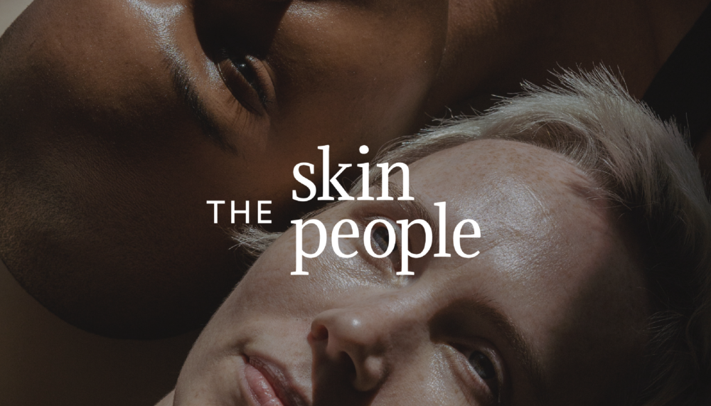
The Skin People is the specialized practice of dermatologists Natalie Hone and Camila Antia in Texas, who come together to create a space that provides quality and trustworthy services, from medical treatments to cosmetic concerns.
INFO
The mission of this project was to create a name and identity that reflected the experience, personality and expertise of Camila and Natalie in the world of dermatology, positioning themselves as the one-stop-shop for all their patients' skin needs.
The brand had to communicate the comprehensiveness of their services, the quality of their practice and the companionship in their treatment. These values inspire the brand name “The Skin People”, showing a community specialized in dermatology by including “skin”. With the word “people” we point out that anyone can go to heal and take care of their skin.
The typography used in the logo is clean, classic and timeless, which helps evoke the quality of the medical practice. Due to the thickness and endings in its letters, it creates a neutral but memorable logo. That clarity and closeness is reflected in the warm palette of cream and green tones, with a photographic style that focuses on different textures, colors and skin types, with happy and carefree people.
At Brandia we love having the opportunity to collaborate with people who have dedicated their lives to helping others, we are proud to be part of the construction of this great brand.
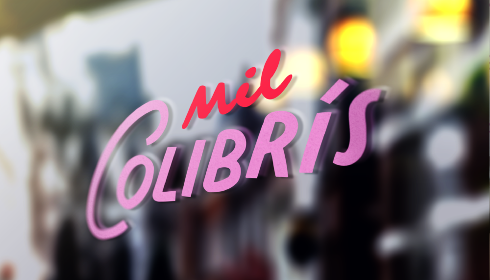
Mil Colibrís is a cafe and bakery in Chicago, inspired by the experience, career and Mexican roots of Daniela Segoviano, who approached us to create the identity of this beautiful project.
INFO
The mission of this collaboration was to create something that truly represented Daniela as a person and as a Mexican cook, that felt like her and reflected her unique and distinctive authenticity. Part of this meant communicating the quality of her service and the warmth and care with which she prepares each dish.
Considering these concepts and the essence of the name (a dream that always stuck with Daniela), a poetic and light, but memorable logo was designed, showcasing the aesthetics of Mexican signs to reflect Daniela's roots and traditions. The use of cursive speaks of a handmade nature while the strokes of the sans serif typography also have welcoming and friendly curves, giving it a personality like that of the founder.
A palette of pinks and reds was integrated, which awaken the appetite and imagination. The warm and magical palette is complemented by an illustrated hummingbird as a secondary element to help position the brand name in an American market, while adding closeness and lightness to the identity.
At Brandia we love working with passionate, dedicated people who are not afraid to imagine, so we are grateful to help build Daniela's dream, with a thousand smiles, a thousand flavors, Mil Colibrís.
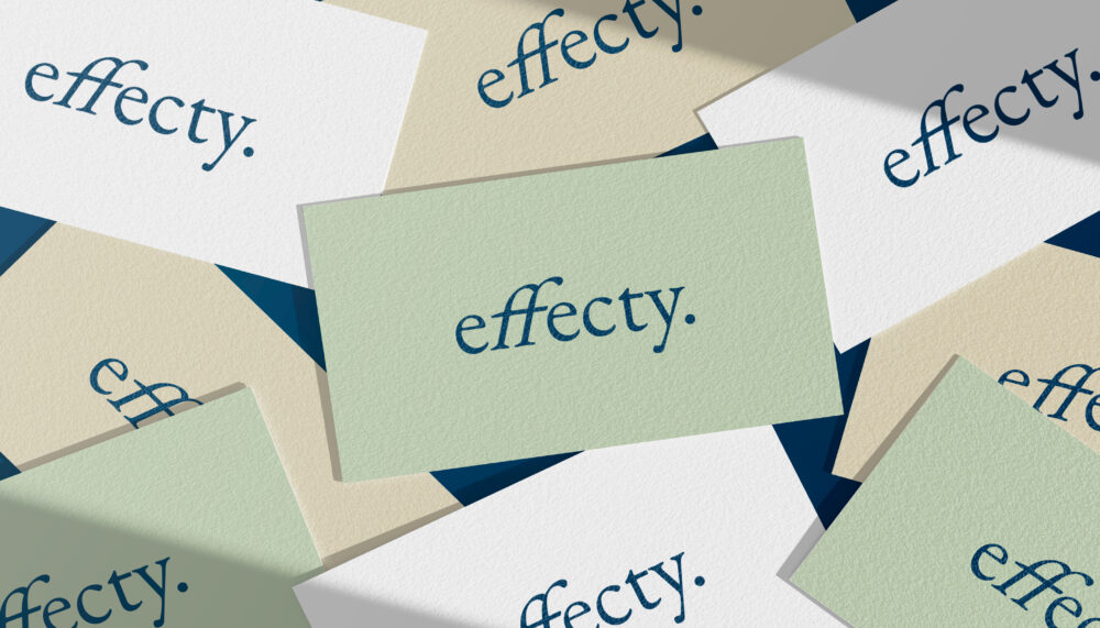
Effecty is a digital platform that promotes wellness with medications that stimulate weight loss. This “telehealth” model helps its users in the search for a healthier, fuller and happier life.
INFO
The objective of this project was to create a name and identity that communicated the key aspects of the brand: trust, companionship and positivity. It was very important to the brand's founders, Robyn Shapiro, Michael Goldberg and Sam Karl, that the tone be light, confident and friendly.
Taking these concepts into consideration, the name Effecty was developed, where we talk about the quality and reliability of the service and medications with the use of “effect” and “effective”, referring to the positive impact of the proposal, and making it closer with the use of the “y” suffix.
The logo features lightness and reliability with a classic typography with an italic accent on the letters “f”, creating a diagonal dynamism that speaks of progress, of movement towards the users' goals, of moving towards a healthier and more comfortable body.
The identity is implemented within a palette of greens, blues, light beiges and whites, providing a feeling of peace and lightness. The other visual elements, such as the photographic elements, illustrative style and typographic selection, achieve a human and reliable approach.
At Brandia we love working on projects that seek our new and different solutions and that have the goal of creating a positive impact in people's lives, which is why we achieved this great collaboration and great effects.
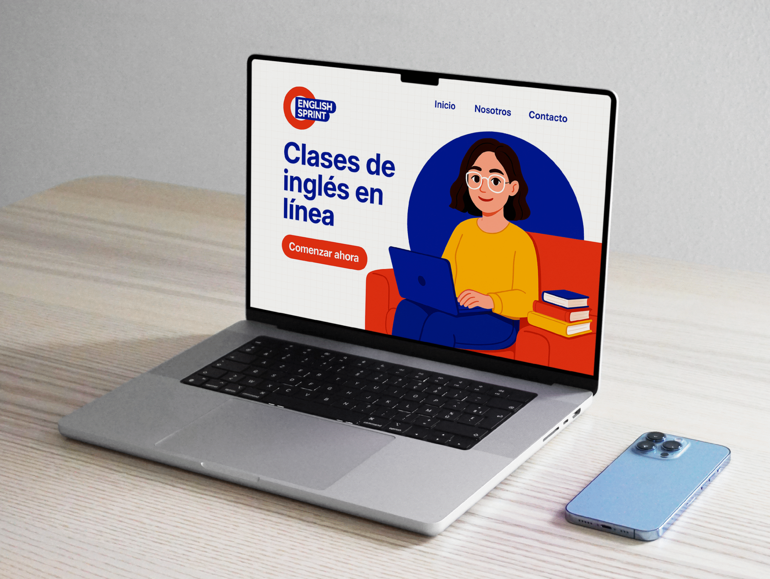
English Sprint is a learning platform and community focused specifically on English education. We collaborated with founder Mercedes Medina to create an identity that conveys quality, warmth, and trust, while connecting with the right audience.
INFO
This educational project offers expert-led lessons designed to help students learn English with the goal of achieving IELTS certification, a standardized exam that measures English proficiency for non-native speakers. To support the brand’s objective, it was essential to communicate a personality that felt friendly, trustworthy, professional, and accessible.
With these ideas in mind, we developed a logo inspired by British Underground signage, featuring an underlined sans serif wordmark and the use of a circular enclosing shape. The slight displacement of the elements conveys movement, dynamism, and agility — all important qualities in an educational environment.
Across the broader visual system, structured and linear resources such as grids and color blocks are combined with rounded accents and more organic strokes, creating a balance between playfulness and order. The color palette is built from neutrals — black and white — alongside primary tones such as yellow, blue, and red, resulting in a system that feels classic, timeless, clear, and memorable.
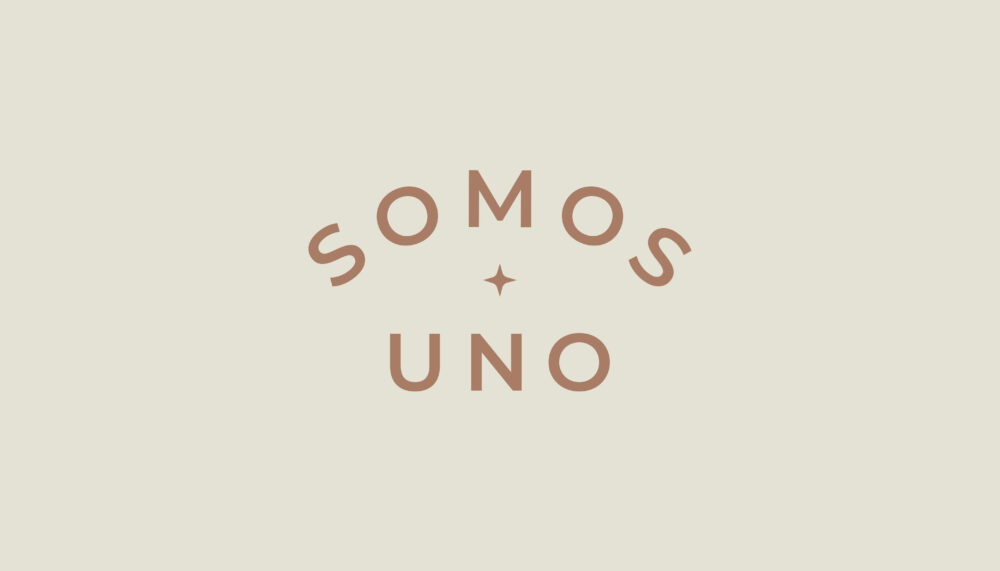
Somos Uno is a personal project of Jacinta Lanz, creative, strategist and founding partner of Brandia, where she seeks to share her knowledge and practice in the world of meditation, sharing peace with others.
INFO
Jacinta began her path towards spirituality many years ago and the time has come to share all her insights with the world. She becomes a companion to help us find ourselves, reflecting off each other and embracing the constant and beautiful transformation that is existing.
Taking this mission and the essence of Jacinta as a person, a name was developed that reflected her perspective (we are all one, one universe, one family). “Somos Uno” was then communicated with a friendly logo, whose curves and illustration invite and welcome while the thickness of the typography and its use of capital letters adds strength to the identity.
The visual system is flexible and adaptable, by using photographs, illustrations and typographic variations, the content becomes inclusive and dynamic. The color palette helps generate consistency and positioning, communicating the warm and peaceful tone of the brand.
At Brandia we love collaborating with projects like this, that seek to generate a positive impact on people and the world. We are grateful to be a part of this beautiful initiative.
We use cookies to enhance your experience while using our website. If you are using our Services via a browser you can restrict, block or remove cookies through your web browser settings. We also use content and scripts from third parties that may use tracking technologies. You can selectively provide your consent below to allow such third party embeds. For complete information about the cookies we use, data we collect and how we process them, please check our Privacy Policy


")


")


")


")