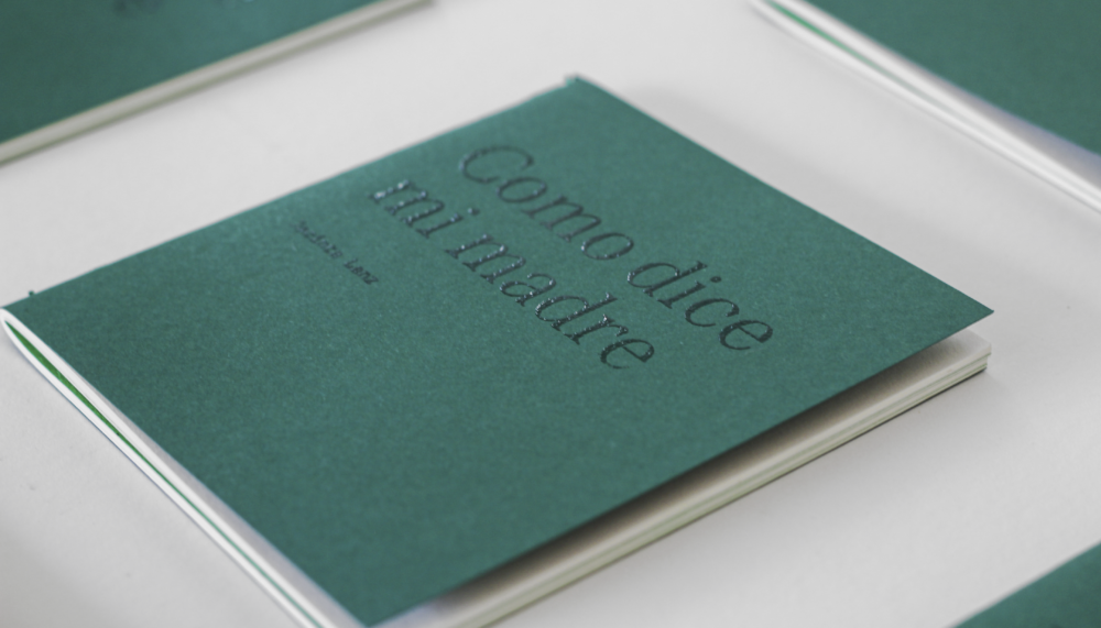
Como dice mi madre (As My Mother Says), is an editorial project composed of a series of popular phrases collected by Jacinta Lanz, a creative, strategist and founding partner of Brandia.
INFO
Jacinta started this project with the intention of immortalizing the wisdom behind statements that we’ve all heard before, these bits of knowledge that unite us with universal lessons, because just as her mother said them, yours could have too.
Considering this mission and the variety of themes within the collection of phrases, an equally eclectic visual system was developed, with illustrations, photographs, interspersed with organic strokes, balanced by a classic and timeless typography.
The color green becomes a distinctive element within the visual system, as it is a monochromatic palette. Taking advantage of the simplicity of using only one ink, the printing was made with risograph, which gives the editorial product a unique and very rich texture.
This book is an ode of love, a thank you to our maternal figures for their unconditional support and advice, ingenuity and wisdom.
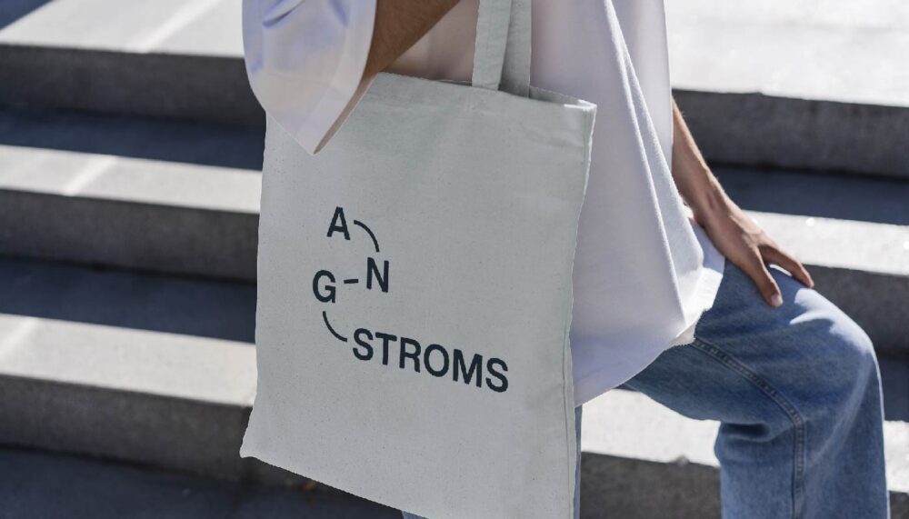
Angstroms is a platform for artists and galleries that allows them to focus on creating exciting art and embark on more ambitious and impactful projects. This organization, dedicated to promoting, supporting and encouraging artistic careers, sought us out to create its identity.la creación de su identidad.
INFO
This collective’s mission is based on bringing better art to the world, consolidating its main values: transcendence, innovation, independence, passion and community.
Taking into account these concepts and the essence of the name (referring to “angstroms” as the smallest measurement that collectively constructs matter), a memorable and unique logo was designed. The letters function as parts that join with lines, whose dynamic curves guide the eye.
The typography maintains a neutral and strong personality with the capital letters in a medium weight, this makes the identity adapt to different graphic elements and visual styles. The letters “Angs” become the responsive version of the logo and act as a sort of a brand endorsement.
At Brandia we love art and creativity, which is why we enjoy being able to collaborate with initiatives like this one, creating a community whose mission aligns with ours: contributing to the graphic history.
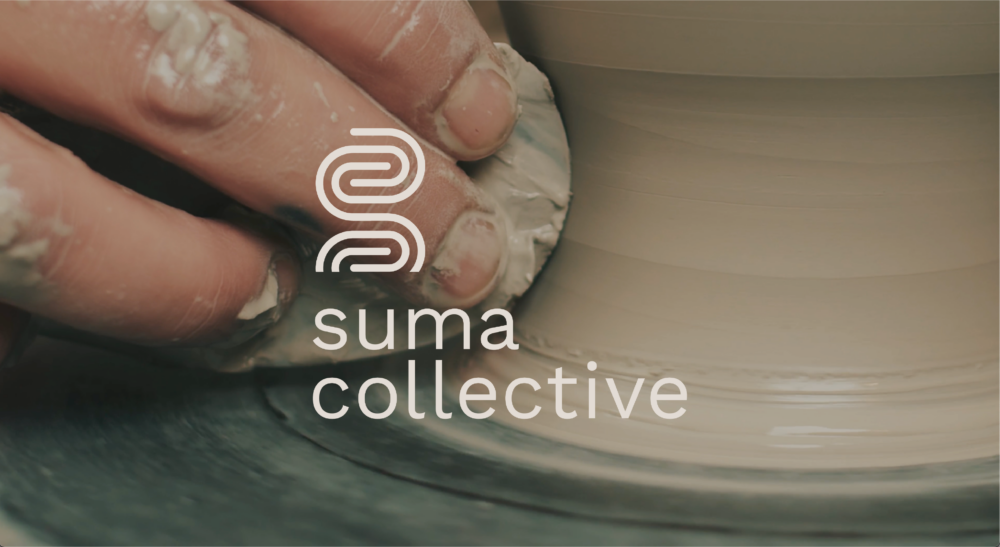
The objective of this project was to generate a brand strategy and identity that communicated the personality and vision that José Ramón Ruíz had, creating a platform, narrative and community that can connect organically.
INFO
When we began discussing the project with José Ramón, it was clear that it was about building a community that connects and expands through unique experiences: combining art, nature, discussion, and transcendence.
With this platform, we developed the collective's name, which speaks of a whole, something made up of different parts, seeking to contribute something to the lives of its members through exploration. We took that adventurous spirit and applied it to the logo with a lowercase font, making it more user-friendly, and an icon that transforms the "S" into a labyrinth composed of several lines, referring to the different paths and members of the platform.
The visual system was comprised of clean, adaptable typefaces, warm, deep colors, with an emphasis on textures, close-ups, and images that evoke the creative, spiritual, rich, and diverse universe of the identity.
Brandia always welcomes these types of projects with open arms, as we love collaborating with people who allow themselves to forge their own paths and mindsets based on connection, creation, and sharing.
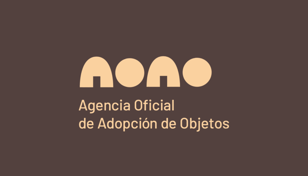
Agencia Oficial de Adopción de Objetos (AOAO) is a curatorial selection and restoration project of second-hand objects founded by Rafael Medina and Jessica Juárez, two creatives passionate about design who seek to give new life to forgotten or discarded objects.
INFO
Rafael and Jessica were very clear that what should be highlighted in their brand was the concept of a second life, from which their main values emerge: revive (refers to the restoration part), resignify (reflects their creative perspective), revamp (communicates about the quality of the pieces) and re-inhabit (points to the adaptability of the offer).
Taking into account the conceptual guidelines, a unique name was developed which proposes the objects as living beings, who are adopted by clients when integrating them into their spaces. With this metaphor, The Official Object Adoption Agency builds its narrative and reveals its ingenious personality.
For the development of the logo, this refined, creative and dynamic identity was captured through structural letters that show off the acronym and position the brand with the small doors in the “A”, reinforcing the concept of finding and building a home. This is complemented by the full name as a descriptor in a more minimalist and formal typography.
At Brandia we love being able to work with projects like this, where the best of design, art and interior design is combined into an original proposal full of stories and connections.
Las Garrafas has some new members in its family: a series of wines that evoke the Mexican tradition and exalt the quality and sublimeness of the brand. The main objective was that the visual identity could celebrate the aesthetics of our country and its incredible flavors.
INFO
Mexico is a country of great joy, flavor and magic; so it is not surprising that the essence of its villages is an infinite source of inspiration. These communities represent our culture, being the cradle of various legends and stories, leaving us the legacy of amazing experiences.
Based on these landscapes, characters and colors, we created our own village using very traditional graphic styles that take us to a fun and diverse universe.
We found a balance between the popular and the exquisite for the creation of the labels. We kept some previously established graphic elements of the brand, such as the stamp and fonts, keeping ourselves within the aesthetic realm of the "Las Garrafas" family.
We love working with brands that are constantly growing, which is why it is an honor to continue collaborating with Las Garrafas for all these years, as it has encouraged us to continue innovating and creating wonderful things together.
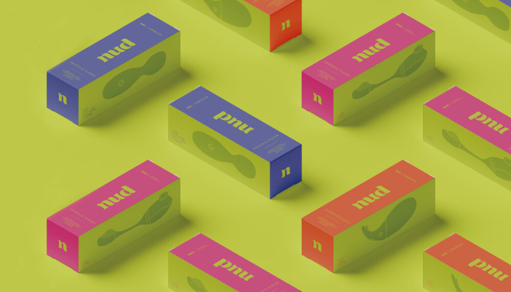
Tania and Karen decided to pool together their expertise in sex education and in the business world to create a happy, disruptive and friendly brand. They came to us to develop a brand, identity and packaging strategy that reflect their personality and essence.
INFO
At Nud, they faithfully believe that the most important thing about our body is to discover and enjoy it, which is why the main values that the brand communicates are freedom and pleasure. Thus, they are breaking with existing taboos and becoming more than just accessories: it is a place to share, learn and enjoy.
The logo is made up of a thick typeface with soft strokes that refer us to a friendly and fun brand, while its lowercase letters speak of the closeness and intimacy with which Nud communicates. It is a simple, clean and timeless logo, whose curves reflect the movement of bodies and the celebration of pleasure.
Taking into account the spirit of celebration that was raised in the strategy phase, we developed a bright but reliable packaging where a simple box becomes the invitation to your party of pleasure. We use a color palette and certain illustrative resources such as female silhouettes and an informative iconographic system that refers us to a bright and energetic joy, highlighting the brand's pillars: turn on, enlighten and let go.
We can see that the final result feels close and fun, striking a balance between the intimate and the bold..
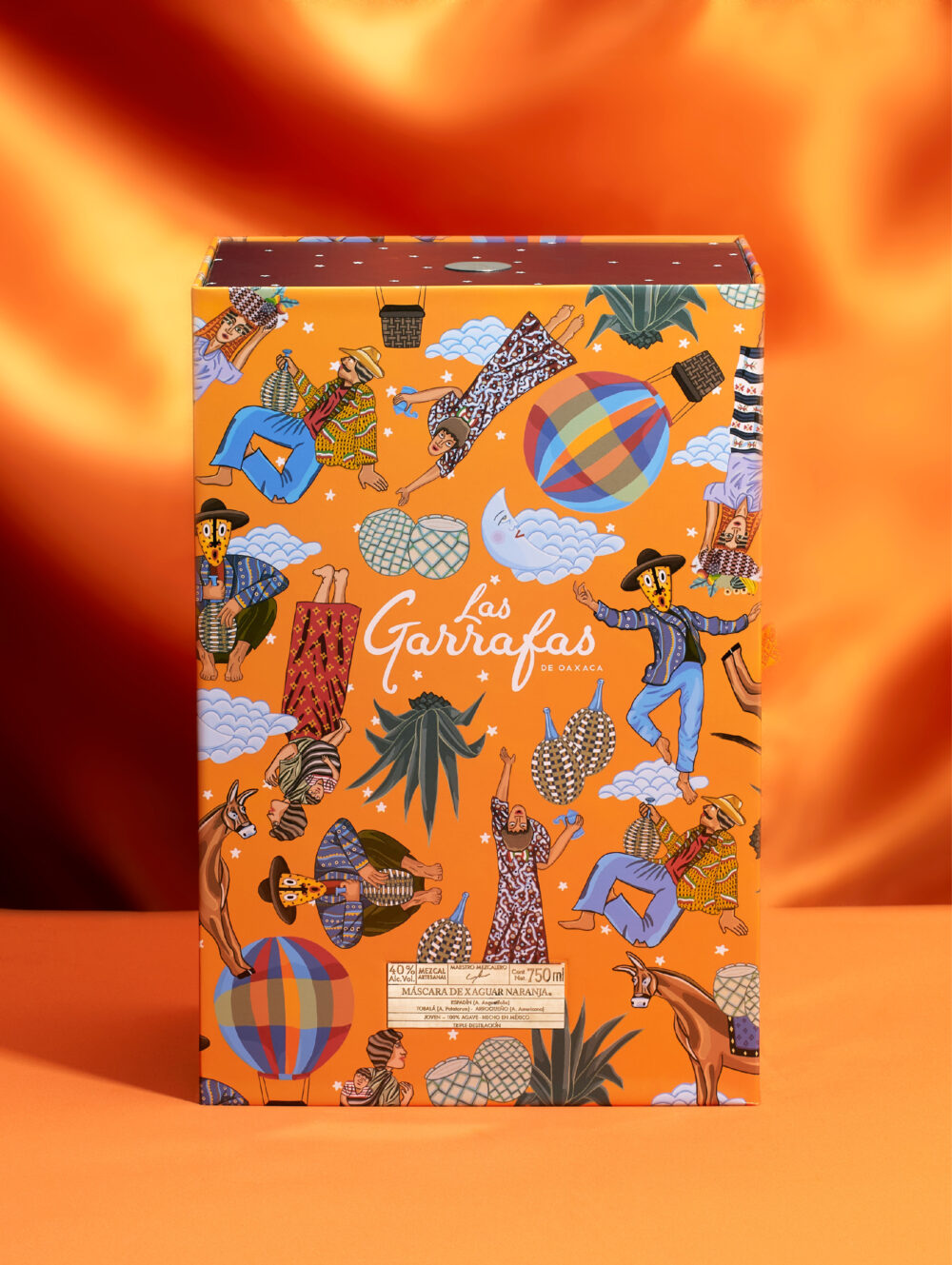
To celebrate 10 years of exalting the senses, Las Garrafas wanted to launch a limited edition of its Máscara de Xaguar mezcal and commemorate the journey they have been on, not only with this particular product, but as a brand.
INFO
Their products have taken them far, so far that today they boast a wide variety of flavors and experiences. Subtlety and quality become the master touch that can distinguish the most precious works in the world; and that is what defines Las Garrafas.
For this reason, we present a tribute to the celebrations of life with unique and joyful packaging. The inspiration for this design comes from the artwork titled "Las Garrafas" made by the Mexican artist Leovigildo Martínez, in which there is a game of subjects that exchange flavors, laughter and mezcal.
We used the main concept of the work in order to create new illustrations and a variety of characters that have different expressions, where each one represents the joy of being able to share with others, thus creating a party and a design where celebration predominates and everyone is invited to join.
It is the details such as the interior frosted with stars, relating it to the custodian of the night that represents this drink; or the energetic orange of Máscara de Xaguar that make the decade-long experience of Las Garrafas extraordinary and unforgettable.
Más Visión is a dedicated company that does things with its heart, striving to generate quality vision health solutions in an accessible and reliable way. On this occasion, they sought out Brandia to help them restructure their branding and strategy.
INFO
We know that the world of eye care tends to be clinical and cold. We, however, collaborated with Más Visión so that they could better communicate the brand's emotional benefits.
We developed a strategy that brings to light that in Más Visión, more than just selling glasses, they seek to walk by your side and give meaning to things so that you can find moments of happiness with the people you love, filling your panorama with joy and helping you to see more happiness in life.
In the redesign of the logo, refinements were made to the original logo so as to give it a better visual balance and take the brand to a more entertaining and striking place. By having four logo variations, an appropriate use of each one was defined so that the brand maintains a recognizable coherence.
The graphic system helps us to give it that unique personality through different elements... The photography informs us of both the brand’s offer and the customer’s experience; the typographies sway and contrast dynamically; the enveloping figures that intervene in the communications tell us about the care you will receive.
A color palette was created that stands out and communicates positive and happy values. These are reinforced by the illustrations that help bring the brand closer, showing the essence of Más Visión.
All these elements lead us to a clear communication system, which connects with the key objective of the brand and transcends with its users on an emotional level.
Ogo distributes cell phones through the use of credits that offer a friendly and accessible service. By understanding their value proposition and brand personality, we collaborated with them to develop a different name and logo.
INFO
The main objective of the brand is to be able to take the world of telephony to a new stage that resonates in a fun and dynamic way so that more people can communicate with whomever they want, whenever they want.
As human beings we seek to prosper, move forward, learn more, explore new opportunities and above all... connect with people in different ways.
This is what Ogo offers and that is why the identity and name should also be communicated. The name "Ogo" is a variation of the word "Go", which tells us about constant innovation to move forward, and it being a palindrome makes it friendly, memorable and phonetically fun.
The logo is made up of a speech bubble that works as a container for the name; this makes it fresh and intimate, in addition to immediately transporting us to the world of communication. The typography is bold and friendly, which differentiates them from the competition, as are their colors: bright, contrasting and bursting with energy and connection.
When accompanied by happy, everyday images, the brand’s identity is activated and their personality is fully reflected, thus making Ogo your connection on the move.
_THE BEST LEGAL SERVICES FOR THE BEST OPPORTUNITIES
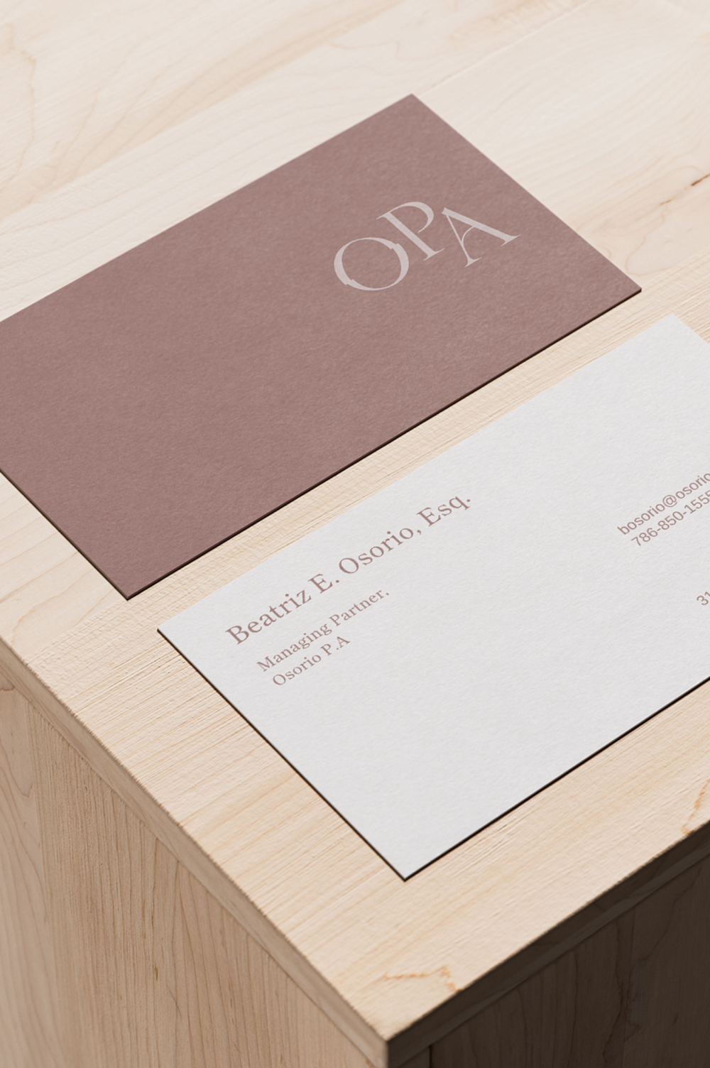
Beatriz Osorio is a lawyer with her own law firm in Miami that focuses on supporting migration processes for both work and family cases. She reached out to us for help creating the identity of her brand: Osorio PA.
INFO
The main aspects that Osorio PA communicates are exclusivity and trust; values that are born from the vision of Beatriz.
The logo conveys implicit movement with the inclination of the O referring to migration, a concept that is further emphasized with the inclined cut of the second letter O, which reflects a quick and easy transition as being part of the brand's service. The selected typography communicates high end quality, with refined and classic strokes and endings.
Visual trends in the legal service industry are generally drab and masculine in style. Our graphic style and warm color palette distinguish us from other firms.
We can see that the final result is sophisticated, unique and builds trust for the consumer.
We use cookies to enhance your experience while using our website. If you are using our Services via a browser you can restrict, block or remove cookies through your web browser settings. We also use content and scripts from third parties that may use tracking technologies. You can selectively provide your consent below to allow such third party embeds. For complete information about the cookies we use, data we collect and how we process them, please check our Privacy Policy