_YOUR GLOBAL SOURCING EXPERT
Foresight, born during the pandemic in Los Angeles, is a company that offers medical supplies to businesses. As they grew and joined forces with others, they decided to turn their identity around, thus seeking out a collaboration with Brandia.
INFO
The founders of Foresight were very clear that their brand is distinguished by its ability to supply products in crisis situations when others have not been able to. Taking into account the values of trust, transparency and seriousness, as well as the history of the brand, the name Foresight was developed, thus communicating its value proposition.
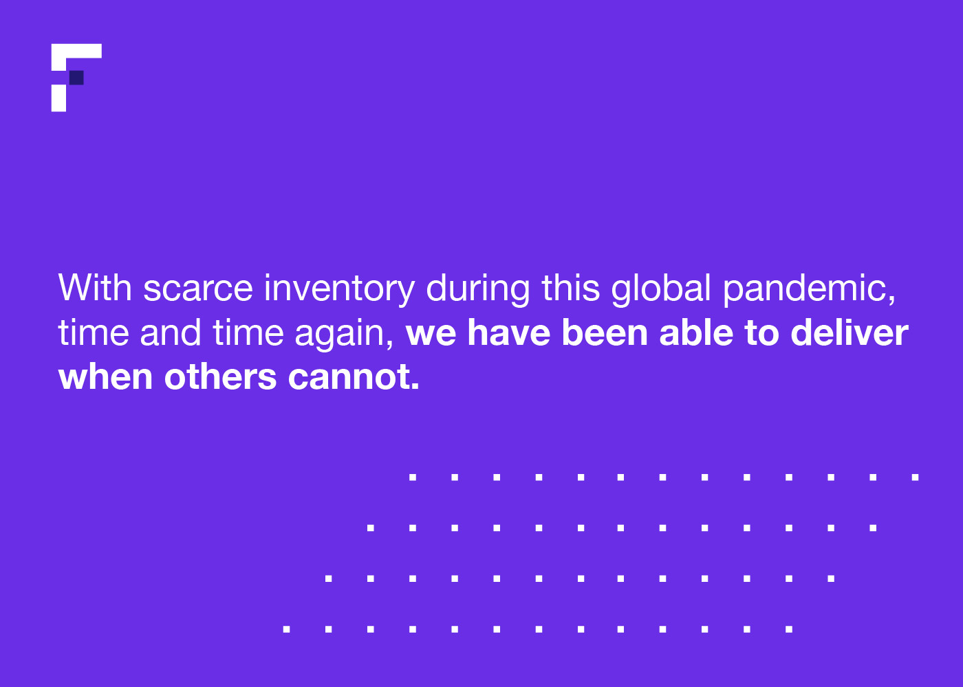
To be consistent with the established function and personality, a clean logo was created with a subtle detail: a square that breaks the stem of the letter F, which becomes a vision of the future, a safe move and a highly distinctive element.
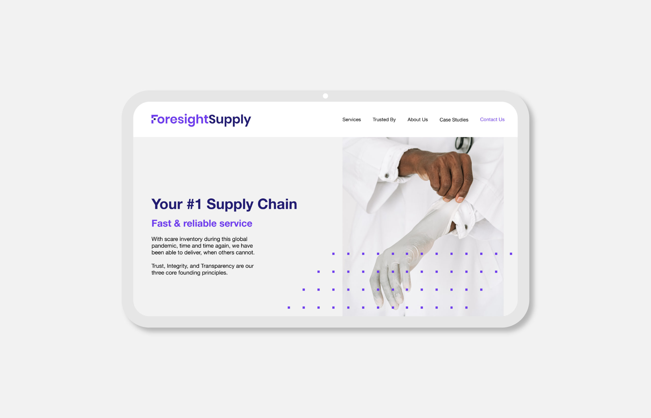
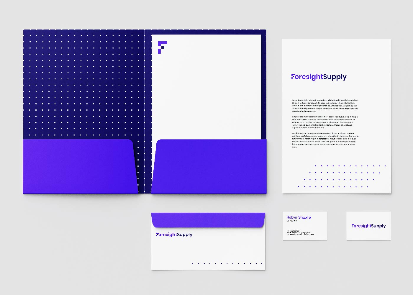
Foresight's identity is built from the use of the square as a texture, a sans serif typography and a photographic style that evokes cleanliness; the combination of these elements fits perfectly within the health industry. In chromatic terms, purple was chosen as the corporate color, since it stands out among the colors of the competition.
By combining all the graphic resources, we can really understand Foresight as a reliable and agile brand.


