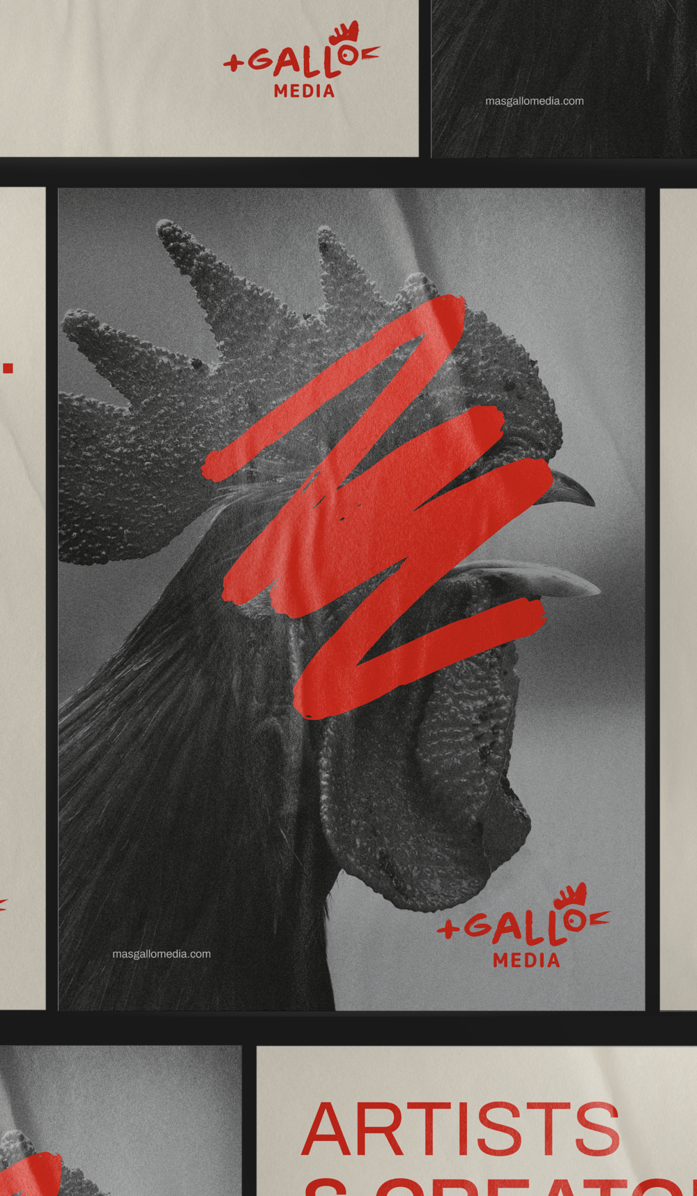
Más Gallo Media, formerly called Altius, is a creative brand dedicated to the production of experiences, content and talent management. The team was searching for a change in image and strategy, with the aim of having a brand that is consistent with who they are and what they offer; thus resulting in something completely renewed and disruptive.
INFO
This project allowed us to collaborate with a very confident team that has a clearly defined point of view: a team that is "muy gallo" in what it does. That is why its branding had to exploit this exact tone with a strident voice that rises above the rest, distinguished by its quality and authenticity.
The redesign was based on being a disruption to its previous model, and it speaks to a brand with a strong presence and a lot of punch. The strategy uses these concepts to develop messages such as “Rise Up & Shake Up”; breaking the silence and telling bolder and more original stories.
The naming refers to that irreverent personality, the winning spirit and a perfect combination that exalts self-improvement: they are more; they offer more; they risk more; they give more; they listen more; they create more; that's why they are Más Gallo Media.
The logo is made up of several different elements: The name “Más Gallo” (“+ Gallo”) is written in a typeface with gestural lines and is combined with a texture that communicates the daring and original attitude of the brand. This is intervened by certain illustrative elements in the letter "o", thus forming a rooster with a fun character.
The color palette is made up of whites, grays, blacks and a red that highlights and interrupts the neutral passivity. We developed some graphic elements that intervene in the communications and give them a distinctive touch, as well as the use of illustration and photographic style, resulting in a unique and different project.
La Tribu was born out of a love for dogs, with the aim of providing a better life for those who are abandoned and mistreated through rehabilitation and care in order to find them a home.
INFO
A tribe is a group of beings connected by common values; starting from this concept we arrived at the name of this great project, because what unites them is the belief that dogs are love.
It should be communicated that in this space people and dogs are seen as the same: all deserving of respect and a dignified life. For this reason, dogs take center stage in the brand’s identity, from the logo to its applications, thus demonstrating the love and diversity of the community as well as the protection of it.
The logo uses the idea of a totem, which, in the mythologies of certain societies, is seen as a protective emblem for the tribes. This totem symbol features a system of dogs designed from geometric shapes, representing companionship and strength.
The color palette, composed of green tones, can be seen throughout the communication system. It represents the physical space of the shelter, freedom and nature - where dogs are most fulfilled.
This community takes care of itself through acts of love, courage and awareness, since each member has incalculable value and gives unconditional support. For this reason, a friendly and close illustration style was developed that helps communicate how incredible it is to be part of the tribe.
At Brandia, we love getting involved with projects that leave positive footprints and supporting them pro bono. If you have a project or foundation that needs branding help, let us know! Our doors are open.
Anzara Health is an online endocrinology service founded in New York, by Sarah Musleh and Ana Kausel, two specialists in the area who seek to take their practice to a point of excellence, innovating with an agile and reliable service.
INFO
Sarah and Ana approached us to help them create their brand identity. The main values that it was to reflect were exclusivity, quality, care and professionalism.
Taking into account the general graphics of health services, which usually have a very cold and clinical style, we chose to highlight Anzara Health with a warm color palette and fonts that are rarely seen in this environment.
The logo reflects the quality of the experience with a serif typeface and an accent on the “A”, giving it a distinctive element with a dynamic and light stroke. This is complemented by the descriptor of the service (“Health”) in a light sans serif typeface to evoke closeness and trust.
This project encompasses a quality experience through imagery that connects with the user, offering a completely personal and close service without losing the brand's safe tone.
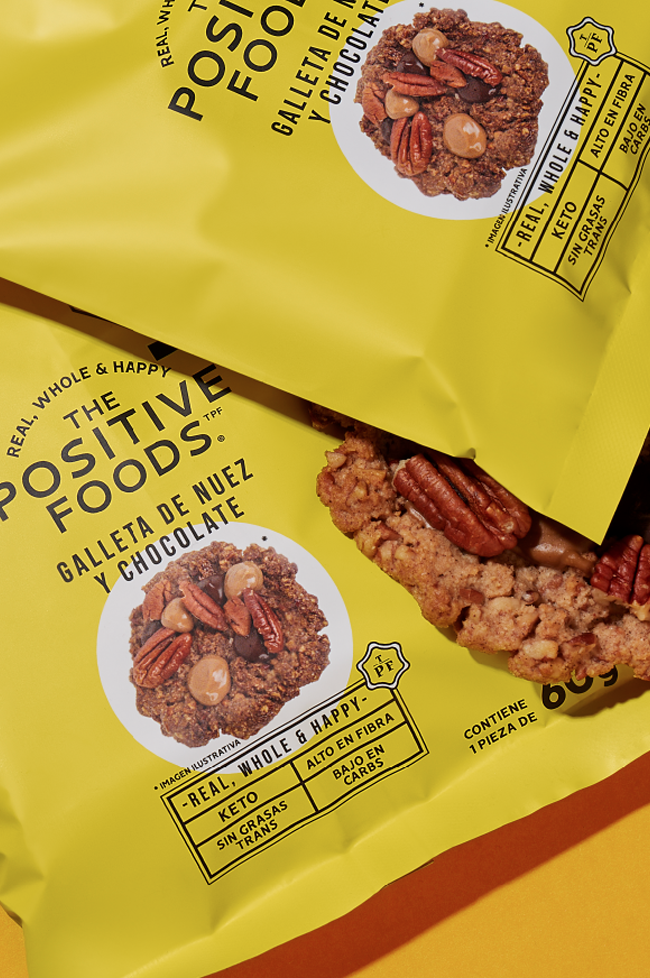
The Positive Foods is a brand that seeks balance within our meals whilst keeping a diverse range of lifestyles in mind. With the initiative of creating delicious and healthy food; Ale, Pau, Luis and Pam merged their distinct qualities to develop this great brand.
INFO
We know that a bite can communicate a sweetness that goes beyond taste: a smile, a hug. TPF collaborators wanted to communicate a positive impact through food with products that were real and accessible.
Taking this mission into account, a brand strategy was developed that elevates the values of balance and joy. Their promise is to pamper you and take care of you at the same time, hence the name: The Positive Foods.
The logo is clean and modern; its arrangement reminds us of the sun at dawn, thus transmitting the brand’s positive and cheerful side. This is reinforced by a palette of yellows and oranges that run through all communication, illuminating your shelves and pantries with an irresistible warmth.
The iconographic elements serve to inform and demonstrate the transparency of the ingredients used, while the product photos in combination with images of satisfied consumers tell us about the TPF experience.
The messages of being real and happy are transmitted not only through positive and comforting text, but also with the graphic tools of the brand’s system that work together in perfect balance, just like the brand’s personality.
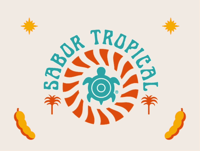
Tortuga Tulum is the newest member of the Las Garrafas family: this tamarind liqueur fuses the best of Tulum by manifesting a balance between partying and conservation.
INFO
Following the custom of Las Garrafas, Tortuga Tulum chooses a particular animal to represent the concepts of its essence. In this case, sea turtles are the face of this refreshing and potent tamarind flavor, evoking grandeur and fun. The brand joins forces with the Yepez Foundation in order to support this emblem of the local and global ecosystem: the turtles.
We developed a brand strategy in which the drink is a celebration of this magnificent species and of the atmosphere of enjoyment that we see in Tulum. Taking these messages into account, we speak to the “paradise seekers”, those who are always looking for the next adventure.paradise seekers”, aquellos que están siempre en busca de la siguiente aventura.
The graphic identity represents this balance of fun and awareness. The label stands out for its "groovy" style, combining illustrative elements that dress up the bottle and evoke a party energy. The colors we used transport us to those sunsets we see at the ocean, playing with each other in the most jovial way.
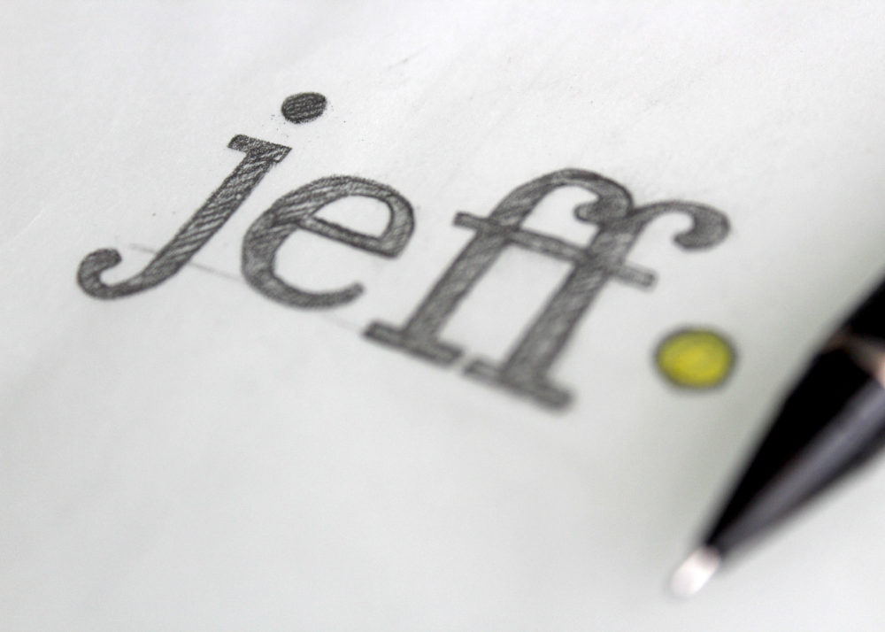
Jeff Bomberger, a true Californian, has lived many lives in one. This was until he realized that his calling was to share his intuition with other people, helping them navigate spirituality by connecting with the present and with themselves. In this project, we collaborated with him so that his personal brand could reach more people.
INFO
An identity was developed based off of the feeling of being in balance, thus calling for a simple and subtle aesthetic. The concept had to align with Jeff's personality so that it felt authentic to him.
We developed a logo that was aligned with these values, using a patinated but thick typography that conveys confidence and balance. We combined it with an abstract minimalist detail: the name is interrupted by a golden dot that speaks of energy, unity and fullness.con un punto dorado que habla de energía, unidad y plenitud.
It was very important that the website evokes inclusivity and intimacy as the goal is to help as many people as possible using his practice. That's why, when browsing the site, you can feel calm with the gradual transitions that connect you with the brand’s essence.
Foresight, born during the pandemic in Los Angeles, is a company that offers medical supplies to businesses. As they grew and joined forces with others, they decided to turn their identity around, thus seeking out a collaboration with Brandia.
INFO
The founders of Foresight were very clear that their brand is distinguished by its ability to supply products in crisis situations when others have not been able to. Taking into account the values of trust, transparency and seriousness, as well as the history of the brand, the name Foresight was developed, thus communicating its value proposition.
To be consistent with the established function and personality, a clean logo was created with a subtle detail: a square that breaks the stem of the letter F, which becomes a vision of the future, a safe move and a highly distinctive element.
Foresight's identity is built from the use of the square as a texture, a sans serif typography and a photographic style that evokes cleanliness; the combination of these elements fits perfectly within the health industry. In chromatic terms, purple was chosen as the corporate color, since it stands out among the colors of the competition.
By combining all the graphic resources, we can really understand Foresight as a reliable and agile brand.
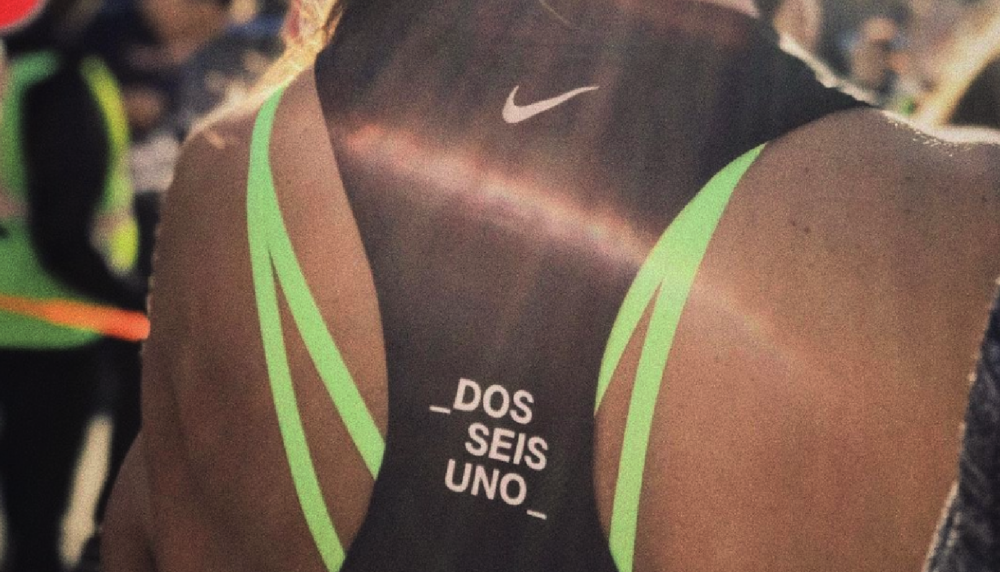
261 is a community that represents the freedom of women in the arena of running, from which they were excluded for a long time. This initiative uses races as the perfect pretext to create a space full of empowerment.
INFO
For this project, it was extremely important to have a name that spoke of its essence and origin. For this reason, the bib number of the first woman to run the Boston Marathon, Kathrine Switzer, was used. She paved the way for many women runners and was the inspiration for 261.
The developed identity is concisely communicated with short but strong messages. It uniquely invites others to become part of the community and experience a sense of support and sisterhood.
An exclusively typographic logo was developed: it has a strong weight and is italicized, giving it confidence and movement. This dynamism is reinforced by the displacement of the “six”, which moves forward towards an aspirational future. Embracing the text with underscores tells us about the message of inclusion that inspires the project.
The system is made up of colors and images that not only give visual strength, but also connect with the brand's message. This achieves the perfect balance between photographic and illustrative use, giving life to a transcendent brand.
Have you ever wanted the experience of cooking like one of the best in the comfort of your own home? Cinco, by Lamex makes this possible through unrivaled designs and quality, all so that you can enjoy the premium experience in your kitchen.
INFO
A brand strategy was developed based on offering sophisticated products that enhance the art of cooking. The brand plan was built around their quality guarantee, the ideal experience that they offer and their superior vision. We communicated this innovation through the name Cinco, which evokes the prestige of a 5-star meal and an experience that involves all 5 senses.
Based on this brand strategy, we developed a unique brand identity. Its logo is an abstraction of the number five, which in turn becomes a quality seal for the brand.
The minimalist and sophisticated identity of the packaging highlights the sublime curves and details of the products, which takes us into a world of perfect functionality. We created a visual balance between the technical aspects of the product and the elegant simplicity of the experience that is evoked.
The combination of all these elements represents the best example of the developed visual system, which is made up of an iconographic use, a sober palette and a photographic style that inspire the user to be part of the Cinco by Lamex experience.
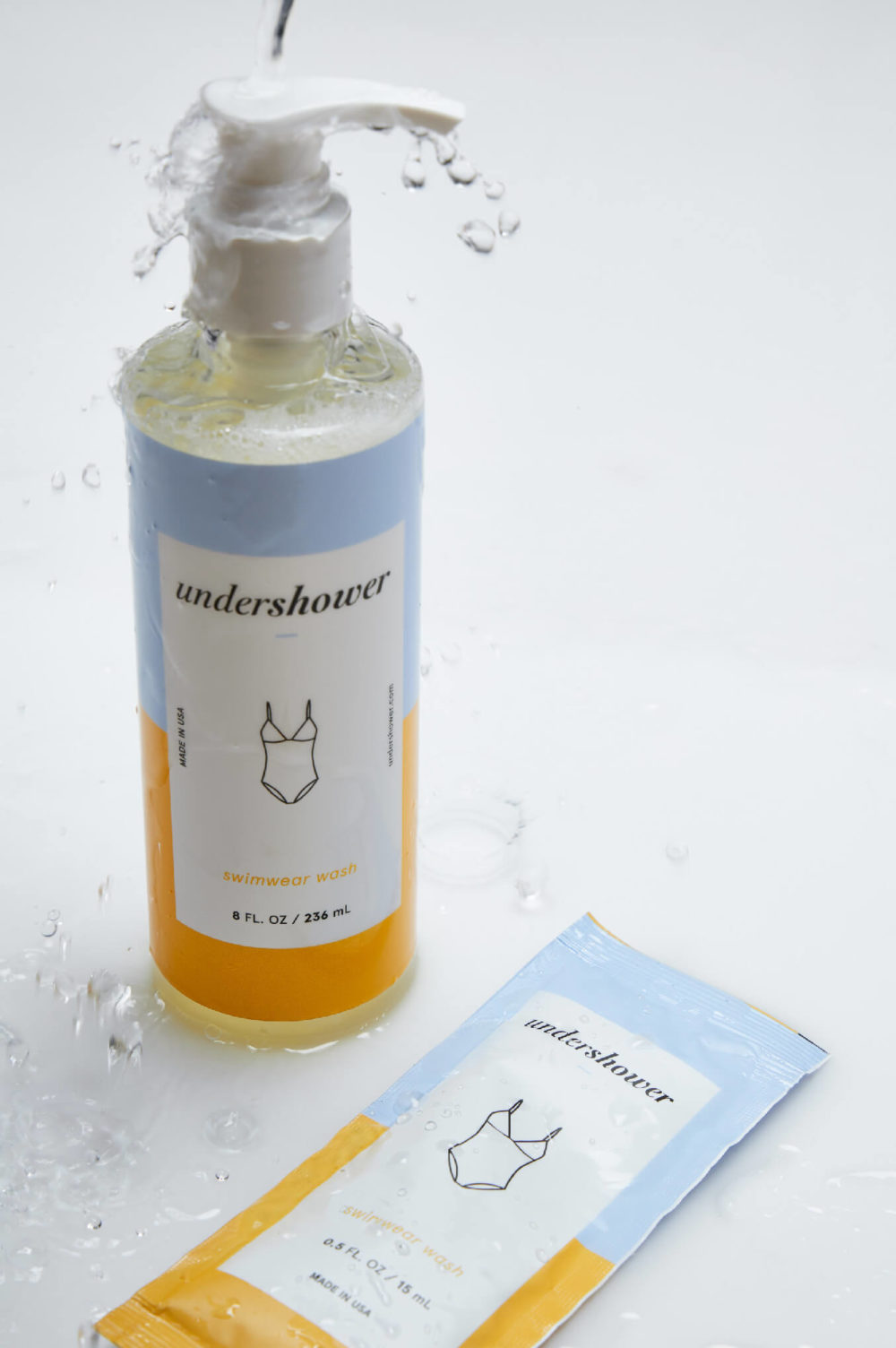
Many people habitually wash their underwear by hand, doing so either out of care, modesty or in order to avoid mixing such unique clothes with the rest. Undershower is born in Miami and arises from the recognition of this daily, intimate custom; seeking to empower and normalize it.
INFO
Intimate clothing and its care tend to be a rarely visited topic of conversation, and so most people ignore the potential benefits of washing their underwear in the shower. This product presents you with a fun, sustainable and quick way to keep these clothes clean.
Undershower celebrates this daily habit, breaking down the stigmas and prejudices that surround it and penetrating a world that is seldom talked about. Its benefits range from reducing water waste to preserving the quality and duration of the underwear. las prendas.
The brand’s concept communicates the simplicity of the product in a fun and friendly way. We used subtle colors that attract attention and express confidence and inclusivity, getting rid of labels and showing that this is a habit for everyone. y demostrando que este hábito es para todos.
The packaging uses chromatic and illustrative elements to evoke cleanliness, tranquility and warmth. An italic typeface was used for the logo, representing the delicacy and subtlety of the experience.
Caring for your delicates is caring for yourself and self care is self love.
We use cookies to enhance your experience while using our website. If you are using our Services via a browser you can restrict, block or remove cookies through your web browser settings. We also use content and scripts from third parties that may use tracking technologies. You can selectively provide your consent below to allow such third party embeds. For complete information about the cookies we use, data we collect and how we process them, please check our Privacy Policy


")