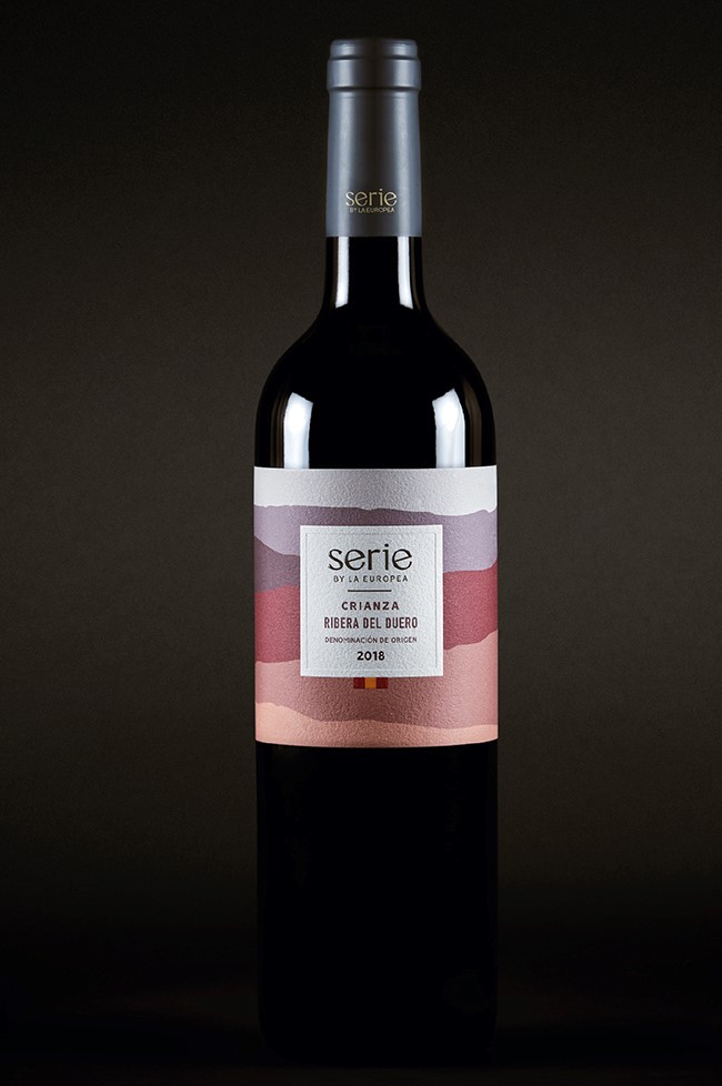
_Serie by La Europea came to us with a challenge: to create a multi-category brand dedicated to the creation and commercialization of wines, spirits and gourmet products with the backing of La Europea.
INFO
For this project it was essential to share the extraordinary selection of products that the brand has, which is why its name takes up a concept that comes from the art world. Originally, a series refers to a group of similar artistic pieces, but in the case of Serie by La Europea, we are talking about wines, liquors and gourmet foods with extraordinary flavors and details.
For the design of their labels, we found our inspiration in the landscapes of their products' places of origin. This abstraction of colors and textures accompanies consumers through innovative and unique products with a young spirit.
Collectors of extraordinary flavors - this is how we define Serie by La Europea. Its team of experts selected the best products in the world to bring them to your table so that you can unleash your sybarite side, that inner explorer of hedonism and pleasure.
Using botanical ingredients, scientific methodology and a passion for well-being, Biune creates clean formulas for skin and hair care and uses their brand to promote the interrelation between nature and your body.
INFO
One of Biune’s characteristics that stands out is that they use the best ingredients to create the best products. With herbs, oils and extracts of the highest quality, they deliver the very best of nature to their consumers. For them, we designed a brand that transmits security, care, simplicity and elegance.
Our inspiration for its creation came in the form of scientific and botanical encyclopedias where specimens are shown as they are. Biune products perfectly balance the best natural ingredients with the proven benefits of scientific research. This is why we define the brand’s DNA as being "In synergy with your skin". In addition, it was important to communicate the care for the planet that the company has. Within Biune, a culture of regeneration of the environment and society is promoted to create benefits for all.
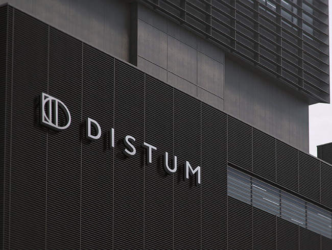
Distum is a real estate developer dedicated to generating innovative architectural concepts. The rationale we defined for Distum is: "Transforming the urban landscape through a unique way of living".
INFO
The name refers to the word “different”. It was important for this brand to transmit to its consumers an innovative and original spirit, and at the same time communicate exclusivity and prestige.
Distum aims at having its consumers take ownership of their spaces and make them a projection of their personal lifestyles. Its exceptional developments are achieved by an experienced and heterogeneous team capable of creating projects that stand out in the international market. One of the characteristics that make Distum a remarkable brand is that they not only create places that are easy on the eye, but they also consider the users and their environments from the very beginning.
_Branco Estudio is dedicated to making its clients' dreams come true by using their interdisciplinary team who combine architecture, design, and art. The mission of Branco Estudio is "to create spaces that become more than a place". Its founders are committed to ensuring that their clients can experience art in their everyday lives, and they fulfill this by creating spaces that are simultaneously aesthetically pleasing and functional.
INFO
The name means white, a color associated with purity and new beginnings. It is inspired by the painter's unaltered canvas; the achromatic wall in interior design; the architect's undeveloped plan; and the client's living space. Their essence, "livable art", is also used as a slogan and appeals to their team's desire to break down the barriers that art often implies and bring it into the everyday experience.
The main element of the logo is the number three, which refers to the number of founding partners and the three disciplines that make up the spirit of the company - an abstraction of exponential talent. Meanwhile, the typography supports the transmission of the most functional values: formality, punctuality, transparency, and constant communication.
Branco Estudio makes it possible to inhabit art, and now can do so through a graphic identity built especially for them.
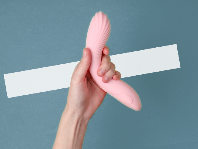
_Disclose is a brand dedicated to transforming society's general perception of sexuality through a platform about sexual well-being. We defined their rationale as "Making people proud to explore, take control of, and celebrate their sexual wellness."
INFO
The name is a play on words that invites you to discover the world of sexuality in many different areas - physically and mentally. Just as its name plays with the meaning of the word, the logo also has two graphic elements. On the one hand, the typography shows the brand's purpose with discretion and elegance, and on the other, the pipe represents the drive to discover your sexuality.
Disclose believes in a free world to enjoy and feel without judgment, without guilt and without pain. It encourages its consumers to believe in their bodies and their pleasure through education. Its wish is that all people take pride in knowing that they are part of a revolution that promotes sexual well-being and honest conversation spaces. In this way, it wants to encourage us to free ourselves from the wrong that has been attributed to sex and to enjoy sexuality in a full and shameless way.
_Bebé Camaleón is a platform dedicated to baby gear rental through an eco-conscious consumer business model. We defined their reason for being as: “Building a better world for future generations". Baby Chameleon imagines a world where, in addition to taking care of your pocket and your family's well-being, we manage to reduce the environmental impact of this industry.
INFO
The name is inspired by the little ones, and by the adaptable, curious and colourful chameleon. One of the brand's goals is to teach families to make smart decisions, always prioritizing safety and cleanliness. The typographic logo is accompanied by a small pet that conveys the idea of family, appealing to this sweet and intimate world.
Baby Chameleon wants all families to have access to new and functional brands without spending a lot of money. On top of that, it wants to build a community of parents who enjoy this new family stage thanks to incredible products that accompany them only for as long as necessary, and thus impact the world in a positive way.
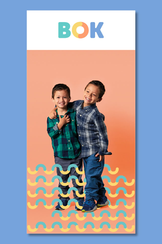
_Bok is an innovative and multifunctional space that has a playroom, party room, cafeteria and working space. They encourage children's fun and learning by expressing their skills and creativity in a safe, comfortable and friendly environment.
INFO
“Boosting healthy, curious and creative minds” was the brand’s promise that was defined in order to communicate the importance of developing children's creativity. Its essence, "Great minds, great worlds", highlights the space where your great ideas are inspired to create and build a great world.
The logo is very colorful and refers to its most important market: children. The rounded typography speaks of closeness, love and security to demonstrate the company’s awareness. The union of colors in the O conveys a feeling of movement to illustrate the vital and creative minds of children. The character named Boki, who is the letter O with arms and legs, was developed to go along with the brand. His movements are fun, and creates a bond of trust with their market.
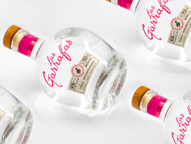
_"Custodians of the most desired mezcal in the world" is the raison d'être that was defined for this incredible mezcal. Its essence, "Elegant, soft, exquisite", speaks of the exaltation of the senses. It is the feeling of the finest silk, the resonance of an orchestra playing in perfect harmony, the master brooch that distinguishes the most precious works in the world.
INFO
A brand architecture process was carried out to differentiate the different types of mezcal and cover the different consumption segments. Four products were defined in its portfolio and the following nomenclature was created: its iconic Xaguar, Pink Snake, Quetzal and Blue Monkey.
Elements and colors that represent the cultural richness of our country in a contemporary way were used for the packaging line. The result was a family of mezcals that stimulate all the senses of the consumer.
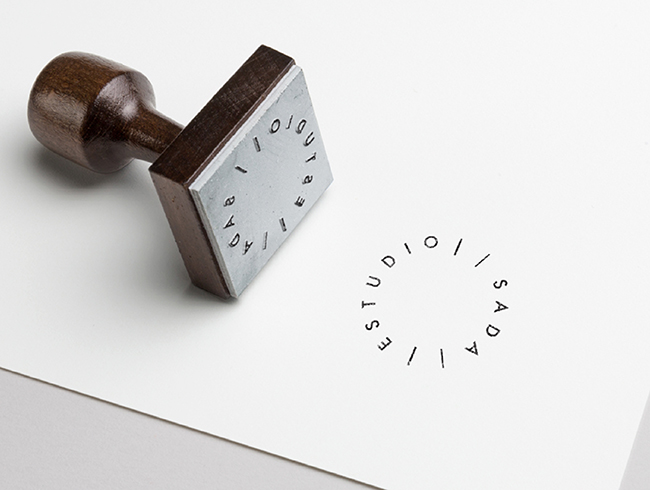
_Through the exploration and practice of the different manifestations of design, Estudio SADA is dedicated to developing effective communication strategies to tell stories through objects. The studio aims to design spaces (from a museum, to a stand at a fair or exhibition) in a creative way in order to tell stories and generate experiences.
INFO
To create a strategy as original and unique as the brand itself, we worked hand in hand with José Antonio Sada - the mind behind this project. Together, we defined the brand's promise as “Create spaces that tell stories through the balance between design and content”.
With the aim of communicating the value proposition of creativity and functionality, the slogan “Spaces that speak” was created, which not only conveys the essence that characterizes the brand, but also the narrative that they are able to find within each object.
A logo was created whose main element is the circle, to communicate the simplicity with which they work, as well as the idea of a constant cycle of movement and change. It is composed of the name “Estudio Sada” and the four lines that form a delimited space, with inputs and outputs that are marked to transmit the brand’s values.
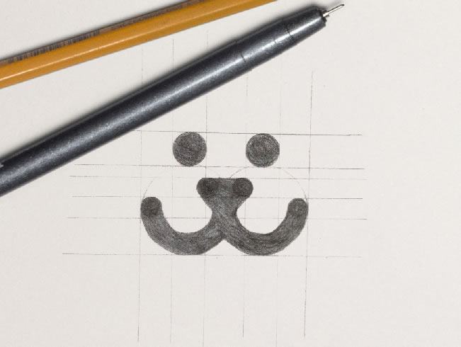
Bark provides unique care for dogs; they understand their needs and attend to them with love, care, and knowledge. Suitable for today's lifestyle, they provide the peace of mind that man's best friend will always be in good hands. To convey this security and affection, the rationale was developed: “Becoming a second family to your dog, giving you peace of mind”. “The slogan that was created for the brand is “We hear it as you do”.
INFO
This slogan is related to the word bark. To add a dynamic and emotional touch to the brand, the slogan can be modified in some of the communications, applications and promotions by changing the “we hear” for different verbs that reflect the care, service and emotions that Bark offers towards dogs.
The logo is based on the initial letter “B” in the name and represents the face of a happy dog. Its rounded lines make it very friendly and convey closeness and love, in contrast to a solid typeface that speaks of trust and commitment to its customers.
We use cookies to enhance your experience while using our website. If you are using our Services via a browser you can restrict, block or remove cookies through your web browser settings. We also use content and scripts from third parties that may use tracking technologies. You can selectively provide your consent below to allow such third party embeds. For complete information about the cookies we use, data we collect and how we process them, please check our Privacy Policy


")


")
")

")
")