Yama
_WE EMPOWER YOUR FUTURE
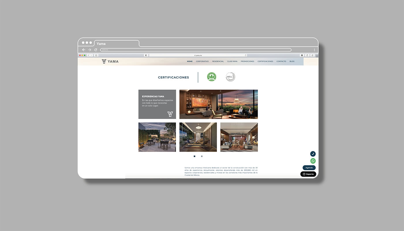
_Yama is a real estate developer committed to offering comprehensive and customized spaces and solutions to their customers. They inspire and support their clients during the best decisions of their lives, helping them fulfil all of their dreams and forming a visionary and successful community whose priority is to ensure their future safety.
INFO
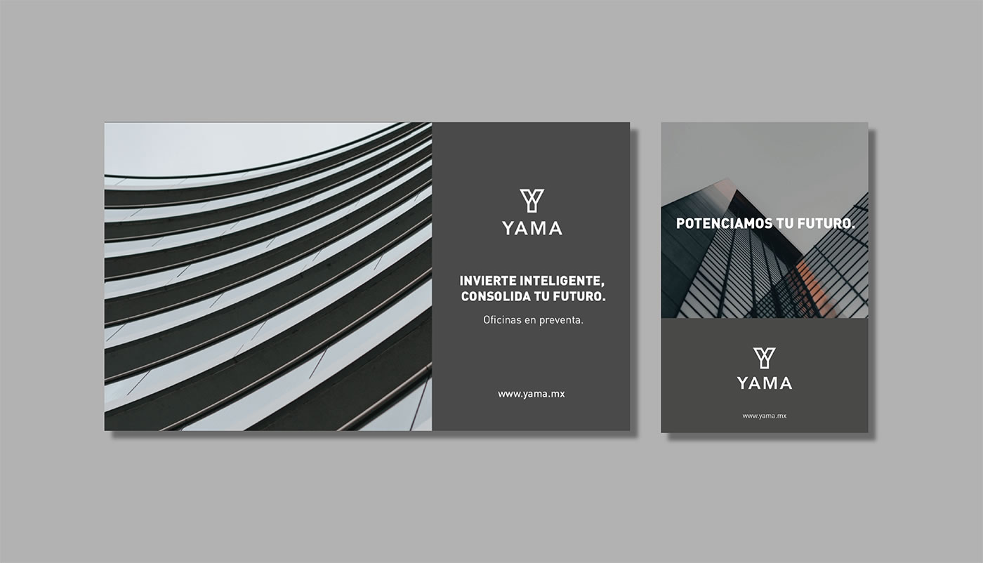
For the creation of the strategy, we sought to communicate the attributes that make it unique. To achieve this, the rationale “driving the major projects of your life” was created paying attention to its ability to coexist in a housing and office market. The slogan that was defined was “we empower your future”, with the same above intention and together with the importance of investing to generate a successful future. Likewise, we worked with a nomenclature system with the objective of naming all the specific areas that made up the brand.
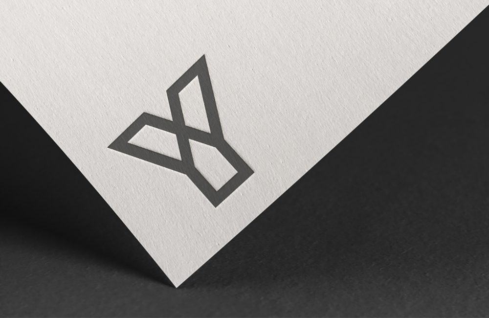
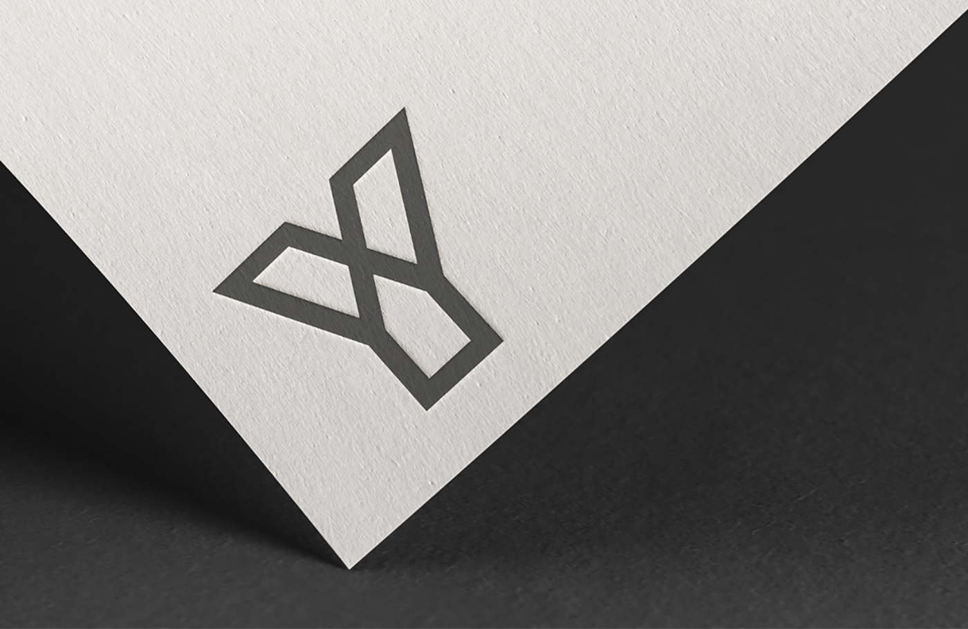
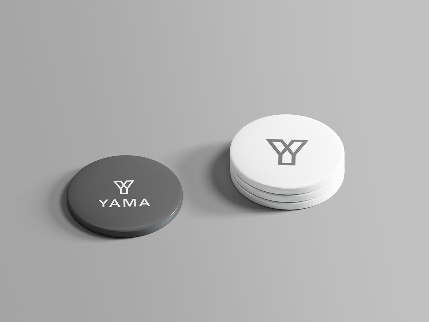
In relation to the strategy, a logo was created consisting of two main elements: the symbol and the name. The typography chosen transmits solidity and reliability, and the symbol that accompanies it, which is a letter Y that characterizes the brand, makes it approachable and intelligent. Similarly, the Y is formed by the three divisions that represent the 3 real estate areas they offer: life, business and capital. The logo represents the close treatment and the ability to provide tailored responses, enhancing the future of Yama's customers.
AXM
_EXPLORE, LIVE, TRAVEL
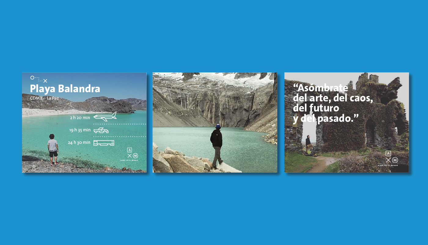
_Always looking forward, Alan sets the tone in the category of travel vloggers. His message transcends due to both his natural ability to connect with his audience as well as the useful and innovative content he provides them with.
INFO
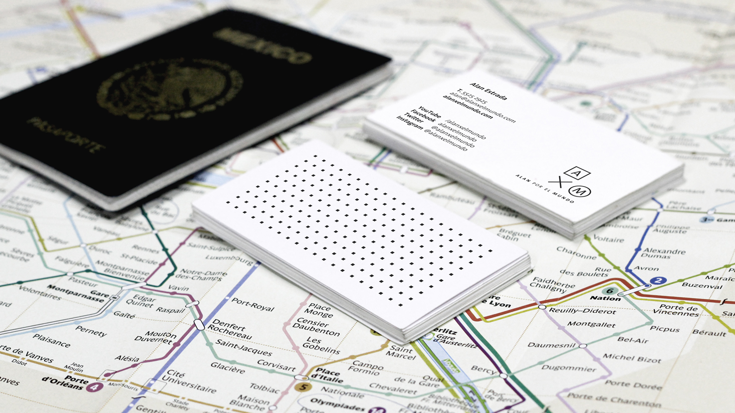
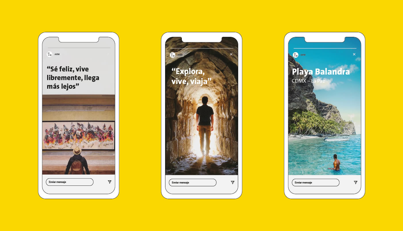
Whether he is narrating his experiences from a 5-star hotel or exploring the most hidden corners of the world, Alan always maintains his authenticity. Based on this, the mission of "Be happy, live freely, go further" - and its essence "Explore, live, travel" - were developed, reflecting happiness and inspiration.
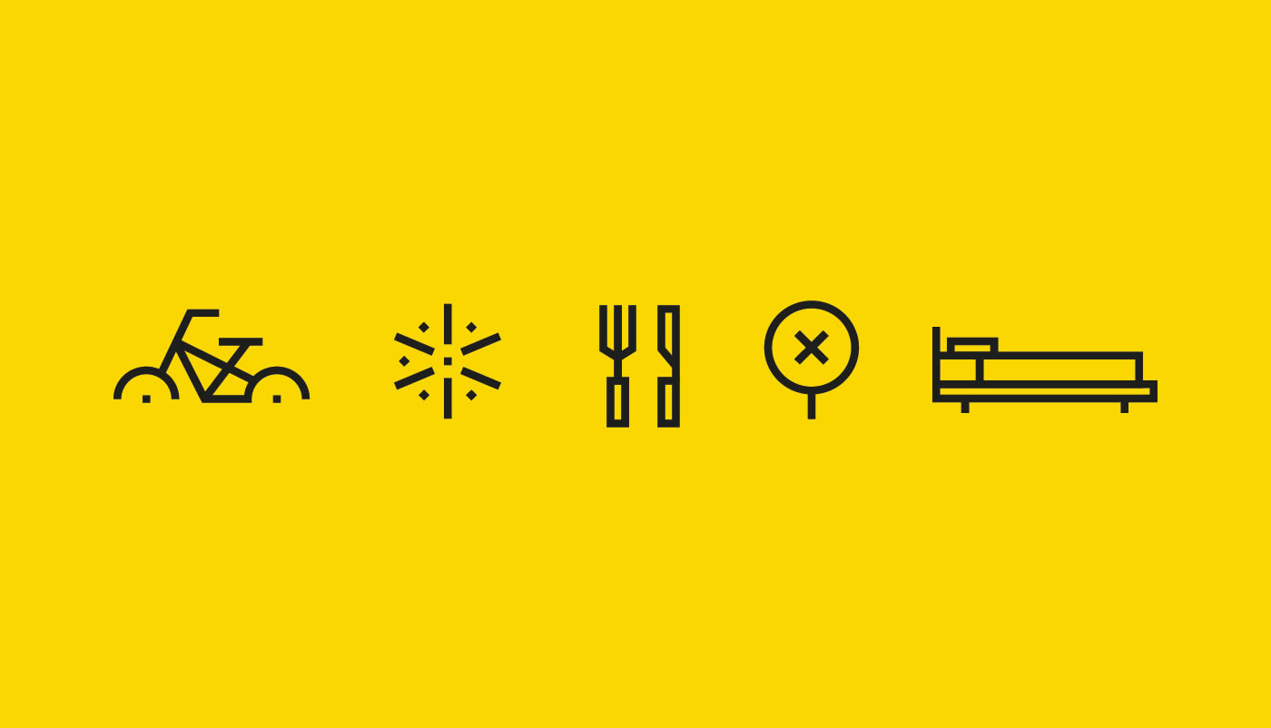
This strategy was represented with a simple design, linking the letters A and M with a multiplication sign to represent the word "by". As part of the AXM system, a series of graphic elements were designed that help to reinforce and complement the visual identity of the brand, as well as to clearly present its information and content.
Kubo
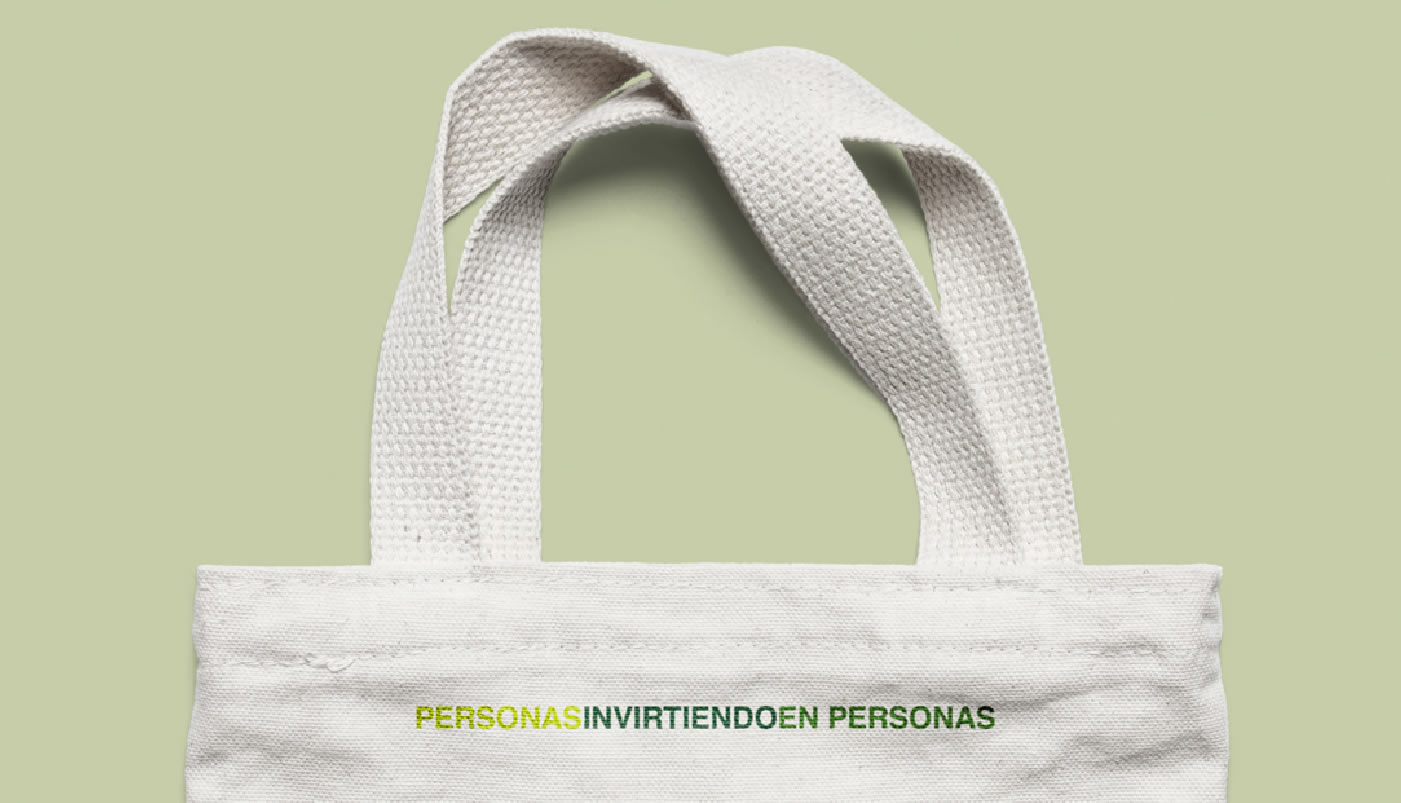
_PEOPLE INVESTING IN PEOPLE
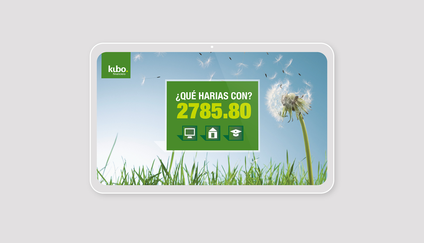
_Based on a highly disruptive model, Kubo is an online financial community that allows direct operations between people (p2p lending), leverages the use of technology to reduce intermediation costs and translates these efficiencies into substantially lower rates for the accredited and in higher returns for investors.
INFO
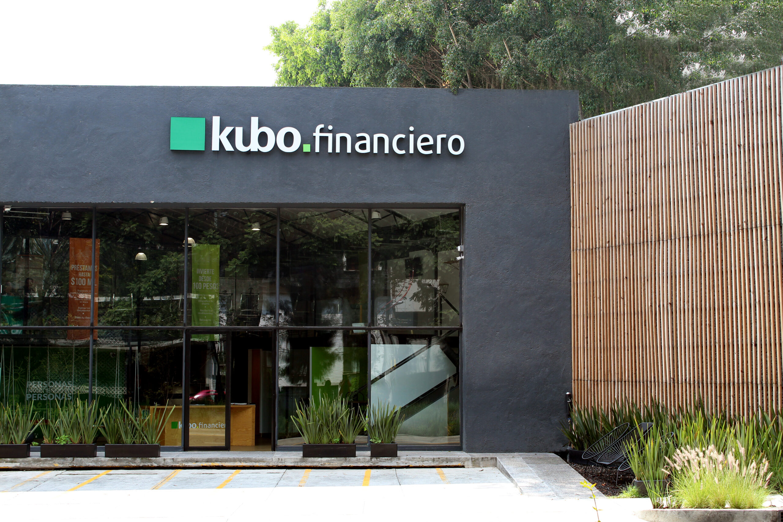
Under the premise "People investing in people", we helped devise the new brand proposal for the customer. “Boosting the development of people, families and businesses" was defined as the brand name of Kubo. The essence of the company is "Be a short bridge between investors and borrowers."
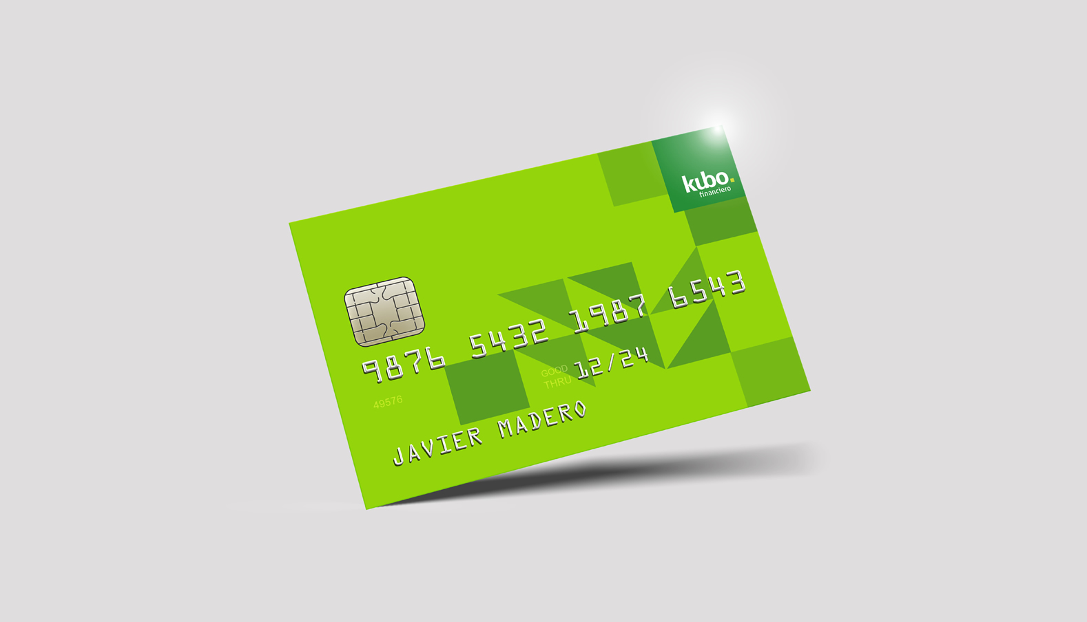
Based on a concept that represents values in a clear and affordable way, the composition of their identity is innovative but timeless. The union between "u" and "b" translates as the closeness between Kubo and its customers and the green color conveys hope and progress.
TBG
_CONNECTIONS AMPLIFIED
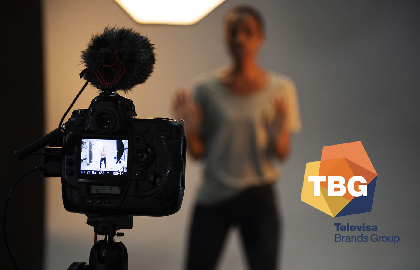
_The work consisted of redesigning the Editorial Televisa brand to support the transition of a company, whose previous primary focus had been editorial, towards a media ecosystem that responds to current needs.
INFO
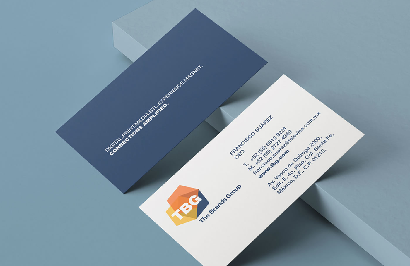
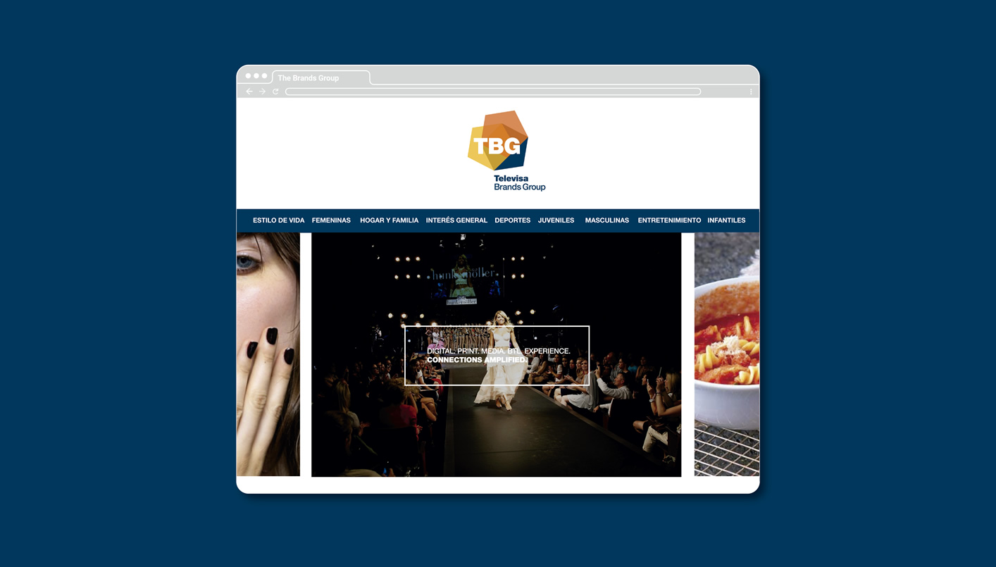
A brand architecture process that defines the product portfolio offered by the company was carried out: print, digital, media, + BTL, experience and magnet.
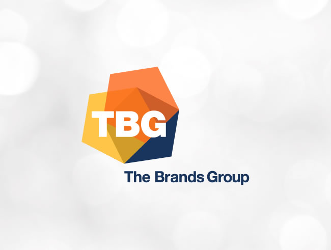
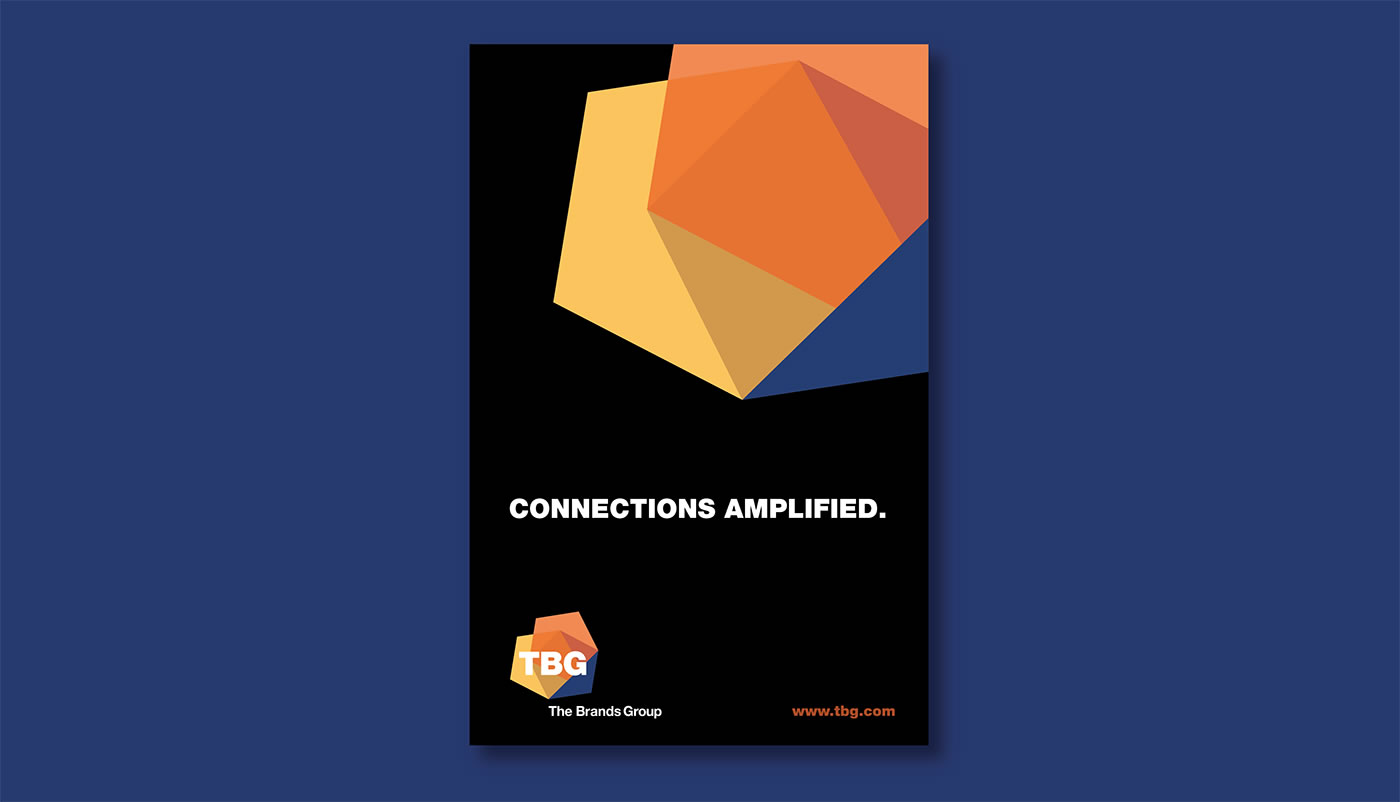
Based on the name “TBG: The Brands Group” and the essence that was developed for the brand, “Connections Amplified”, a visual strategy was designed to communicate the value proposition.
The identity of this platform is composed of three pentagons, which represent the dynamism and variety of the different business units that, like the figures, point to different directions but come together to form an integral service.
Laudex
_UNLEASHING YOUR POTENTIAL
_In a market with low penetration and knowledge of educational credits in Mexico, Laudex has the opportunity to become the spokesperson for the sector in a country where financial reality and educational aspirations are not always aligned.
INFO
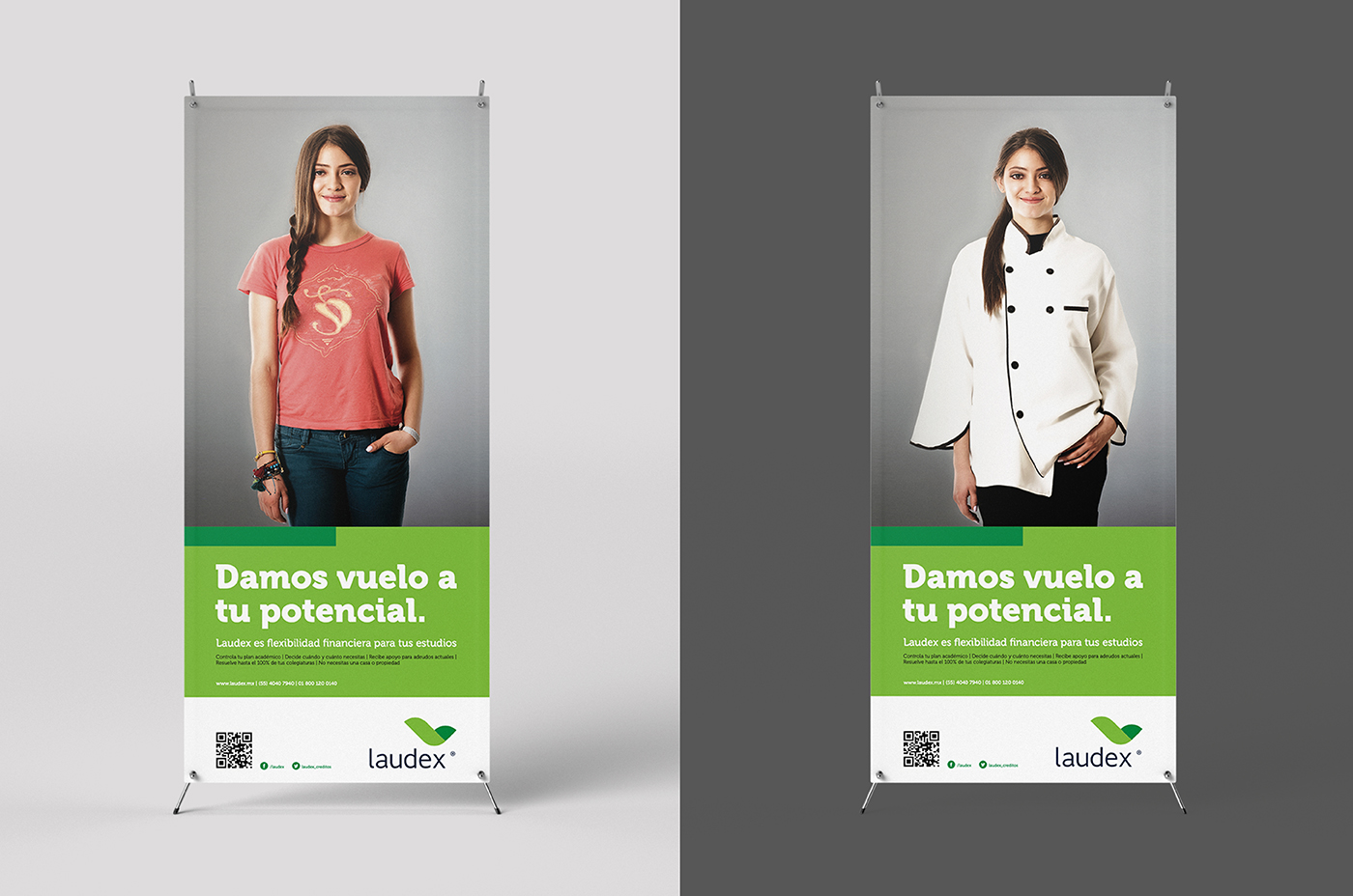
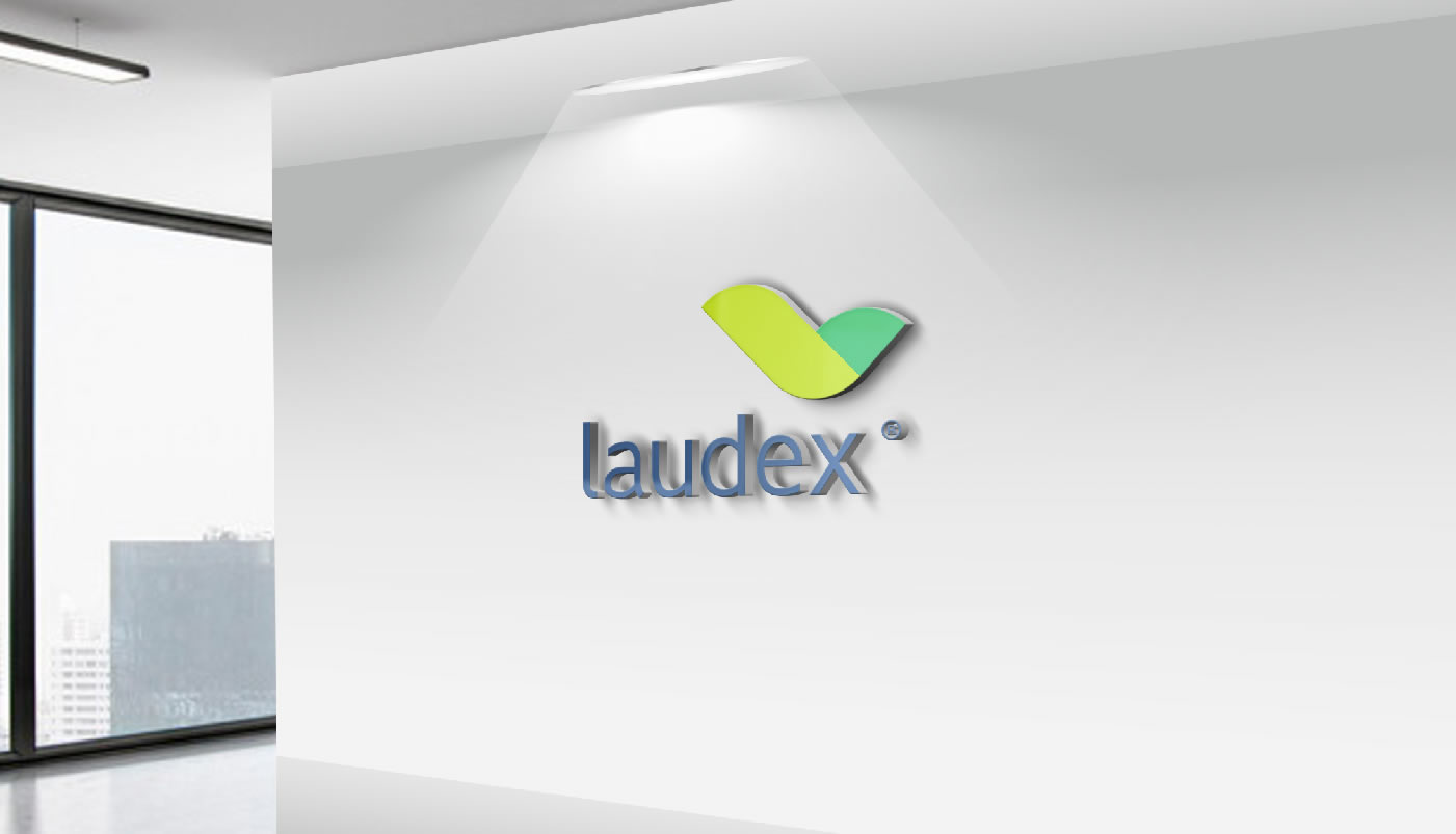
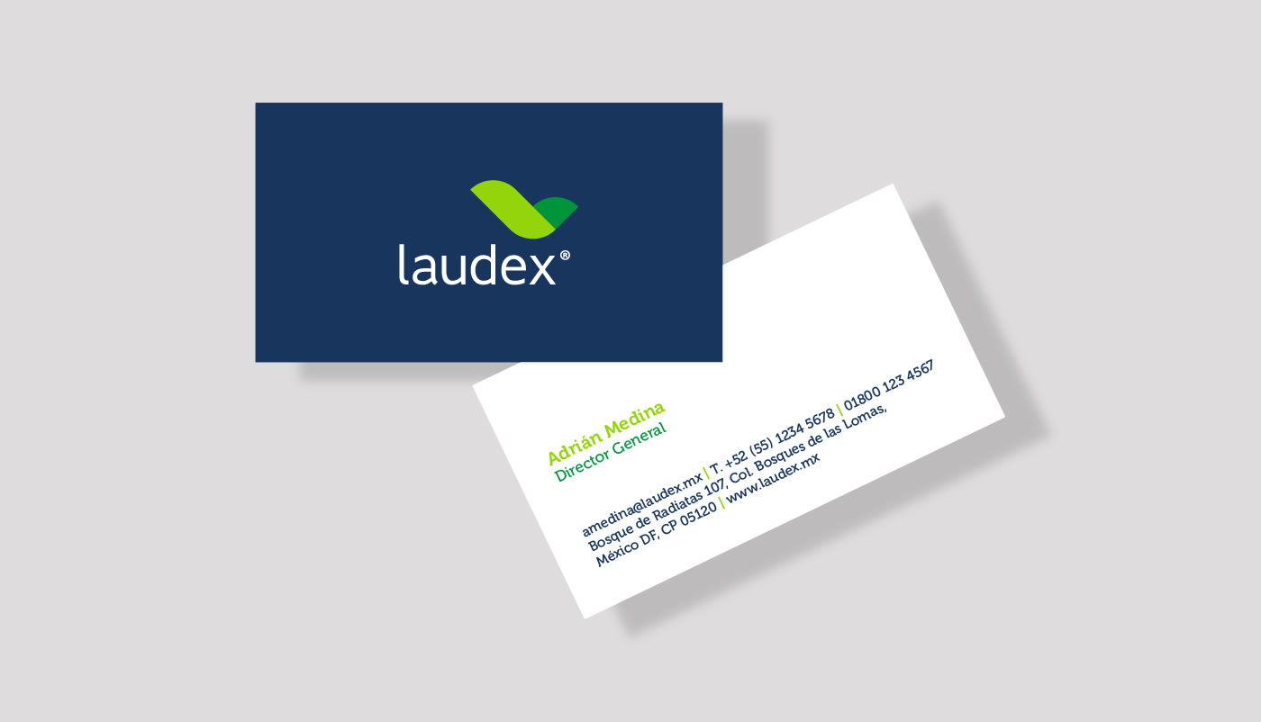
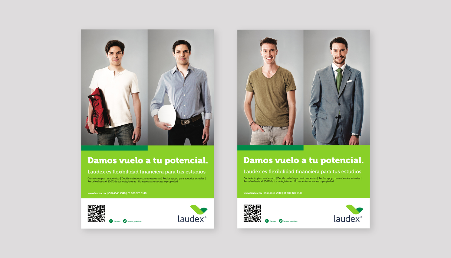
To convey the work of the brand, the mission “We trigger education, we change lives” and its essence “Unleashing your potential” were created. Both talk about orientation, flexibility and transparency. It was possible to convey solidity and confidence, both for students and for parents and universities.
Based on the previous symbol and the new essence of giving flight to potential, the brand’s identity was changed to reflect its proposal to be more flexible and support Mexican talent.
Melding
_WE CREATE STORIES
_In this case, we worked with the objective of capturing and projecting the verve of a multimedia content production agency that evolved to give way to a more consolidated company, without losing sight of its innovative and current essence.
INFO
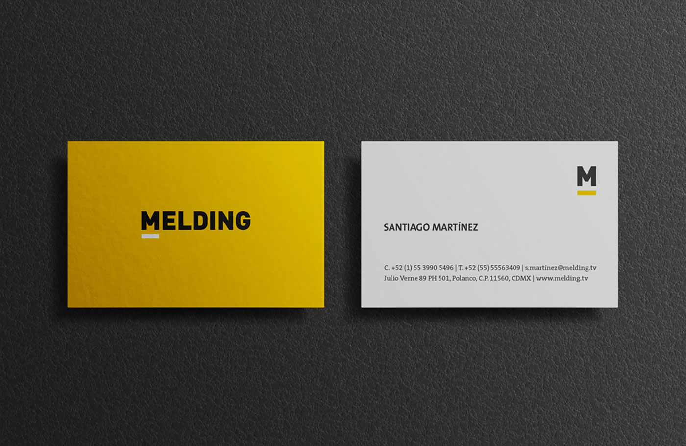
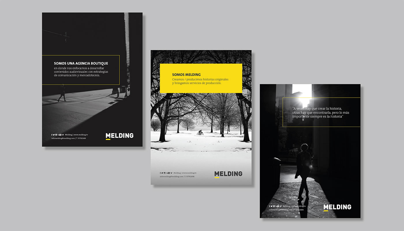
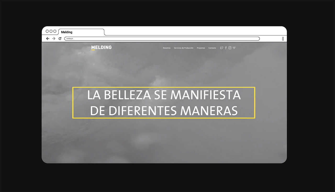
Through a deep analysis, both internally and externally, the redesign of its corporate image was reached, the way in which the agency portrays its value proposition was strengthened and it thus became much more memorable.
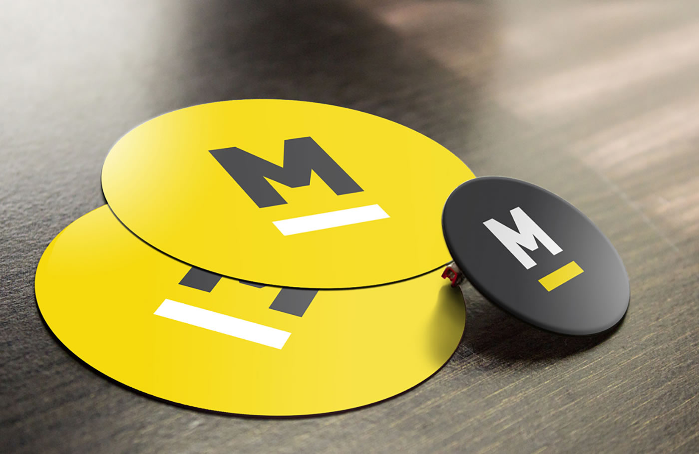
Based on the creation of the M monogram, the brand now has a practical and easy-to-use element through a wide range of mediums.
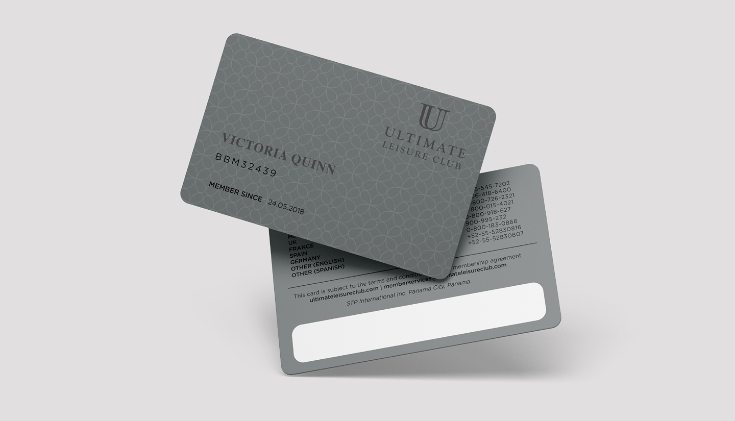
Ultimate
ULTIMATE VACATION CLUB
_ This exclusive club offers an experience of the highest level. Day by day it pursues a single goal: to pamper and ensure the happiness of all its guests.
INFO
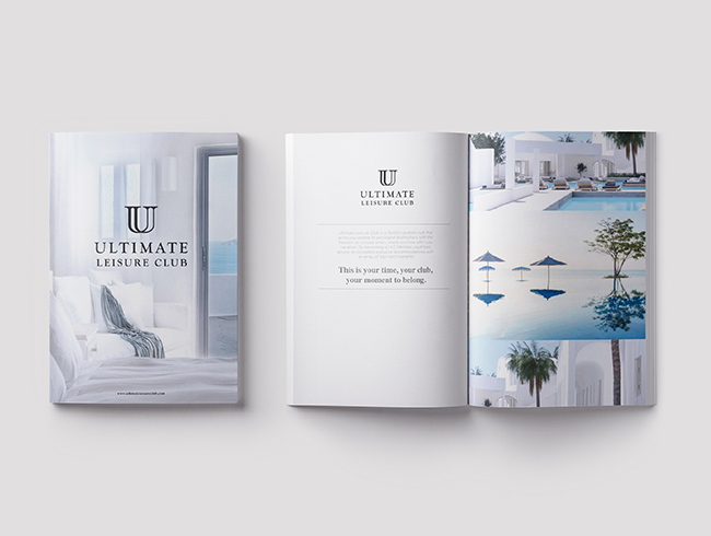
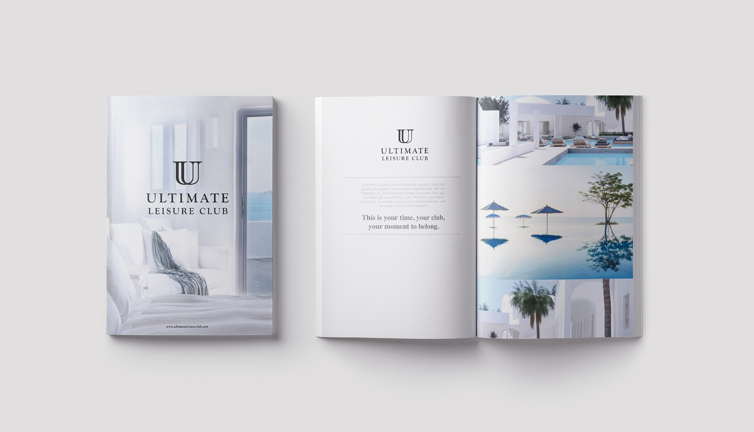
The Ultimate Vacation Club logo represents the luxury, elegance and exclusivity that this brand offers its guests throughout their vacation experience. The monogram (which comes from the Greek word meaning “a letter”) is delicate and fine, contrasting with a classic and neutral typography. While its predominant color reminds the viewer of shades of gold, a precious metal.
Brandia was also responsible for the development of the name. The objective was to portray a place of the highest level, with the latest, most sophisticated and inspiring trends. At Ultimate Vacation Club, guests are the most important thing, and so everything revolves around their comfort and enjoyment.
“Boosting healthy, curious and creative minds” was the brand’s promise that was defined in order to communicate the importance of developing children's creativity. Its essence, "Great minds, great worlds", highlights the space where your great ideas are inspired to create and build a great world.
The logo is very colorful and refers to its most important market: children. The rounded typography speaks of closeness, love and security to demonstrate the company’s awareness. The union of colors in the O conveys a feeling of movement to illustrate the vital and creative minds of children. The character named Boki, who is the letter O with arms and legs, was developed to go along with the brand. His movements are fun, and creates a bond of trust with their market.
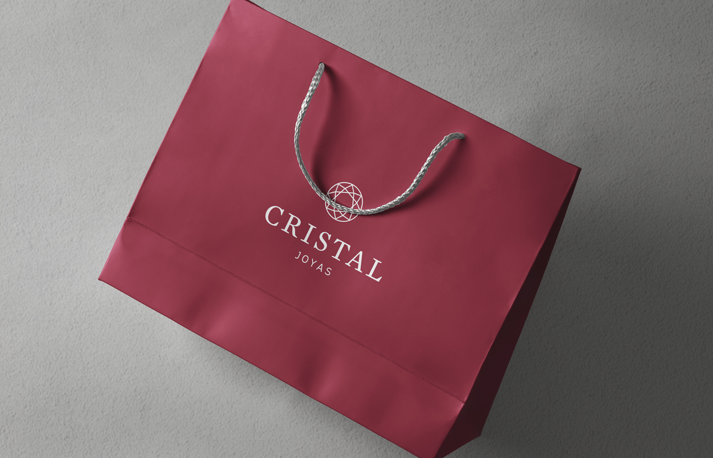
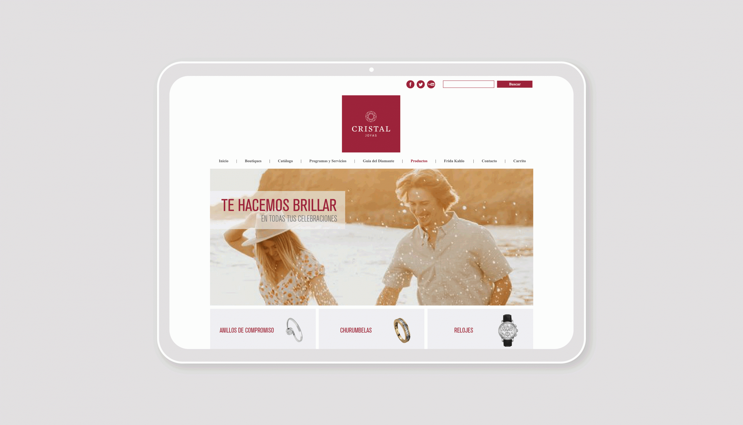
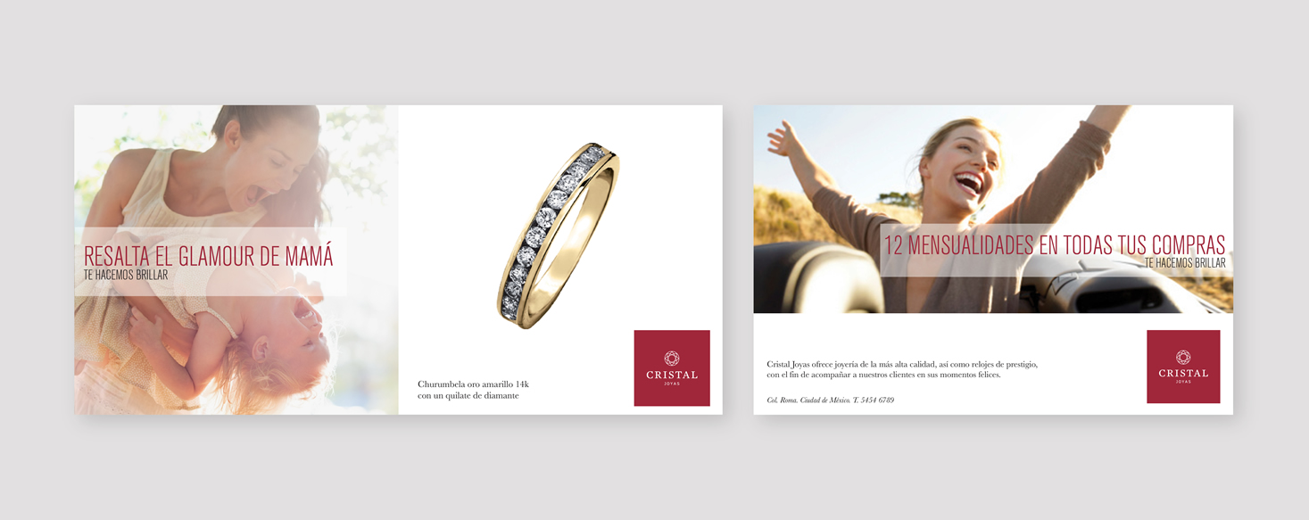
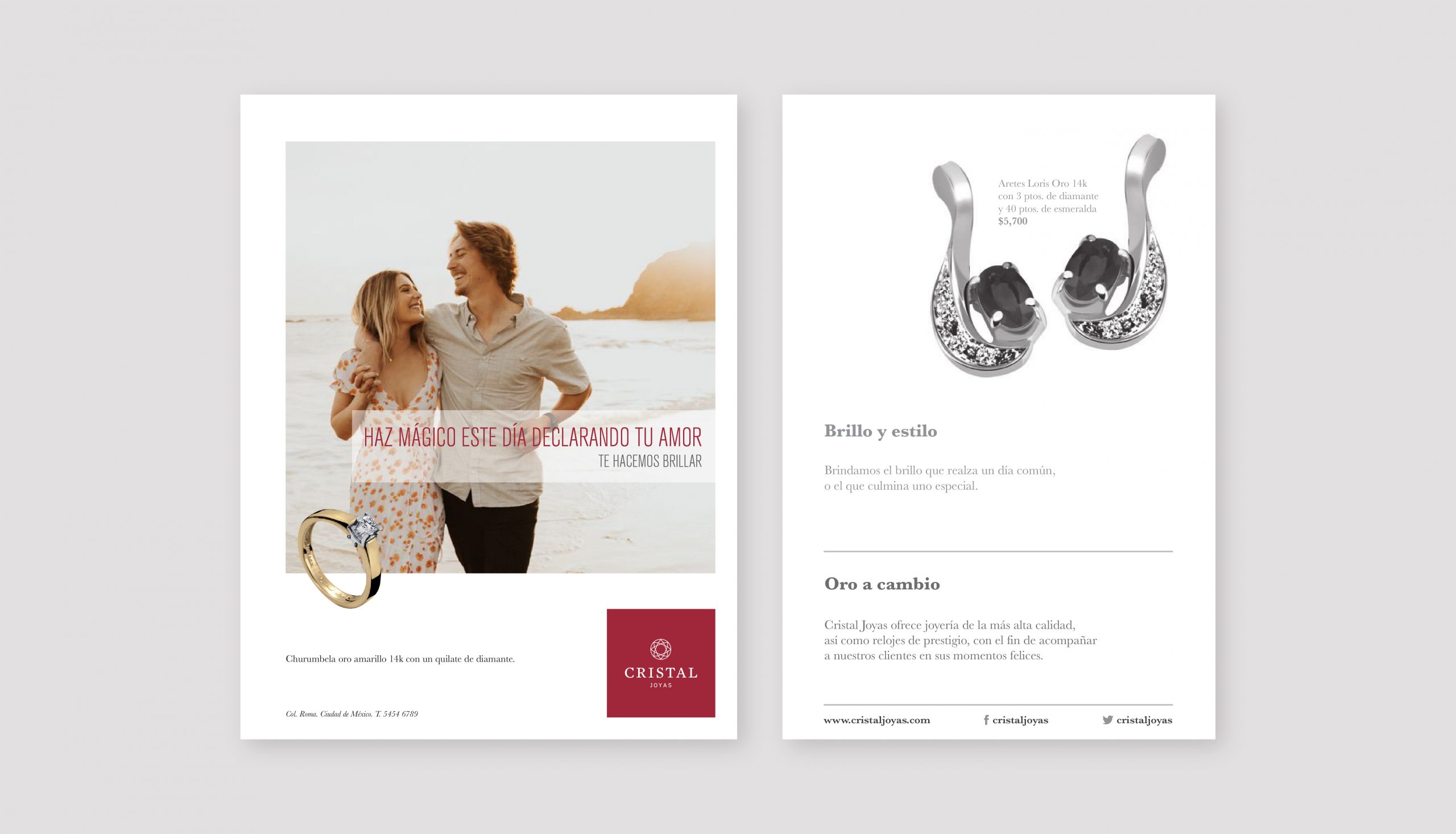
Cristal Joyas
_WE MAKE YOU SHINE
_Cristal Joyas went through a project of repositioning themselves, where the attributes that make the brand unique to its target market were highlighted and rescued.
INFO
Based on a rigorous investigation - both internally and externally - the brand platform was then defined with the rationale being “We provide the brightness that enhances a common day, or the one that culminates a special one.” Likewise, the essence “We make you shine” was developed, which refers to the occasion of gifting its customers, or of customers gifting themselves.
A message matrix was developed for its different consumer segments highlighting the attributes that make the brand unique: service, quality, accessible luxury and experience.
In terms of visual identity, refinements were made to the current brand logo. Its legacy was respected, but its features were reinforced to make it much more readable and able to communicate its value proposition.
AN
_TO THE POWER OF THE N
_AN is a company specialized in consulting oriented to information technologies with a clear international vocation.
INFO
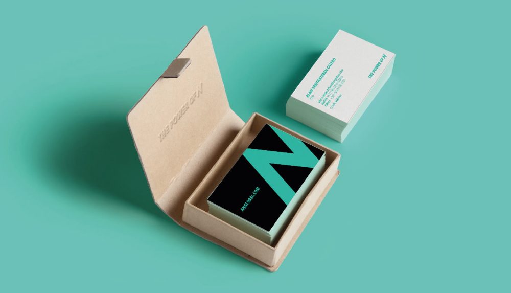
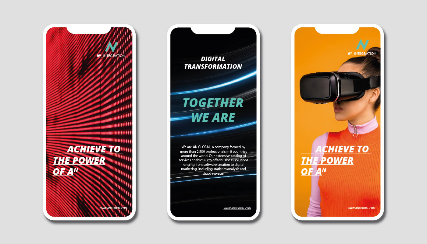
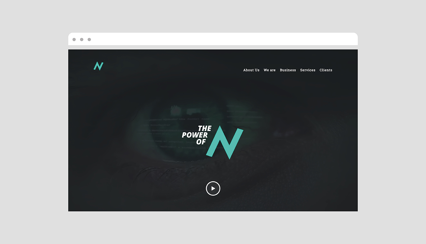
The objective of the project was to create a corporate brand that leads a diversified portfolio of consulting, marketing and IT services. The company's raison d'être was conceptualized as: “We are in business to exponentially transform the power of yours.” The essence was then developed as “To the power of the N”, referring to the name AN and the exponent N as a way of transforming the way of doing business.
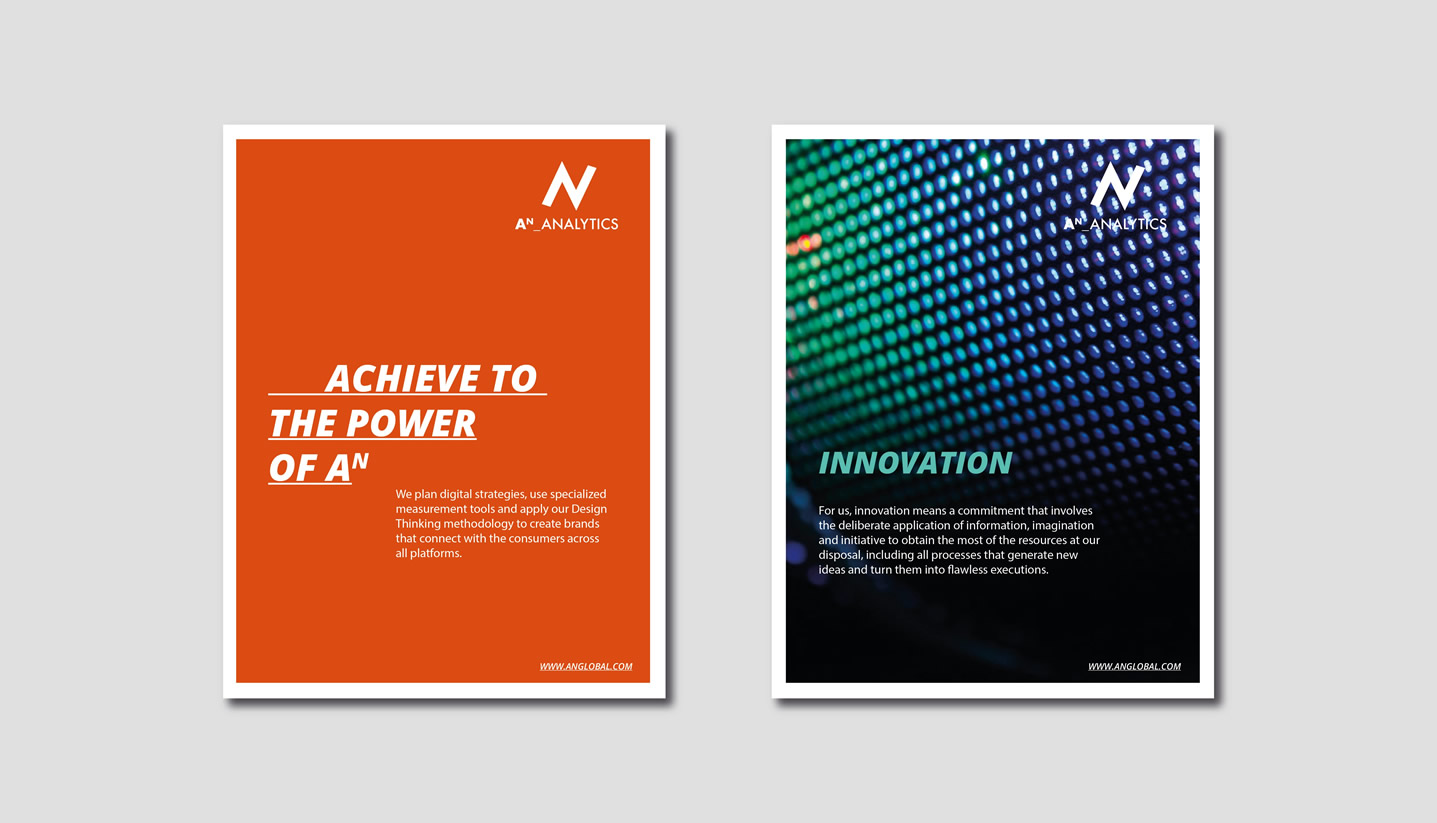
The essence can change depending on the company's service: "Transform to the power of the N", "Talent to the power of the N". Thus, a specific architecture was developed for each business area, ordering the company's portfolio of services.
The logo emphasizes innovation and movement through a dynamic form that simulates a graph with growth capacity. The concept of promoting N is emphasized in the typographical arrangement, where the icon is the protagonist. The aqua color speaks of the avant-garde and innovation, in combination with black, which is a color that represents the strength and seriousness of a global company.
Post recientes
- La importancia de un buen nombre. 19 de November de 2025
- Las marcas mexicanas más vistas en el mundo. 24 de September de 2025
- Entrevista con Rafael I. Medina, Director de Brandia. 20 de August de 2025
- Top 4 Casos: Nuestros proyectos favoritos 17 de June de 2025
- Siete Machos: Una nueva alquimia 11 de June de 2025
